Become a MacRumors Supporter for $50/year with no ads, ability to filter front page stories, and private forums.

BizRunner

macrumors member
Original poster
Jul 13, 2009
71
21
Iowa City, Iowa
I purchased the 13" Air last August and am a bit worried how Yosemite will look on the screen. I really don't want to install it and not be able to read the thin fonts - with the popularity of the Air I can't see Apple totally moving to a Retina only OS but who knows.

I don't want to know about people's opinion's of the OS (I personally think it looks great in photos) just about the quality on a new Air.
 

icanhazapple

macrumors 6502a
Feb 26, 2009
580
1,246
I purchased the 13" Air last August and am a bit worried how Yosemite will look on the screen. I really don't want to install it and not be able to read the thin fonts - with the popularity of the Air I can't see Apple totally moving to a Retina only OS but who knows.

I don't want to know about people's opinion's of the OS (I personally think it looks great in photos) just about the quality on a new Air.

I have a 2012 Air - it's not nearly as bad as what people are making it out to be but at the end of the day it's personal preference.
 

BizRunner

macrumors member
Original poster
Jul 13, 2009
71
21
Iowa City, Iowa
Is it any worse than Mavericks? I know the screen is not retina but when you compare a Retina Mavericks computer to Non-Retina Mavericks I wonder if it is any more noticeable than doing the same with Yosemite.
 

ecschwarz

macrumors 65816
Jun 28, 2010
1,435
356
I personally felt that Lucida Grande was an excellent font for non-retina displays, but I like the direction Apple is going with Yosemite. That being said, it's a bit tougher to read some things if you have just about any display out there that isn't attached to a rMBP, but still not awful and certainly not as bad as some people are making it out to be.
 

icanhazapple

macrumors 6502a
Feb 26, 2009
580
1,246
Is it any worse than Mavericks? I know the screen is not retina but when you compare a Retina Mavericks computer to Non-Retina Mavericks I wonder if it is any more noticeable than doing the same with Yosemite.

in my usage, it is not any worse than Mavericks.
 

sou1 so1di3r

macrumors 6502a
Jun 26, 2008
779
13
Denver, CO
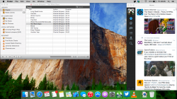
Looks fine here
 

Attachments

  • Screen Shot 2014-07-25 at 3.22.40 PM.png
    Screen Shot 2014-07-25 at 3.22.40 PM.png
    806.2 KB · Views: 316

Zetaprime

macrumors 65816
Dec 4, 2011
1,481
262
Ohio, US
I purchased the 13" Air last August and am a bit worried how Yosemite will look on the screen. I really don't want to install it and not be able to read the thin fonts - with the popularity of the Air I can't see Apple totally moving to a Retina only OS but who knows.

I don't want to know about people's opinion's of the OS (I personally think it looks great in photos) just about the quality on a new Air.
I'm using it on a 2011 Air. I don't think it's any worse than Mavericks in that respect. The fonts are thinner but still perfectly readable.
 

skillwill

macrumors 6502
Feb 12, 2008
480
661
Im running Yosemite on the Air and it looks brilliant. People just have to find something to moan about.

All I can guess is that it's one of those things where you don't notice anything looks worse until you use it on retina and then go back.
 

daijholt

macrumors 65816
Jun 14, 2013
1,113
343
Wales, UK
See for yourself. Lots of text in this pic, and this is from my 11inch Air.

Don't forget to zoom in on the image once you click it to remove the slight blur that seems to have appeared after uploading.
 

Attachments

  • Screenshot 2014-07-25 23.25.51.png
    Screenshot 2014-07-25 23.25.51.png
    1.2 MB · Views: 304

Saturn1217

macrumors 65816
Apr 28, 2008
1,360
1,048
I agree with others here. I tried Yosemite on my 2013 13" MBA expecting the fonts to be terrible. They are fine. I am extremely prone to eye strain to the point where i usually browse the web at >100% zoom and use an anti-glare screen protector. I had no trouble reading anything.
 

torana355

macrumors 68040
Dec 8, 2009
3,627
2,713
Sydney, Australia
The text and icons in the title bar have jaggies on any screen that is not retina, for example the wifi icon is really jaggy. Both my 2011 MBA and 2012 iMac look the same. Dark mode is worse again which is a pity as i think dark mode looks great. If you cant see the jaggies then you need to get your eyes checked lol.
 

iJcaP

macrumors 6502
Jun 19, 2010
302
25
In my opinion it looks better than Mavericks. Mavericks Finder Bar, for example, on the 13" Air doesn't look as smooth as the Yosemite Finder Bar. I didn't want to install Yosemite on my Air either, so I just installed it on my external HD and now I can run both Mavericks and Yosemite, without messing around with my SSD. I've realized that running Yosemite gives me one hour less of battery life than running Mavericks. But that's probably owed to background processes that are unique to beta software (diagnostic reports and system status things).
 
Last edited:

torana355

macrumors 68040
Dec 8, 2009
3,627
2,713
Sydney, Australia
Looks great to me (2014 13" MBA). A lot of the complaints are blown out of proportion

I disagree. I installed Yosmite with zero pre-conception. The jaggies in the title bar stood out to me like dogs balls. Then again i work in the printing industry so i have a keen eye for detail. I still really like Yosmite but i think it might be time for an upgrade to a retina laptop if Apple don't fix it by final release.
 

coldjeanzzz

macrumors 6502a
Nov 4, 2012
655
17
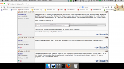
Readability isn't a concern for me as my eye sight is fine, I have a problem with the font in certain areas because it just flat out looks worse. The title bars for whatever reason look awful on a non-retina display. On a retina display they look dark and smooth but on a MBA they look thin and jagged. This problem doesn't exist with Lucida Grande.

Here is what I'm referring to


You can't tell me the font doesn't look worse on the title bar in Yosemite
 
Last edited:

Norcal.

macrumors regular
Dec 7, 2012
137
172
Doesn't look particularly blurry to me. But then again, once you go retina anything with lower res looks blurry.
 

Fuchal

macrumors 68030
Sep 30, 2003
2,613
1,136
There's definitely a bug in Yosemite where the font smoothing doesn't always draw correctly. You can see it a lot on the clock in the menu bar. Sometimes its nicely smoothed and then sometimes its choppy and thin. I'd reserve judgment until a later beta & release.
 

damidget

macrumors regular
Aug 3, 2013
101
0
Brisbane, Australia
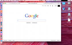
This is on my 11" 2012 MBA

EDIT: You have to zoom in otherwise it looks blurry
 

Attachments

  • Screenshot 2014-07-29 11.53.26.png
    Screenshot 2014-07-29 11.53.26.png
    287.1 KB · Views: 157
Last edited:

fanta

macrumors regular
Jun 2, 2011
110
2
Readability isn't a concern for me as my eye sight is fine, I have a problem with the font in certain areas because it just flat out looks worse. The title bars for whatever reason look awful on a non-retina display. On a retina display they look dark and smooth but on a MBA they look thin and jagged. This problem doesn't exist with Lucida Grande.

Here is what I'm referring to

[url=http://i.imgur.com/N9jIAhU.png]Image[/URL]

You can't tell me the font doesn't look worse on the title bar in Yosemite

This is exactly what i am experiencing too, here is one more screenshot where you can see that its NOT perfectly fine.

http://dl.getdropbox.com/u/3396571/Bildschirmfoto%202014-08-19%20um%2016.53.19%20Kopie.png

Look at the "r" in Folder or the "U" in "UI"... Thats everything else but smooth.
 

MaxPayne79

macrumors regular
Jun 11, 2014
182
1
I'm running Yosemite on my 13" Haswell Air since DP1 and it's pretty amazing. Like it more than Mavericks. It's more fluid. Battery life has never been an issue under Mavericks and it's just as good under Yosemite imo. :)
 
Register on MacRumors! This sidebar will go away, and you'll see fewer ads.