Anyone else notice this?
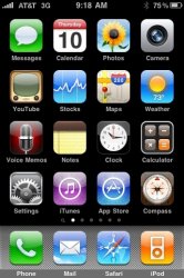
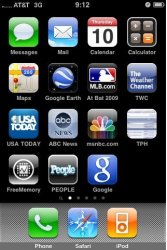
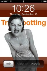
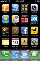
On the lock screen and the "sync in progress" screen, the AT&T logo is right up against the signal bars. But on the main screen or within any other app, the logo moves over so there's a space between it and the signal bars.
Hidden "feature" or oversight by Apple? I remember reading somewhere that in the 3.1 betas there was a fix for long carrier names, but it seems weird that it's in different places at different times.


