Become a MacRumors Supporter for $50/year with no ads, ability to filter front page stories, and private forums.
A few sunset pics, C&C please
- Thread starter kreuzberg
- Start date
- Sort by reaction score
You are using an out of date browser. It may not display this or other websites correctly.
You should upgrade or use an alternative browser.
You should upgrade or use an alternative browser.


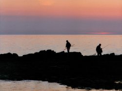
2 and 7 are my least favorite. the others have good subjects imo
the photos dont seem to be vivid in color however
the photos dont seem to be vivid in color however
Agree; these are nice shots, but they could do with a little contrast and saturation adjustments. But I'm drawn to them as photographs, which is the most important thing.
They're all quite nice. If I had to offer something it would be to shorten the sky in 7 - that would likely change the focal point dramatically.
I have to disagree. Photos 2 and 7 are my favourite, Just goes to show how individuals vary!
And I particularly like the silhouettes of 7 although I agree it needs cropping slightly.
I really like the sky in 4 but I think the giant rock in the middle really spoils it.
What do you like about them, kreuzberg?
And I particularly like the silhouettes of 7 although I agree it needs cropping slightly.
I really like the sky in 4 but I think the giant rock in the middle really spoils it.
What do you like about them, kreuzberg?
I've given 7 a crop, is this any better? I've also added it as an attachment as I noticed flickr seems to dull the pictures and reduce the saturation/contrast compared to how they look in Photoshop.
I like the colours in 1, 3, 4 and 5, I also like the simple contrast in 7. Im not sure that 2 and 6 work, 2 seems a little busy and 6 a little boring.
I like the colours in 1, 3, 4 and 5, I also like the simple contrast in 7. Im not sure that 2 and 6 work, 2 seems a little busy and 6 a little boring.
Attachments
hmm... just a question, how did you meter??... I think these images could use a little bit of foreground light.
I am all for sunset images and I think yours came out very well (except number 4. that rock is too big and too dark. it makes almost 20% of the image in the middle black), but some of the foreground subjects are quite dark and could be more interesting.
This is not a rant, just merely a suggestion. Could you take the RAW file, if you have one, and not necessarily do a pseudo HDR but merely overlay number 2 in Photoshop and give the boat a _little_ bit more brightness.
Otherwise well captured.
1 and 7 are definitely my favorite since they bring the siluettes to life. but then again different tastes as the commenters above mentioned
I've just been using the stop down metering built into the camera. I've overlayed number 2 and it has made it a little brighter although I'm not sure if it works:

What d you guys think?
Any opinion on which version of 7 is better, crop or no crop?
What d you guys think?
Any opinion on which version of 7 is better, crop or no crop?
1 is my favourite.
If you took the photo a few minutes before you could have got a lot more light on the grass and eliminated the need to use a HDR type thing just an idea anyway.
Nice work though
If you took the photo a few minutes before you could have got a lot more light on the grass and eliminated the need to use a HDR type thing just an idea anyway.
Nice work though
Any opinion on which version of 7 is better, crop or no crop?
The cropped version is much better in my opinion, the original has too much empty space at the time that it draws your attention away from the subjects.
Personally, 6 is my favorite, and 2 and 7 are my least favorite.
I did some editing to 6 just to show how I would change it (hope' your okay with that)

1. First I increased the saturation
2. Then I increased the sharpness
3. Then I increased the exposure
4. Then I changed the temperature so the photo had a "warmer" feel
5. Lastly, I cropped some of the coast out, so it didn't seem so busy
IMO, 2 seems to dark, and the boat is just to "in your face", and IMO, you need to crop in on the people in 7 more, even more then you already have. And I would also increase the exposure a little bit more, and maybe increase the saturation.

Don
I did some editing to 6 just to show how I would change it (hope' your okay with that)
1. First I increased the saturation
2. Then I increased the sharpness
3. Then I increased the exposure
4. Then I changed the temperature so the photo had a "warmer" feel
5. Lastly, I cropped some of the coast out, so it didn't seem so busy
IMO, 2 seems to dark, and the boat is just to "in your face", and IMO, you need to crop in on the people in 7 more, even more then you already have. And I would also increase the exposure a little bit more, and maybe increase the saturation.
Don
very nice pics!
though i cant help notice. but some sort of haze or fuzzy blur all over the pics on some of them.
EDITh wait my bad, went on your flickr saw that they were from film. im sure the originals dont have that haze i see.
though i cant help notice. but some sort of haze or fuzzy blur all over the pics on some of them.
EDIT
h wait my bad, went on your flickr saw that they were from film. im sure the originals dont have that haze i see.I did some editing to 6 just to show how I would change it (hope' your okay with that)
Thats cool, edit away.
I like what youve done with 7, although I'm still not sure on the other one, I'm just not feeling it. I'm gona try what you did with it though on a couple of other photos that I didnt think were good enough to post and see can they be rescued.
I've given 7 a crop, is this any better? I've also added it as an attachment as I noticed flickr seems to dull the pictures and reduce the saturation/contrast compared to how they look in Photoshop.
It's not that. Photoshop displays a range of colors, not all of which can be displayed in jpeg form. Make sure when you save for web, you're exporting with an embedded color profile.
Personally, 6 is my favorite, and 2 and 7 are my least favorite.
I did some editing to 6 just to show how I would change it (hope' your okay with that)
View attachment 181237
Don
Exactly, sometimes sunsets may need a little PP....
I like 1 and 5...
It's not that. Photoshop displays a range of colors, not all of which can be displayed in jpeg form. Make sure when you save for web, you're exporting with an embedded color profile.
Ahhh I didn't know that! Thanks for the tip, I'll have to remember to do that from now on!
Register on MacRumors! This sidebar will go away, and you'll see fewer ads.