Become a MacRumors Supporter for $50/year with no ads, ability to filter front page stories, and private forums.

dejo

Moderator emeritus
Original poster
Sep 2, 2004
15,982
452
The Centennial State
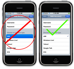
So, the iPhone HIG states that you should never use the highlight to indicate selection in a table view, use the check mark accessory instead. Alright. And it also states that if your table is more than a couple of pages long you should include an index (like the a-z on the right of the Contacts list). Again, alright. But it also says you should avoid using accessories in a table view with an index because the accessory may interfere with the index. But, they don't suggest an alternative.

So, now I'm stuck. I have a table view that contains nearly 300 items, that I want to allow the user to select from. Because of the size, it would seem an index is in order. But if I use an index, I shouldn't use a checkmark accessory. But I also shouldn't permanently highlight a cell to show selection, I should checkmark it. It's like circular logic of "if you do this, don't do that". :mad:

So, I come here for possible solutions to this quandary. Whadya think?
 

dejo

Moderator emeritus
Original poster
Sep 2, 2004
15,982
452
The Centennial State
By accessory I think they mean on the right of the table view
Correct, they mean on the right side of the table view cell.
Could you put the checkbox on the left like OmniFocus?
Hmm, yeah, I don't think a check mark on the left side is going to work in my case, since I already have an image on the left side of my table cell. Having the check mark so close to the image may cause it to be "lost in the mix", so to speak.

I appreciate the suggestion, though!
 

BNicholson

macrumors newbie
Apr 7, 2008
14
0
So, the iPhone HIG states that you should never use the highlight to indicate selection in a table view

Correct me if I am wrong but doesn't this break there own rules? They use highlight in contacts to show you which table cell you have selected. The only reason why I could see them suggesting using a check mark or something of that nature is if you were having some sort of "group select" or "group delete". To be honest it is just a matter of personal preference as far as I am concerned.
 

PhoneyDeveloper

macrumors 68040
Sep 2, 2008
3,114
93
When you have an index the tableview helpfully, or not, makes your cells a little narrower. I would try to put a checkmark on the right edge of your cell and see what it looks like. It probably won't end up under the index. You may need to use your own checkmark image or some other image with the same meaning.
 

Luke Redpath

macrumors 6502a
Nov 9, 2007
733
6
Colchester, UK
Correct me if I am wrong but doesn't this break there own rules? They use highlight in contacts to show you which table cell you have selected. The only reason why I could see them suggesting using a check mark or something of that nature is if you were having some sort of "group select" or "group delete". To be honest it is just a matter of personal preference as far as I am concerned.

I disagree. The HIG is there for a reason. The blue highlight indicates temporary selection (i.e. it highlights when you touch the row and unhighlights when you lift your finger). It's purely for visual feedback that you have touch the row you meant to. What I think that they mean by "selection" is more permanent selection, e.g marking an item as selected/marked/checked. In this case you should use the tick mark accessory to indicate the user has already selected that item.

Re: the original post, I think the core of your problem lies in the fact that you are asking users to make selections from a really long list, which seems like a usability flaw in itself. Is there any way you can break this list down into separate screens?
 

dejo

Moderator emeritus
Original poster
Sep 2, 2004
15,982
452
The Centennial State
Correct me if I am wrong but doesn't this break there own rules? They use highlight in contacts to show you which table cell you have selected. The only reason why I could see them suggesting using a check mark or something of that nature is if you were having some sort of "group select" or "group delete". To be honest it is just a matter of personal preference as far as I am concerned.
Highlights are okay but should only be temporary, not permanent. They should be used as visual feedback that the app acknowledges the tap of the user on that row. I don't think the Contacts highlight are permanent, are they?

When you have an index the tableview helpfully, or not, makes your cells a little narrower. I would try to put a checkmark on the right edge of your cell and see what it looks like. It probably won't end up under the index. You may need to use your own checkmark image or some other image with the same meaning.
I've tried putting the check marks in and the index sits right over top of them.
 

dejo

Moderator emeritus
Original poster
Sep 2, 2004
15,982
452
The Centennial State
Re: the original post, I think the core of your problem lies in the fact that you are asking users to make select items from a really long list, which seems like a usability flaw in itself. Is there any way you can break this list down into separate screens?
It's possible, there are categories for the items. But the end user may not be familiar with the category for the item they want to select. Just like the user may not be familiar with the group for a contact, thus, there's still an All "filter".
 

Niiro13

macrumors 68000
Feb 12, 2008
1,719
0
Illinois
Correct me if I am wrong but doesn't this break there own rules? They use highlight in contacts to show you which table cell you have selected. The only reason why I could see them suggesting using a check mark or something of that nature is if you were having some sort of "group select" or "group delete". To be honest it is just a matter of personal preference as far as I am concerned.

No, I think the OP paraphrased otherwise the HIG was unclear. They meant for list selection. Example:

The highlight should be used to indicate that the person's finger is currently pressed on that cell and should go away once they lift their finger. It should not be used in the same way a checkmark or radio button is used.

As to the OP, I think that you should maybe use your own checkmark. I think the reason why the HIG states that is because the accessories are placed far right enough to where the index blocks them. If you use your own accessory and move it more to the left, then the index will not interfere at all.
 

Attachments

  • Picture 3 copy.png
    Picture 3 copy.png
    201.6 KB · Views: 77

PhoneyDeveloper

macrumors 68040
Sep 2, 2008
3,114
93
I've tried putting the check marks in and the index sits right over top of them.

OK, in that case I think you need to either use your own image and put it somewhere a little to the left of the index or make your cells a little narrower.
 

PhoneyDeveloper

macrumors 68040
Sep 2, 2008
3,114
93
You set the width of the cell in cellForRowAtIndexPath: If you wanted your cells to be one width sometimes and another width at other times just set up your data objects to know the current state and then reloadData.
 

dejo

Moderator emeritus
Original poster
Sep 2, 2004
15,982
452
The Centennial State
You set the width of the cell in cellForRowAtIndexPath: If you wanted your cells to be one width sometimes and another width at other times just set up your data objects to know the current state and then reloadData.
Thanks. I'll play around with initWithFrame: and CGRect and see if I can come up with a usable cell.
 
Register on MacRumors! This sidebar will go away, and you'll see fewer ads.