Become a MacRumors Supporter for $50/year with no ads, ability to filter front page stories, and private forums.

skillwill

macrumors 6502
Original poster
Feb 12, 2008
480
661
It finally feels as if Apple has got widgets right.

From being able to turn on weather and stocks in iOS 5's notification centre, to having them all over the place (favourites in app switcher, some not very well designed in the notification centre) in iOS 8, it's something they've never just managed to nail. I'm glad they have gone for this approach rather than having them floating around the homescreen and I look forward to devs optimising their widgets for iOS 10.
 

shenfrey

macrumors 68030
May 23, 2010
2,507
778
It finally feels as if Apple has got widgets right.

From being able to turn on weather and stocks in iOS 5's notification centre, to having them all over the place (favourites in app switcher, some not very well designed in the notification centre) in iOS 8, it's something they've never just managed to nail. I'm glad they have gone for this approach rather than having them floating around the homescreen and I look forward to devs optimising their widgets for iOS 10.

The only widget I would want on my home screen, is the google search widget.
 

jarodlee88

macrumors member
Jun 12, 2016
40
14
I, too believe Apple nailed it for the widgets in iOS 10. Hopefully more developers make great widgets for it. Maybe even Google Now.
 

shenfrey

macrumors 68030
May 23, 2010
2,507
778
I, too believe Apple nailed it for the widgets in iOS 10. Hopefully more developers make great widgets for it. Maybe even Google Now.

What is this approach? Are you talking about the swiping left on the lock screen?
 

jarodlee88

macrumors member
Jun 12, 2016
40
14
What is this approach? Are you talking about the swiping left on the lock screen?
I was talking about the widgets at the spotlight search area. Looks like a cool concept instead of hiding the widget in the Notification Center
 

clukas

macrumors 6502a
May 3, 2010
990
401
The widgets are great but take up a lot of space. So at the moment i can only see 4 widgets at once on my iP6S. Hopefully they can optimise this so we can see more widgets at once.
 

dannyyankou

macrumors G5
Mar 2, 2012
13,835
29,835
Westchester, NY
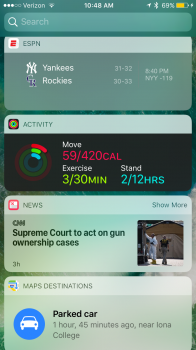
I think it's really good.

IMG_0001.PNG
 

batting1000

macrumors 604
Sep 4, 2011
7,464
1,874
Florida
If you're not on the home screen, widgets have their own pane in the Notification Center. If you're at your home screen, the widget pane isn't in NC anymore.
 

Paco II

macrumors 68020
Sep 13, 2009
2,288
706
That inconsistency is a real head scratcher to me. Having different ways to find them based on where you are is dumb.

If you're not on the home screen, widgets have their own pane in the Notification Center. If you're at your home screen, the widget pane isn't in NC anymore.
 

GreyOS

macrumors 68040
Apr 12, 2012
3,358
1,694
That inconsistency is a real head scratcher to me. Having different ways to find them based on where you are is dumb.
Yes absolutely. You can sort of see the motive- when you're on the homescreen you don't need to bring down the tray for widgets, so why show it there. But the inconsistency is more glaring and it keeps catching me out.
 

drewh

macrumors newbie
Nov 17, 2014
7
3
Yes absolutely. You can sort of see the motive- when you're on the homescreen you don't need to bring down the tray for widgets, so why show it there. But the inconsistency is more glaring and it keeps catching me out.

Are you and batting1000 talking about iOS9's implementation or the new iOS10 one? I can't see the inconsistency on iOS10 beta, its basically swipe to the left on the lock screen or first page of home screen, thats the only way to get to them... is this right?

My only worry is they limit them to the size of each of those rectangular tiles... will severely limit the widget (i.e. I used to have the Bloomberg one, or Google nearby transit that would need more horizontal space to display all the info).
 

GreyOS

macrumors 68040
Apr 12, 2012
3,358
1,694
Are you and batting1000 talking about iOS9's implementation or the new iOS10 one? I can't see the inconsistency on iOS10 beta, its basically swipe to the left on the lock screen or first page of home screen, thats the only way to get to them... is this right?

My only worry is they limit them to the size of each of those rectangular tiles... will severely limit the widget (i.e. I used to have the Bloomberg one, or Google nearby transit that would need more horizontal space to display all the info).
I'm talking about the inconsistency of the notification tray which is one case you missed. Sometimes you can swipe right to see the widgets (when notifications opened from within app) sometimes you can't (when opened on home screen)

It sort of makes sense cos on home screen you can just swipe right directly, but when you have the notification tray up already, sometimes you're a little disoriented and wonder why you can't just swipe right to see widgets, which is something you can _sometimes_ do
 

drewh

macrumors newbie
Nov 17, 2014
7
3
I reckon they thought about it and came to this conclusion - notification center should be for notifications, not also shoving widgets into it. So, you want to check notifications, swipe from the top to see the tray. They didn't want to mix widgets in with the homescreen grid (to keep that ease of use angle) so the only option was to put them on the left panel swiping to the right. That way they're always there.

I had gotten used to seeing the widgets in NC but it did seem they just shoved it in there - remember how it had three areas then they simplified it to two. Now just the one it probably should be in.
 

GreyOS

macrumors 68040
Apr 12, 2012
3,358
1,694
I reckon they thought about it and came to this conclusion - notification center should be for notifications, not also shoving widgets into it. So, you want to check notifications, swipe from the top to see the tray. They didn't want to mix widgets in with the homescreen grid (to keep that ease of use angle) so the only option was to put them on the left panel swiping to the right. That way they're always there.

I had gotten used to seeing the widgets in NC but it did seem they just shoved it in there - remember how it had three areas then they simplified it to two. Now just the one it probably should be in.
But they ARE in the notification tray, just only when you open the tray from an app(rather than on home screen). Is that something you get?
 

drewh

macrumors newbie
Nov 17, 2014
7
3
But they ARE in the notification tray, just only when you open the tray from an app(rather than on home screen). Is that something you get?

Oh.... THATS what you mean! Yeh I got the same. That is weird and not really cohesive or obvious at all - the old way then was more consistent! Hmm...... not sure how they could fix this really.. ?
 
  • Like
Reactions: GreyOS

Still100

macrumors regular
Dec 21, 2011
203
17
Question, can you access the widgets when in apps/3rd party apps?

That was a good reason to keep them in the notification centre.
 

drewh

macrumors newbie
Nov 17, 2014
7
3
Question, can you access the widgets when in apps/3rd party apps?

That was a good reason to keep them in the notification centre.

Yeh, thats where you have to swipe down for NC and then to the right to access the left pane. Only a dot at the bottom of the NC hints that there is a left pane.
 
  • Like
Reactions: Still100
Register on MacRumors! This sidebar will go away, and you'll see fewer ads.