So uh... I'm not sure if anyone else has pointed this out yet, but... I've last track of how many times people have called attention to the fact that the little cutout/notch in the APM Smart Case is not properly lined up with the lightning port. Almost all of these people comment on how "it isn't like Apple to miss a detail like this."
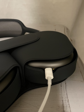
I can only assume these people hadn't yet tried charging the APM's in their case. If they had, they'd be able to see right away what's going on there. I, too, just assumed it was an oversight or crappy QA or something until I finally charged my APM's for the first time today. When you first plug the lightning cable into the APM's (whilst in their Smart Case) this is what you see:

Do you see what's going on here? The notch cutout is not misaligned. It's just cut with extra space on the right-hand side so as to keep the charging indicator light visible. I'm not saying it isn't ugly. What I am saying, though, is that this wasn't a mistake or an oversight!
I can only assume these people hadn't yet tried charging the APM's in their case. If they had, they'd be able to see right away what's going on there. I, too, just assumed it was an oversight or crappy QA or something until I finally charged my APM's for the first time today. When you first plug the lightning cable into the APM's (whilst in their Smart Case) this is what you see:

Do you see what's going on here? The notch cutout is not misaligned. It's just cut with extra space on the right-hand side so as to keep the charging indicator light visible. I'm not saying it isn't ugly. What I am saying, though, is that this wasn't a mistake or an oversight!
Last edited:

