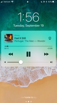
I'm normally fine and generally supportive with Apple's design changes in their iOS updates, but this one really seems like a step back. Large album art used to be something that Apple really emphasized. Remember CoverFlow? This just seems like a step back and an unnecessary change. Anyone else agree?
Got a tip for us?
Let us know
Become a MacRumors Supporter for $50/year with no ads, ability to filter front page stories, and private forums.
Album Art on Lockscreen
- Thread starter andrewtm
- Start date
- Sort by reaction score
You are using an out of date browser. It may not display this or other websites correctly.
You should upgrade or use an alternative browser.
You should upgrade or use an alternative browser.

My son and I both agree exactly with what you have said. Seems like a big step backwards with the small album art that displays. Can't figure out why they would do that. Seems like not a big issue, because no else seems to be complaining about. Wish they would make it larger again.
My son and I both agree exactly with what you have said. Seems like a big step backwards with the small album art that displays. Can't figure out why they would do that. Seems like not a big issue, because no else seems to be complaining about. Wish they would make it larger again.
I like having the volume and the playback controls right near each other, but this really defeats the point of album art.
I like having the volume and the playback controls right near each other, but this really defeats the point of album art.
If they are pushing for this notification-bubble style music controls in the lockscreen, how do you think they should have implemented the larger album art better?
I think they should have kept the big album art. Then you can tap the album art to show the title, playback controls and volume control on a transparent white background that blurs the album art, you know like when you open folders. And to see your old notifications, just swipe up like how it is now. Now this is an idea!
I liked the bigger album art on the lockscreen also but I understand why they switched it. Also since the switch to this style I wish it worked like it should more often. 90% of the time for me the bar that shows how far into the song you are doesn't work and stays stuck; therefore displaying the wrong timestamps for the song I’m listening to.
I don’t like it cuz everytime my screen lights up from raise to wake i hit the next button by mistake
I'm normally fine and generally supportive with Apple's design changes in their iOS updates, but this one really seems like a step back. Large album art used to be something that Apple really emphasized. Remember CoverFlow? This just seems like a step back and an unnecessary change. Anyone else agree?
Agree.. I like the one with "Album art" rather than this new control stuff..
Hope, Apple revert back to Album Art.
Register on MacRumors! This sidebar will go away, and you'll see fewer ads.