Become a MacRumors Supporter for $50/year with no ads, ability to filter front page stories, and private forums.
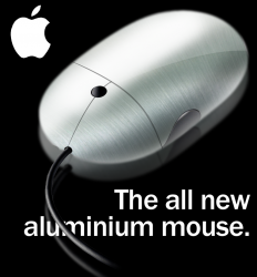
Aluminium Mouse mockup
- Thread starter Kankki
- Start date
- Sort by reaction score
You are using an out of date browser. It may not display this or other websites correctly.
You should upgrade or use an alternative browser.
You should upgrade or use an alternative browser.
And the gloss. Have you ever seen metal, brushed or matte, reflect like that?
I have!
I've got a brushed aluminium flask that's got a lacquer finish.
I have!
I've got a brushed aluminium flask that's got a lacquer finish.
I also have a similar flask.
Isn't the reflection typically inverted, like it's sitting on a piece of glass? I like the idea though.

As do I.I also have a similar flask.
Nice idea. The proportions/perspective on the lines is totally wrong though.
Yeah, I suck at perspectives, especially in Photoshop. Hell, I used the pen tool
This is none too shabby actually. I would like a mouse like that.
I would leave the lines at the buttons out though.
David
I would leave the lines at the buttons out though.
David
Apple sucks at designing mice.
corrections:
apple's mice suck.
the designs of said mice actually are quite nice.
corrections:
apple's mice suck.
the designs of said mice actually are quite nice.
Only if you say that design is just making it look pretty (which is apple's problem).
Designing should be making something that's functional and pretty.
You know when you scratch a blackboard or feel frosted glass, thats what this mouse is going to be like based on those pics, I wouldn't handle it 
Only if you say that design is just making it look pretty (which is apple's problem).
Designing should be making something that's functional and pretty.
i don't agree with you at all. the mighty mouse is a great four button mouse. some love it, some hate it- that doesn't make it a bad mouse.
Apple is due for an update of the mouse. When do you guys think Apple will put one out? For the last 10 years, they've always followed the design of the iMac, right? Why didn't we get a rmouse edesign with the aluminum iMac?
Not too bad, but I decided to get the Logitech MX Revolution mouse for my Mac Pro and the Logitech VX Nano mouse for my new MacBook coming tomorrow. They are both sweet mice IMHO.
Just for fun, let me find a complaint too! The reflection of the thumb "rest" is upside-down.
Otherwise, I say sweet mouse.
Otherwise, I say sweet mouse.
I think it looks pretty good, but like many others I would tone down the gloss finish on the mouse... Maybe try a "Mac Pro" aluminum finish (as long as we don't have to deal with the reality of dirty finger smudges). 
Oh and you might want to see if having the text over the mouse cord looks better...
 Hmm maybe there should be a "Post your flask" thread...
Oh and you might want to see if having the text over the mouse cord looks better...
But whether the flask has good taste depends on the contents.That's because you have good taste!xUKHCx said:I also have a similar flask.
Register on MacRumors! This sidebar will go away, and you'll see fewer ads.


