Become a MacRumors Supporter for $50/year with no ads, ability to filter front page stories, and private forums.

mebehere

macrumors 65816
Original poster
Sep 21, 2012
1,104
1,120
First of all, I’m just a public beta guy who tried this out on my iPad.

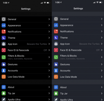
I realize that among the dark apps, there are some dark gray elements for contrast. But some of them are just too black if you ask me. Especially with the calendar. It’s pure black and, well, I don’t like it.

I have YouTube set to dark mode, and it’s very pleasing as a dark gray.

It would be nice to have a darkness slider so that apps aren’t pure black. I realize this won’t happen as it’s ios, but I think it’d be nice.

Pure black in any app is too much if you ask me.
 
The public: complains about not having a dark mode.
Apple: adds a dark mode.
The public: complains about dark mode.
Guess nobody can be happy.

Seriously though, I was a person who preferred dark grey dark modes but after using the iOS one since iOS 13 entered beta, I've grown to prefer pure black to dark grey. But I can understand the other perspective of people who prefer the dark grey look, and I do agree, Apple should add a toggle for pure black or just a dark grey, then everyone can be happy.
 
You are not!

The 'Apollo' app has a choice between grey and black and the grey is so much better.

I wish iOS had this... I find the pure black dark mode to be completely unusable. Maybe they'll get around to adding this in a couple of more years...
 

Attachments

  • apollo_dark.png
    apollo_dark.png
    649 KB · Views: 620
Dark grey would use more battery because the pixels would have to be lit up... Dark black turns off the pixels to give it a real deep black feel, that you can only experience on a oled screen.
 
  • Like
Reactions: Freakonomics101
Couple thoughts -

-Dark gray would be nice, but OLED panels - including Apple's - can have some seriously bad banding issues on dark gray screens at low brightness, so you might be glad the dark mode is more black focused.

-That said, I think true black dark mode with high brightness on an OLED screen results in some nasty contrast that is hard to look at, plays with your eyes weird. Low brightness is fine though.

-I also think blacks on OLED screens are less than pleasing to look at in bright sun, because you're literally looking at a screen that is mostly off, which makes it seem like you're looking for dust under the glass or something. The deep blacks look good indoors, but out in the sun, not so much.
 
You’d see the dirty screen effect with a grey background more. Imagine the amount of threads on here would be unbearable. (Google if you don’t know what that is)
 
No way. I mean if people want it, wouldn’t be bad to have the option but I upgraded to OLED for this very reason. It’s easier on my eyes to read at night and even during the day. The constant whiteness drove me bonkers.

Gotta keep in mind that having every single pixel lit up all the time with the OLED would not be as energy efficient. It would be a marginal difference but would put more stress on the display.
 
I agree. There will be OLED users that want the extra battery but for everyone else we should have the option of usability with a non-blinding look (or cool look if you feel like that). Pixelmator make a totally black app on macOS and I find it very hard to navigate due to the almost invisible boundaries and UI pointers. They should all take a look at FCPX to see how Apple does a good dark interface.
 
Black smearing on OLED screens at low brightness is so bad I don't understand how does this pass quality control. To be honest I don't understand how people don't complain about this. I know it happens on all OLED screens across other manufacturers as well. But is bad, really bad. I use dark mode and I tend to prefer full dark but dar grey should be much better because of this. An power consumption should not be that affected because grey also consumes less energy than white.
 
You’d see the dirty screen effect with a grey background more. Imagine the amount of threads on here would be unbearable. (Google if you don’t know what that is)
iOS 13 dark mode in Mail uses a full screen grey background when viewing an email. It’s very clean with no banding or dirty screen effect FYI.
 
(Off-topic)

I think the Apple implementation of dark mode needs more contrast.

There's an easy way that I use and reccomend.

Go to Settings > Accessibility > Display & Text Size > Turn on "Increase contrast".
 
I don't think the predominantly black UI of the dark mode looks particularly bad. That might just be because I am a fan of the inky blacks on an OLED screen though. There are some usability downsides to the current dark theme:
  • As others have pointed out, the screen is very hard to read in bright sun when dark mode is active. The mostly dark theme turns the phone into essentially a mirror. Apple could combat this by adding an anti-reflective coating to the iPhone screen like what is found on the iPad Pro line.
  • The Maps app is simply too dark. It's hard to read in dark mode under even normal lighting. The map has much more variation in color and tone in light mode for some reason.
  • The smearing effect that results from the delay in a pixel turning on from black is not pretty. Having a dark grey theme would fix this one.
I've ended up setting a schedule for light mode during the day and dark mode after sunset. It's a shame because I really like the way apps like Messages and Photos look in dark mode. But Maps is almost unusable in dark mode during the day and light mode in other apps does a much better job of combating reflections in bright lighting.
 
  • Like
Reactions: dustin.haley
Dark grey is better than black when you are in normal lighting. Black is better when you are in a legitimately dark environment. Dark grey looks way too bright when your in a pitch black room.

Apple is effectively saying that this mode is for when you’re in dark environments, not because you just prefer the look of dark apps and want to use them all the time.

I think Apple reluctantly made a dark mode, so they made a true black mode to force people into scheduling it with sunset.
 
Register on MacRumors! This sidebar will go away, and you'll see fewer ads.