Become a MacRumors Supporter for $50/year with no ads, ability to filter front page stories, and private forums.

LERsince1991

macrumors 65816
Original poster
Jul 24, 2008
1,245
37
UK
Just thought I'd post a logo I designed for my future company.
Just wondering what some of you more experienced and talented people think of it really, any constructive criticism is welcome!

Thanks in advance.
 

Attachments

  • LR - Luke Riggall Design & Architecture - Three.jpg
    LR - Luke Riggall Design & Architecture - Three.jpg
    53.3 KB · Views: 160
  • LR - Luke Riggall Design & Architecture - Two - Hi Res.jpg
    LR - Luke Riggall Design & Architecture - Two - Hi Res.jpg
    65.7 KB · Views: 131
I think the "R" takes all the attention away from the rest of the logo. It should be less conspicuous. The "design and" should be on the left, IMO.
 
I agree with the above poster. The LR needs to be much less prominent.

Also, I can't say I'm a fan of the courier typeface in this logo. It just doesn't match and frankly, it isn't noticeable at all.

Here's a suggestion - kill the backgrounds. Start by designing it as simply as possible. Black on white. This will allow you to develop the initial shape and better explore how the characters interact and figure out a more appropriate typeface to go along with it.

Finally, the curve of the upper part of the R looks slightly handtooled and amateurish. I'd suggest using a font such as Avant Garde or Century Gothic or Myriad and chopping that rather than attempting to draw it with bezier curves.

Despite my criticism, I think you're off to a pretty good start. And I actually dig the background of your second image. I just don't think it's appropriate as a part of the logo.
 
As a consumer I wouild see the big R and then squint to see the 'Design & Architecture'

then I would laugh at the design part and walk away…

Now you need to make the LR smaller and increase the contrast between the words and the background.
 
Updated

Thanks to all three of you for your very quick response!
These pictures were actually done ages ago on Corel Paint Shop Pro...
The Letters were hand draw so the R does look a bit uneven.
This next updated logo design was done on Adobe Photoshop CS3
I have taken your advice and used lettering as the basis for the LR and cut parts out.
I changed the shape of the LR slightly about 4 times and believe this new one is much improved, it seems to flow better.
Also i stopped messing around with the backgrounds :cool:
Just did a slight shading with the paintbrush to it wasn't just plain white.
Oh and i changed the font on the text to Bauhaus Std Light

Also I am only 17 and just started using the Adobe CS3 so this is all good learning for me. The forum is actually a very good resource, mixing a big mix of people from students & amateurs with professionals and experts. :cool:

Well take a look. :apple:
 

Attachments

  • LR - Professional - Stage One copy.png
    LR - Professional - Stage One copy.png
    157.8 KB · Views: 141
Well take a look. :apple:

This is looking MUCH nicer. The text underneath is a little close to the logo, and I don't particularly care for Bauhaus– like Avant Garde, it summons a particular period in time, one that isn't working for you, IMO. But a thin sans serif is the way to go, for sure. Also consider going all lowercase– it gives an air of modernism.
 
I don't seem to have Sans Serif for some strange reason.
I could have sworn I've seen it around here somewhere.
Well I used Serifa :rolleyes: maybe its in a different language.


Got rid of the capital letters, It seems more simple without them.
Chose a few simple fonts, some more sharp 'in your face' style than others.
I'm still not sure about the fonts though.

Thanks again.
 

Attachments

  • LR - Professional - Stage Two copy.png
    LR - Professional - Stage Two copy.png
    157.5 KB · Views: 111
  • LR - Professional - Stage Four copy.png
    LR - Professional - Stage Four copy.png
    158.9 KB · Views: 139
  • LR - Professional - Stage Three copy.png
    LR - Professional - Stage Three copy.png
    157.4 KB · Views: 106
Try making the "RL" shorter and squatter and thicken the lines, then put the "design & architecture" to the right of it. Maybe make "design &" bigger than "architecture" so it's the same width.
 
Looking a bit more like a logo now! :)

One has been aligned the other hasn't.
I can never decide what I like the most.
Thanks again for the very fast feedback! :cool:
Click the images to make them larger to get the full effect.
 

Attachments

  • LR - Professional - Stage Six copy.png
    LR - Professional - Stage Six copy.png
    140.3 KB · Views: 131
  • LR - Professional - Stage Seven copy.png
    LR - Professional - Stage Seven copy.png
    140.5 KB · Views: 116
I'm not a fan of the font but between those two the one on the left is way better, no contest.
 
Looking a bit more like a logo now! :)

One has been aligned the other hasn't.
I can never decide what I like the most.
Thanks again for the very fast feedback! :cool:
Click the images to make them larger to get the full effect.

I wouldn't just adjust the tracking between the letters in "design &" but actually increase the point size to make the widths consistent. There's too much space between the letters now and it looks off.
 
The "RL" object is not really working; these letters do not naturally work well together, and are not very interesting in terms of the juxtaposition of the letter forms.
(In particular, the vertical stroke of the "L" in front of the loop in the "R" is unfortunate)

I think I would choose a more staid font (Goudy Old Style is nice) and utilize the ampersand as the main visual hook.(for example, dramatically enlarge the ampersand and use a different color)
I think I would also choose to spell out the name rather than using the initials.

ie:
L. Riggall
Architecture & Design
 
Well I've been playing around with the final touches to the layout (which I'm not good at) and decided that I'm happy with this.

Changed the separation of the letters back to 0 as it looked bad and have changed font sizes.

I have included a picture with the Goudy Old Style like 'Snickelfritz' suggested... I have to say its not bad, although I am going for a very modern look the old style font doesn't look as bad as i thought, it sort of looks more 'professional' with that font. I'm not good at these finishing touches as i can never decide when to stop but I believe these are near.

I'm not good with all the technical phrases used by 'Snickelfritz' mainly because I haven't learned any computer skills at any school, course or Uni. Only yesterday thought myself to use Adobe Photoshop CS3 as i was using Corel Paint Shop Pro Photo X2. I found the Adobe products hard to catch onto but when i did everything fell into place really. Still only a basic level of understanding though.

This is a very good learning curve for me as I would not have otherwise learnt to use these programs. Even at Uni I would only be using architecture software so this is very handy.

I guess it can still be improved but its came a long way so far in... less than a day? :rolleyes:

Cheers
 

Attachments

  • LR - Professional - Stage Ten copy.png
    LR - Professional - Stage Ten copy.png
    143.3 KB · Views: 120
  • LR - Professional - Assortment copy.png
    LR - Professional - Assortment copy.png
    260.2 KB · Views: 112
  • LR - Professional - Stage Eleven copy.png
    LR - Professional - Stage Eleven copy.png
    141.4 KB · Views: 122
If you have the full adobe kit, you should be doing this in Illustrator, not Photoshop.

Also, if you are going for modern, that typeface has the opposite effect. It looks dated.
 
I think the RL needs to be seperated a bit, made squarer or made using a more block like text.

Looking at it on my iPhone the shape just looks messy and needs to be a bit more uniform.
 
Fit the LR in a longitudinal rectangular box, glazed silver with gradient on the left! On the right side of the rectangle fit in boxes as in the second image in first post! Reduce the box size moderately and fit 1 word in one box!
 
Two thoughts

A logo has to effectively communicate a message. If the viewer can't make out the character object, what are they going to remember? Where are they going to start looking online or in the phone book, or ask their friends? What was the name of that firm? Blob design? BR, LR, RR, >>???

A design and architecture firm has a visual premium on the design of the logo - the fonts, layout, colour, aesthetics (cool modern, classic, whatever), and how well it works at all distances and all print/display media. It is your first impression to the customer of how well THEIR visuals will turn out when they hire you.

So far, I would never give any business to a design firm with a dorky looking logo like this. Sorry, blunt -- but the samples are showing a huge lack of visual coherence and understanding of how type works. If this is a real company, we are talking about risking losing tens and hundreds of thousands of dollars in work. Hire a real graphic designer. This is fundamental. If it is a professional firm, then hire professionals.

You wouldn't hire an unlicensed electrician to wire a house without permits, or trust Joe's kid brother to determine the right concrete mix for the foundation, or use scrap iron instead of rebar in the walls. Don't cheap out on your company's public image.
 
I agree with many of the above posts. Firstly, I don't much care for the font you use. A simple, elegant, classy font (Garamond, Verdana, or Arno, for example) which is clear, uncluttered, and above all, legible should be your starting point. To my eye, the "modern" look does not work at all on this logo. It is "trying" too hard, and is simply not succeeding.

I agree also with CanadaRam; both about how the logo has to effectively communicate the message of the firm and about how absolutely vital it is for firms which sell themselves on their visual appeal and design capabilities to get this completely right. This is what you are supposed to sell, and this is what customers will see as your end product. If you can't design a visually appealing and attractive logo for yourself - and your task is design in architecture - how on earth will a customer be persuaded that you can do a decent job for them?

What are regarded as architectural classics tend to have clean lines, an attractive visual aesthetic, and usually some form of contemporary relevance regarding form and function, and possibly also in the materials used. Your logo must indicate that this is what you would be able to design and at present, it doesn't.
Good luck with it.
 
Thanks to everyone that's taken the time to look and share their thoughts.
This was just a little project to get used to some software, a bit of experience and fun.
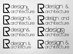
I'm not so good at graphics design compared to architecture, product or fashion.
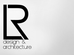
LR design & architecture is just some made up company that I may start in the future. I mean I'm going to uni to study architecture for 7 years then I would like to carry on at uni as part time as I work as an architect and do a product design course, then do add products to my portfolio. After a while when i get bored (I get bored with anything and need a challenge, this wont be different) I will do a fashion design course at uni. Basically I would like to have a high level of understanding and ability in most areas of design. My graphics design isn't that good but I have the software from my school and would like to teach myself.

Id say i have learnt quite a bit in a day but it wont stop.
This thread actually attracted a bit more attention than I thought but its good to see what real designers in the real world would think.

and as for the...
You wouldn't hire an unlicensed electrician to wire a house without permits
My family had an extension on the house adding 50% to the size and I helped design it, I wired the electrics in the 'media room', turned out well :p
I redecorated my room when my parents were out, took me a week and everyone's pleased with the finish, another skill to add to my collection.

It's just about getting an understanding and developing my skills in any area of design and technology... I enjoy a challenge and learning new things.
:)
 
G@wd help your family if the house ever burns down, because the insurance company won't if they knew this...

Building codes and licenses exist for a reason.

LOL Ya... The electrician didn't exactly leave it to me, he fully checked it and everything, just helping out and getting a bit of experience.

Anyway I didn't think this was that bad :p, certainly came a long way from what it was. Its not like I've done a 5 year course at uni and had 15 years work experience as a graphics designer is it...
 

Attachments

  • LR - Professional - Stage Fourteen copy - no background.png
    LR - Professional - Stage Fourteen copy - no background.png
    139.8 KB · Views: 112
  • LR - Professional - Stage Fourteen copy.png
    LR - Professional - Stage Fourteen copy.png
    159.4 KB · Views: 119
  • LR - Professional - Stage Fourteen - All In.png
    LR - Professional - Stage Fourteen - All In.png
    207.9 KB · Views: 136
I like the second one way better than the third and the first!

But did you consider my previous comment! Any thoughts?
 
I like the second one way better than the third and the first!

But did you consider my previous comment! Any thoughts?

Fit the LR in a longitudinal rectangular box, glazed silver with gradient on the left! On the right side of the rectangle fit in boxes as in the second image in first post! Reduce the box size moderately and fit 1 word in one box!

I did read it but just didn't really 'get it', I'm pretty new to graphics design so I'm not that good on my software for now.
What did you mean by 'glazed silver',


I think i get it I'll give it a go! correct me if its not what you were thinking.
Cheers
 
Sort of like this?...
Sorry if its completely wrong :p
 

Attachments

  • Banner One copy.png
    Banner One copy.png
    101.6 KB · Views: 95
  • Banner Two copy.png
    Banner Two copy.png
    104.1 KB · Views: 100
  • Banner Three copy.png
    Banner Three copy.png
    105.5 KB · Views: 97
Register on MacRumors! This sidebar will go away, and you'll see fewer ads.