I've been updating the beta APK's as they drop from Google and 3rd party app developers and other than a few little odds and ends in some apps, the material design formula is being followed to a tee. Just today I downloaded Google camera, wallet, google+, drive, and a few other 3rd party apps like Today Calendar. Take a look.
Got a tip for us?
Let us know
Become a MacRumors Supporter for $50/year with no ads, ability to filter front page stories, and private forums.
Android 5.0 Lollipop Material Design taking shape in all Google Apps
- Thread starter Lloydbm41
- Start date
- Sort by reaction score
You are using an out of date browser. It may not display this or other websites correctly.
You should upgrade or use an alternative browser.
You should upgrade or use an alternative browser.
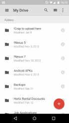
I downloaded all of those as well including Docs, sheets and Google Play Games. I must say, it's quite impressive.
I've been updating the beta APK's as they drop from Google and 3rd party app developers and other than a few little odds and ends in some apps, the material design formula is being followed to a tee. Just today I downloaded Google camera, wallet, google+, drive, and a few other 3rd party apps like Today Calendar. Take a look.
Your face isn't as blue in real life, I see.
Just kidding. It looks fantastic.
Your face isn't as blue in real life, I see.
Just kidding. It looks fantastic.
That is my virtual babe 'Cortana' from the Halo game (if you didn't know?)
I felt it fit since I'm one of the few Windows Phone fanboi's on this forum.
")
Ughh, it's awful and I'm really not looking forward to Lollipop. My main gripe is why is everything so freaking white. It's like Google devs live in some alternate reality where darkness doesn't exist.
That is my virtual babe 'Cortana' from the Halo game (if you didn't know?)
I felt it fit since I'm one of the few Windows Phone fanboi's on this forum.
I did, but I have never keep track of usernames. I was confused as heck when Huntn replaced his.
Ughh, it's awful and I'm really not looking forward to Lollipop. My main gripe is why is everything so freaking white. It's like Google devs live in some alternate reality where darkness doesn't exist.
I do agree with your sentiment that there is to much white backgrounding. WP is the opposite with all black. Not sure what would look better though? Maybe an off-white of some kind? All I know is, at night I have to turn the brightness all the way down on my Nexus 5 running Lollipop, cause it lights up the whole room.
I do agree with your sentiment that there is to much white backgrounding. WP is the opposite with all black. Not sure what would look better though? Maybe an off-white of some kind? All I know is, at night I have to turn the brightness all the way down on my Nexus 5 running Lollipop, cause it lights up the whole room.
I don't understand that. Using these things at night time singes the eyes with all the whiteness... especially when it's white on light-grey.
At least with the iPhone, you can set triple-click home button to 'invert colors' -- which looks funny, but when reading a white web page, it feels a ton better on the eyes.
I like that WP is darker, although I'm not sure there's any way to invert the colors of the background to be dark. This is one of the most important factors keeping me on Apple at the moment.
The ultimate solution is how regular windows handles it, which translates to their tablets. Inverted mode inverts everything which is nice at night, but it does not invert graphics which is awesome for web pages. This is such a BASIC thing that I'm always incredibly surprised none of the phone OS makers are implementing it. Makes me want to strangle the devs/engineers.
It's funny that two years ago when I first got into Android I thought the exact opposite: why all the darkness??? (Coming from an iPhone.)Ughh, it's awful and I'm really not looking forward to Lollipop. My main gripe is why is everything so freaking white. It's like Google devs live in some alternate reality where darkness doesn't exist.
Before my current Note 4, I was using a Note 2 with a custom KitKat rom that has a "total blackout" mode which I really grew to like (LiquidSmooth rom).
And now with my Note 4 I am like, what is with all the white??
Michael
It's funny that two years ago when I first got into Android I thought the exact opposite: why all the darkness??? (Coming from an iPhone.)
Before my current Note 4, I was using a Note 2 with a custom KitKat rom that has a "total blackout" mode which I really grew to like (LiquidSmooth rom).
And now with my Note 4 I am like, what is with all the white??
Michael
I can't decide either way. I didn't love a lot of the interface from KitKat and the white is somewhat refreshing, but I can see where it will be overwhelming.
Whiteness is probably a trick to make you lower brightness and extend battery life. A cheap way of claiming fantastic battery life.
Whiteness is probably a trick to make you lower brightness and extend battery life. cheap way of claiming fantastic battery life.
AMOLED uses more power on white screens, so that theory doesn't hold up.
Mike
I do agree with your sentiment that there is to much white backgrounding. WP is the opposite with all black. Not sure what would look better though? Maybe an off-white of some kind? All I know is, at night I have to turn the brightness all the way down on my Nexus 5 running Lollipop, cause it lights up the whole room.
Is there no option in some areas of it to change the color like you can on some apps? For instance, i use Tweetcastor and i can use a white background, or gray or black.
Is there no option in some areas of it to change the color like you can on some apps? For instance, i use Tweetcastor and i can use a white background, or gray or black.
Few and far between, but yes there are a few apps. TV Show Favs, plex, FX File Explorer are a few that can change background to dark.
Having an amoled screen is leaving me somewhat nervous for all the white.
I didn't even think about that until your post. You have a very valid concern. Glad none of my phones use OLED!
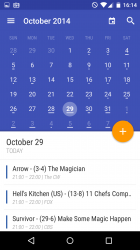
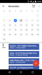
Calendar 5.0 updated. Looks better than it did, but still not as intuitive as the 'Today Calendar' app or iOS's Calendar.
I'll use it on my Nexus 7 but I'll continue to use S-calender on my phone as it allows for a full screen widget (month view) . It's better than the iOS calender imo.
Will the Google Play Now launcher be updated to a lollipop aesthetic (for it's app drawer and animations etc) ?
It should be. Other 3rd party launchers have already updated.Will the Google Play Now launcher be updated to a lollipop aesthetic (for it's app drawer and animations etc) ?
Register on MacRumors! This sidebar will go away, and you'll see fewer ads.