Got a tip for us?
Let us know
Become a MacRumors Supporter for $50/year with no ads, ability to filter front page stories, and private forums.
(another) logo critique/comment thread
- Thread starter booth22
- Start date
- Sort by reaction score
You are using an out of date browser. It may not display this or other websites correctly.
You should upgrade or use an alternative browser.
You should upgrade or use an alternative browser.
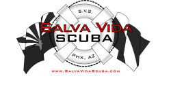
For me they are too busy. It is hard to see the name. I go right to scuba, but I am sure there are more scuba shops in AZ.
I agree, too busy.
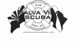
If I was you - see those four little holder things? They're going round the safety ring?
I'd consider putting a snippet of the flags in each of those, and lose the flags on either side compeltely.
I feel this will give the design a more round feel, while not losing your meaning.
R-Fly
If I was you - see those four little holder things? They're going round the safety ring?
I'd consider putting a snippet of the flags in each of those, and lose the flags on either side compeltely.
I feel this will give the design a more round feel, while not losing your meaning.
R-Fly
I agree, too busy.
If I was you - see those four little holder things? They're going round the safety ring?
I'd consider putting a snippet of the flags in each of those, and lose the flags on either side compeltely.
I feel this will give the design a more round feel, while not losing your meaning.
R-Fly
Agreed - a good idea if I ever heard one - OP - your design is far to busy - sorry and it doesn't work in B/W - an important test me thinks unless the company is called "ALVA VI SCUBA"
Attachments
Agree..too busy. Also the main text is hard to read. Consider a white stroke on the lettering to get it to pop.
Got to say I agree with the others, it's too hard to read the 'Salva Vida'. I do like the feel of it though ")
I agree, too busy.
If I was you - see those four little holder things? They're going round the safety ring?
I'd consider putting a snippet of the flags in each of those, and lose the flags on either side compeltely.
I feel this will give the design a more round feel, while not losing your meaning.
R-Fly
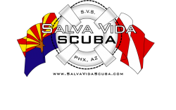
I thought about something like that, but I can't seems to get flags incorporated into such a small space with out confusing the identity of the flags.....
Perhaps white text with a black outline would look better in B/W?
They are way too busy and the font choice is incorrect.
Keep it simple, that is the best advice I can give. Most people make the mistake by trying to put too much into the logo and they end up looking dated, unprofessional and like a dog's breakfast.
Work out what the logo is trying to say then go from there.
Keep it simple, that is the best advice I can give. Most people make the mistake by trying to put too much into the logo and they end up looking dated, unprofessional and like a dog's breakfast.
Work out what the logo is trying to say then go from there.
I thought about something like that, but I can't seems to get flags incorporated into such a small space with out confusing the identity of the flags.....
Perhaps white text with a black outline would look better in B/W?
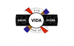
I've had a rough go at implementing the flag idea.
See what you think.
Attachments
Register on MacRumors! This sidebar will go away, and you'll see fewer ads.