Become a MacRumors Supporter for $50/year with no ads, ability to filter front page stories, and private forums.

AndrewLyle

macrumors member
Original poster
Dec 6, 2008
63
0
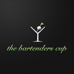
So ive been commissioned to do a logo for a golf tournament for bartenders... here are some of my initial designs. (as in all were done today). any thoughts? am i headed in the right direction?

TBCOrange.jpg


TBCCoaster.jpg


TBCLime.jpg


TBCLimebottle.jpg


TBCMartini.jpg
 
I think the orange peel idea is going somewhere.

Have you thought about applying a golf ball texture to the outside...then trying to recreate it in vector form?

I look forward to seeing what you do.
 
While I like your concepts - they're really pretty solid - I feel as though your execution could use a little work. I'm assuming this logo is going to be printed? How is it going to reproduce when photocopied? When faxed? How about enlarged onto signage? How will it read from a distance?

There lies the danger of using photorealistic elements in logos. They tend to fall apart when resized and photocopied and enlarged. Most logos you see will use an abstraction of an element. Apple doesn't use a photograph of an apple for their logo.

Here's what I suggest - redraw some bolder abstracted vector versions of the orange peel, limes, and other elements.

Secondly, revisit your typography. Think about how the logo will read from a distance. Or shrunk down. It needs to be a bit bolder and more legible.
 
I don't see any relevance with the orange peel logo, I think that you need to work out what the logo is going to be used for printing, web and do your concepts in black until you finalise the design.
 
I think the golfball in the Martini glass has real possibilities, it mixes not shakes the concept of golf and bar tending.

IMHO a stylised 1930's Martini glass illustration with a the dimples of a golf would work, or the glass with a golfball as the olive. I would also work on the typography, personally I would be using either Futura BK (Century Gothic is also close), Didot or Bodoni because it would lift the purpose and message.

Overall the best advise I can give is "keep it simple" and "photos make bad logos".

Awesome idea. Would love to see you do this one up!
 
I like the image in the third or the last one.
Font will probably need to be changed.
 
ezekielrage_99, that is a lovely design, my initial idea was to use the golf ball as an olive but frankly im not very good at illustrator. I feel very comfortable in the pixel world of photoshop, but i have trouble translating what i know to vector art.

Im going to try and re-interprete your design if you don't mind.

No problem, this was a quicky that I put together with the draw tool in Photoshop just to "illustrate" the concept.

But feel free to use the concept.
 
wow, just wow...

anyone here actually start out their logos with pen and paper rather than the computer?
 
The quality is very poor in many of them. It seems as you just used a brush in photoshop to get curved lines. I'm not sure what printer would print those as they are without making changes.
 
The quality is very poor in many of them. It seems as you just used a brush in photoshop to get curved lines. I'm not sure what printer would print those as they are without making changes.

those were just his mockups... as stated originally and later in this thread... Yes.. i would have done them with pen and pencil and not computer until i had a solid vision, but everyone works their own way...

2/3 here as well... like the latest suggestion/mockup!
 
Register on MacRumors! This sidebar will go away, and you'll see fewer ads.