Got a tip for us?
Let us know
Become a MacRumors Supporter for $50/year with no ads, ability to filter front page stories, and private forums.
Any new love for the Dynamic Island ?
- Thread starter GC251114
- Start date
- Sort by reaction score
You are using an out of date browser. It may not display this or other websites correctly.
You should upgrade or use an alternative browser.
You should upgrade or use an alternative browser.
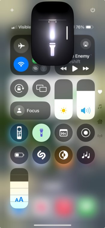
uhh the notification center is so uglyNew flashlight animation. Can also adjust the brightness right there too. Swiping to the left and right makes the light more wide/narrow?
View attachment 2387065
That's the control centre.uhh the notification center is so ugly
I might be wrong - but I do not think they said the words ‘Dynamic Island’ once during the entire presentation.As the title says really.
Any new behaviour/love for the Dynamic Island in B1 ?
Maybe messages and/or email come down from there ?
Cheers
Getting 3D Touch vibes…
I think they realize how outmoded the "Dynamic Island" (aka gigantic notch) looks compared to the tiny almost invisible holepunches in Samsung phones. Almost as bad as the huge chin and forehead of the iPhone 8 era design in comparison to the iPhone X.
I might be wrong - but I do not think they said the words ‘Dynamic Island’ once during the entire presentation.
Getting 3D Touch vibes…
Slowly fazing it out in preparation for an all screen phone. I think they just needed it to sell iPhone 14 Pro's.... master marketing that was. The keynote made it seem so much cooler than it turned out to be.
Slowly fazing it out in preparation for an all screen phone. I think they just needed it to sell iPhone 14 Pro's.... master marketing that was. The keynote made it seem so much cooler than it turned out to be.
Hopefully the huge notch on the phones and their laptops go away ASAP. It's ridiculous. The only thing cool about the "Dynamic Island" is Apple's talent in selling their lazy engineering as a feature.
I'm 90% Android (phone) guy but have an IP15 for when I get bored...and one of my favorite things on it is the Island, does a bunch of cool stuff, is well executed etc. Kinda surprised no Androids copied it even with little pinhole camera cutouts as the starting point...
Register on MacRumors! This sidebar will go away, and you'll see fewer ads.


