Got a tip for us?
Let us know
Become a MacRumors Supporter for $50/year with no ads, ability to filter front page stories, and private forums.
any thoughts
- Thread starter switters00
- Start date
- Sort by reaction score
You are using an out of date browser. It may not display this or other websites correctly.
You should upgrade or use an alternative browser.
You should upgrade or use an alternative browser.


The poster is too disjointed and the text hard to read. You need some unifying factor. Text needs to be places horizontally and font size increased. The blue toning is overused and too dark. The B&W sky does not fit.
...you asked
...you asked
The Logo type is fine...though a little uninspiring, it works. The poster on the other hand is kind of a cluster ****. I mean, what is the purpose of the zig zags, and the blue? What is the b&w sky for? Think simpler. Posters should be easy to read and understand from quite a ways away. I can barely read some of that type when i'm looking at it this close.
You advertising an Egyptian museum, but your layout doesn't tell me that at all. The visuals should compliment the text, and visa versa. I'm not saying throw pyramids and slab-serif text all over it. But think about egyptian and go from there? Look at egyptian artwork. A lot of it is very interesting, and very could be very modern. You could even do a stylized hieroglyphic for the poster. i don't know...i'm just talking now.
-JE
I have to agree with what has been said so far, and add a couple of observations. It's not terrible, but there is room for improvement.
I see what you tried to do with the heiroglyphs in the upper righthand corner, but they are hidden by color. They blend into the background, and seem a little out of place. Maybe incorporate them some other way (transparent overlay?).
As far as the text, "The GEM (Grand Egyptian Museum)" could maybe be shortened to just "Grand Egyptian Museum," since you already are using the GEM acronym very near that text. The rest of the text is too uncomfortable to read, and needs to be worked out differently.
Also, is the photo used a rendering of the future museum? It's really hard to see what it is. My suggestions would be to tone down the color saturation on the bottom blue area, for starters, and do something with the sky. A good method to see how readable your poster will be is to look at the whole thing in grayscale mode. This will show what will pop and what will fade into the background.
Hope this helps, and good luck!
I would tend to also agree with what has been said. The logo works and it's a good start, but I too feel that it does not really convey or represent Egyptian art or history.
Without going too cliche I would also advise that you do some looking around on the net at Egyption type art and sculptures (as one of the posters above also advised). This should help to give you some inspiration as a starting point.
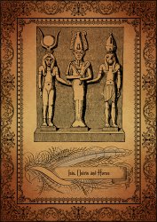
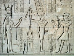
I did a quick search and attached a few images that I thought were visually or graphically interesting in terms of inspiration etc.
The Egyptians were well known for their detail and artistry so perhaps that is something you could build upon, without it being too busy...simple as noted above, is best.
Without going too cliche I would also advise that you do some looking around on the net at Egyption type art and sculptures (as one of the posters above also advised). This should help to give you some inspiration as a starting point.
I did a quick search and attached a few images that I thought were visually or graphically interesting in terms of inspiration etc.
The Egyptians were well known for their detail and artistry so perhaps that is something you could build upon, without it being too busy...simple as noted above, is best.
Attachments


What is the reason for the continued 'tick' shapes. They make it seem disjointed in my view.
The split blue imagery at the bottom is just looking wrong.
Can you see the pyramids from its location, if yes may be worth incorporating a pyramid style design into it.
The split blue imagery at the bottom is just looking wrong.
Can you see the pyramids from its location, if yes may be worth incorporating a pyramid style design into it.
What is the reason for the continued 'tick' shapes. They make it seem disjointed in my view.
The split blue imagery at the bottom is just looking wrong.
Can you see the pyramids from its location, if yes may be worth incorporating a pyramid style design into it.
I think the "tick" shapes are the shape of the building itself, no?
I really enjoy the hieroglyphs that you stuck in there. Very nice to be able to see more of them. The first poster I didn't even recognize them there. It's getting there! Lot's easier to read now too.
Are the three round circle shapes up top the pyramids? If so, how might they look as squares?

Register on MacRumors! This sidebar will go away, and you'll see fewer ads.