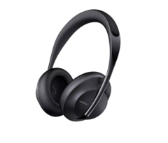
Not keen on the design, look like a big step back from the current QC’s.
Earcups look fine, but the headband looks thin, and this will impact comfort and fragility. Headband adjustment externally (down the stems) seems like a downgrade on internally. I imagine they’ll also look dated fast. Current ones just look like cans, timeless, classic.
The cups rotate, but the whole thing doesn’t fold, meaning a bigger case.
Same battery life as current QC’s.
Touch controls - matter of opinion, but I much prefer buttons. You can’t see what you’re doing, so buttons are better imo for their tactility.
Seem like a lot of compromises to make them more “fashionable” to me. Of all the things the QC35 needed changing, the physical design wasn’t it. A spin on the current design, more HD codecs, better battery life and better NC to match the XM3’s is what I’d have hoped for.
Disappointing, but lets wait for reviews.
I’ve the QC35 II and the XM3’s. They’re both great, the Sony’s (to my ears) having marginally better sound and significantly better NC.
Of the two, I actually prefer the Bose due to the simultaneous BT connection, and I like physical buttons like I’ve said. Using them with iPhone and iPad is a pretty delightful experience due to the simultaneous BT connection. The XM3s don’t handle multiple connections well, but maaaan the NC is brilliant.


