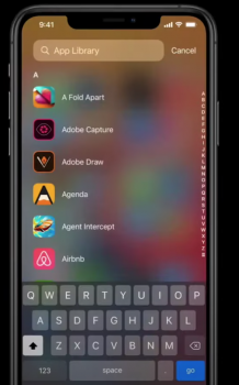
So far i think the App Library feels messy. I am not a big fan of the cluster of App icons everywhere, and i think there should be an option to hide the App Category Folders and go straight to List mode. What do you guys think?
Got a tip for us?
Let us know
Become a MacRumors Supporter for $50/year with no ads, ability to filter front page stories, and private forums.
App Library Thoughts
- Thread starter hawaiipoolman
- Start date
- Sort by reaction score
You are using an out of date browser. It may not display this or other websites correctly.
You should upgrade or use an alternative browser.
You should upgrade or use an alternative browser.
If anything, I think it removes the cluster. I have multiple pages of apps and sometimes it takes me ages to get (without searching) to the app I need. The library is just a swipe away. As for your suggestion, you would end up with a never-ending list of apps. You could still do it anyway if you just use the search field. Personally I do like the app library.
I agree. Or at least include the list on the top half of the screen as a separate scrollable box.So far i think the App Library feels messy. I am not a big fan of the cluster of App icons everywhere, and i think there should be an option to hide the App Category Folders and go straight to List mode. What do you guys think?
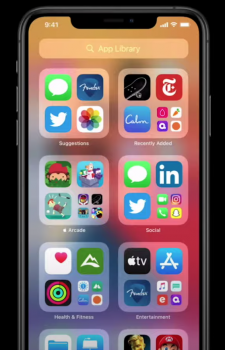
I like it so far, I got rid of my folders/pages and now just have my main page and the app library to the right - feels clean to me.
I do that too (one row of apps on the bottom of screen 1, and widgets covering the rest of screen 1). But i prefer search to launch apps, so the app library isn’t luring me to screen 2 yet.I like it so far, I got rid of my folders/pages and now just have my main page and the app library to the right - feels clean to me.
It’s pretty redundant for me as I have always had the most frequently used apps on the first page and folders with apps I don’t use as often already categorized as folders in the same way it does with the App library. At least doing it myself, I know where each app is. I don’t need Apple to do that for me. I just end up checking all the sections for the app??? Don’t get the advantage over folders besides the first two on top🤷🏽♂️
(Instagram is on the second page so I don’t use it as often by not seeing it IN MY FACE on the first page all the time. - Addicted)
(Instagram is on the second page so I don’t use it as often by not seeing it IN MY FACE on the first page all the time. - Addicted)
Attachments
Last edited:
Somewhat annoying it is all the way to the right. Is there a shortcut to get there. Best I found is you can fast scroll to the last page by swiping right on the dots on the bottom, and then move your finger off the dots and swipe left. Search in the library seems useless, because I would just swipe down and search if I wanted to search. The list thing sounds cool.
I like it but it should replace the now largely redundant widget screen on the left rather than being stuck on the right. Just feels like there's a bit too much going on at the moment.
If I could move the categories around and choose which apps I want large for quick launching it would be better. Right now it’s all curated by what you use most. Sometimes I don’t use an app but once a month but wants it prominent. I’m forcing myself to use it (I hid all of my secondary home screens. I’ll swap personal for my work one when working*) because I may end up liking it.
* As an aside, I’d really like them to allow for Geo-fenced home screens. Show the work one while at work, etc. or even time based ones, one for morning, and night for example. There are so many possibilities with the new Springboard.
* As an aside, I’d really like them to allow for Geo-fenced home screens. Show the work one while at work, etc. or even time based ones, one for morning, and night for example. There are so many possibilities with the new Springboard.
Last edited:
Not sure how I feel about App Library. Interesting approach, I like the fact you can hide pages. I’d like to have the option to rearrange the page order, and more customisability options within app library. Not sure I’ll use it more than just searching for the app tbh.
I like the UI of the App Library screen and the fact that it is scrollable. I just wish I could organize it so my folder or home screens could be the folders in the library underneath the top 2. I do like that each folder is 3 apps or a tap to all the rest.It’s pretty redundant for me as I have always had the most frequently used apps on the first page and folders with apps I don’t use as often already categorized as folders in the same way it does with the App library. At least doing it myself, I know where each app is. I don’t need Apple to do that for me. I just end up checking all the sections for the app??? Don’t get the advantage over folders besides the first two on top🤷🏽♂️
(Instagram is on the second page so I don’t use it as often by not seeing it IN MY FACE on the first page all the time. - Addicted)
Yeah, and for that you don't even need it. You can already search via Spotlight by swiping down on any of your homescreens.Not sure how I feel about App Library. Interesting approach, I like the fact you can hide pages. I’d like to have the option to rearrange the page order, and more customisability options within app library. Not sure I’ll use it more than just searching for the app tbh.

That brings me to another thing, I don't like: there are now THREE search bars.
The spotlight search by swiping down on homescreens.
The searchbar on the widget page on the far left, that looks completely different by the way (bigger, lower placed that spotlight searchbar) and the App-searchbar in the App Library.
With the one in the App Library, you can only search for Apps, while with the other two, you can search for anything (AND Apps of course).
The whole mess makes close to no sense to me ....
Last edited:
Yeah, and for that you don't even need it. You can already search via Spotlight by swiping down on any of your homescreens.
Exactly my point
 .
.Yeah, and for that you don't even need it. You can already search via Spotlight by swiping down on any of your homescreens.
That brings me to another thing, I don't like: there are now THREE search bars.
The spotlight search by swiping down on homescreens.
The searchbar on the widget page on the far left, that looks completely different by the way (bigger, lower placed that spotlight searchbar) and the App-searchbar in the App Library.
With the one in the App Library, you can only search for Apps, while with the other two, you can search for anything (AND Apps of course).
The whole mess makes close to no sense to me ....
Yes it's a mess, and something that could be quite easily solved.
Ditch the Widget screen, or Today view as it's sometimes referred to, and replace with the App library.
All apps are then one swipe away from the first page and this also gives focus to the home screen pages being exclusively for widgets and favourite apps.
Swipe down on any page to access universal search, with dedicated app search in the App library. This all makes sense.
Last edited:
I agree to 100% 😁Yes it's a mess, and something that could be quite easily solved.
Ditch the Widget screen, or Today view as it's sometimes referred to, and replace with the App library.
All apps are then one swipe away from the first page and this also gives focus to the home screen pages being exclusively for widgets and favourite apps.
Swipe down on any page to access universal search, with dedicated app search in the App library. This all makes sense.
Let's report some feedback via the feedback app then... 😎
After thinking about it a bit more, i think it would be better to make the App Library just a list of all apps and turn the individual category folders into individual widgets so you can place them anywhere or hide them. Also remove the Today View since we can put widgets anywhere now.
Yes. If someone says they want the widget screen, then don't put any apps on your first homepage and fill it with widgets. I guess the argument is that the widget screen itself can be screens long whereas you still have a dock and limited space on a home screen, but with widgets on the home screen and widget stacks, you shouldn't need an infinitely scrollable widget screen.I agree to 100% 😁
Let's report some feedback via the feedback app then... 😎
Yes. If someone says they want the widget screen, then don't put any apps on your first homepage and fill it with widgets. I guess the argument is that the widget screen itself can be screens long whereas you still have a dock and limited space on a home screen, but with widgets on the home screen and widget stacks, you shouldn't need an infinitely scrollable widget screen.
Already submitted feedback on this. Having thought about it some more I think the reason for the widget screen staying is to continue to support legacy widgets.
If it does have to stay I think the compromise here would be a toggle in Home Screen settings to turn it off. I’d also have it off by default for new users.
I’d do this straight away, currently I’ve just got a blank page when I swipe left now widgets are on the home screen pages. It’s wierd.
I actually have a blank home screen except for the dock itself. I must swipe once to the right (swiping left) to get to my second home screen which is where apps begin. I like that when I unlock my phone, the screen is clean, like a desktop. But I suspect I will change this to a widget filled screen. I also NEVER put apps in the last row of any home screen. I leave a blank row between the grid and the dock and have found that helpful.Already submitted feedback on this. Having thought about it some more I think the reason for the widget screen staying is to continue to support legacy widgets.
If it does have to stay I think the compromise here would be a toggle in Home Screen settings to turn it off. I’d also have it off by default for new users.
I’d do this straight away, currently I’ve just got a blank page when I swipe left now widgets are on the home screen pages. It’s wierd.
Why can't you delete or move to desktop from the app list? Can only do it from the category folders. The concept of removing (uninstalling) and removing it only from the homepage view is confusing. Lots of average users will be deleting apps (and more importantly, their data).
Same. I like it a lot.I like it so far, I got rid of my folders/pages and now just have my main page and the app library to the right - feels clean to me.
Perfect for people like me who are too lazy to organize a bazillion apps, most of which I rarely use. They need to bring it to iPadOS as well.
Do wish the iPad had this...not sure why they didn’t
Register on MacRumors! This sidebar will go away, and you'll see fewer ads.