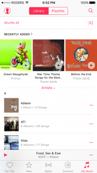
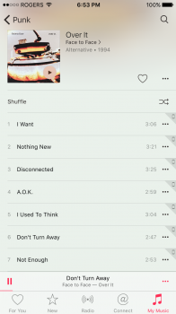
iOS 8.4 finally made me give up using my iPhone as a primary music player and I hope Apple really listens to feedback on their new Music app because it's so messed up in many ways, while I commend Apple for (mostly) restoring the original Artist view, they broke several other things in the process (which seems to be the norm for iOS updates.
My suggestions to improve the music app are:
New landscape view: Yeah the one from iOS 7-8 kinda sucked and was never a true successor to the great CoverFlow interface but completely removing the landscape mode without a compelling or useful UI to replace it shows they have no idea what they're doing.
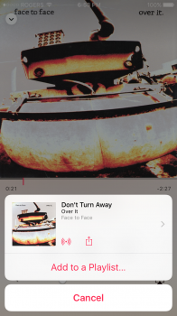
Remove Status Bar from the Now Playing: The Now Playing screen is beautiful except for one detail: Why is the status bar transparent under the album art? It's really distracting and if Apple wants us to have a full screen experience with our music, remove the status bar and the button to hide Mini Player (although that should be reduced to a tap to appear/dismiss sort of thing)
iPad Now Playing: So much wasted screen real estate. At least the Music app from iOS 7-8.3 had the album art take up a good chunk of the screen. And I also noticed that the playhead scrubber is white on the iPad as opposed to hot red/pink. Seems like Apple's UI still cant figure out how they want it to look.
Album info: While I applaud Apple for finally bringing Up Next to the iOS Music app, I wish they hadn't removed the album info screen that was brought up by the same exact button used for Up Next. The album list and the Up Next list should both be in the screen although you be able to toggle which view.
Shuffle all songs: One of the main reasons I stopped using my iPhone as my primary music player was because this feature was removed for no reason. I hope Apple comes to their senses and reimplement this feature.
Shake-to-Shuffle: Bring it back. 'nuff said
Mini Player: A thumbnail of the album art should be on the Mini Player as it looks extremely bare and empty without it (more so on the iPad)
The icon: UGLY! Seriously the hot red icon from 8.0-8.3 was extremely well done (when they flipped the gradient from 7) and was an overall solid visual refinement but of course, Apple had to ruin that too. What was the true point of changing the icon yet again? At least have the multi-colored gradient fill in the icon space with a white music note instead of the opposite which we currently have. Now, the music icon is just another mostly white icon (to join the ranks of Calendar, Safari, Reminders, etc.) to dull the look of iOS and I have now buried it in a random folder instead of its usual spot on the dock where I have kept it there until now because the app is dead to me in so many ways.
The music app peaked with iOS 6 and I don't think Apple will ever get there again as long as they keep shoving their streaming service (which I never use) down our throats.
The music app from iOS 7-8/3 was not perfect by any means, but at least it emphasized the personal music collection (you know, like the iPods we used to all have). Our personal music collections used to dominate the app but now they're just sidelined into one measly tab on the bottom of the screen.
I don't care for streaming or anything, I like having my iPhone as my own personal MP3 player which is why I got a 64GB 6 but now I might just downgrade to a 16GB 6S because if I ever buy another iPhone again, I do not plan on putting my music on there unless Apple gets their act together.
Tim Cook just doesn't get music the way Steve Jobs which is why I don't think the Beats acquisition would've gone down with him around. Also, Dr. Dre and Jimmy Iovine are great at producing music and pushing overpriced headphones, I don't feel like they add anything to Apple other than catering to Cook's emphasis of paid internet services than improving the core user experience of the apps they inhabit.
Shame on you Apple for tarnishing what used to be a great music experience.


