Become a MacRumors Supporter for $50/year with no ads, ability to filter front page stories, and private forums.

Samurai Shampoo

macrumors member
Original poster
Jul 2, 2017
85
2
Hello,

I inserted a "♭" symbol in a line and it thereby increased the line spacing of that line. It's much larger than the other lines now.

When I go into the Format -> Spacing menu and reduce the Spacing, all lines get decreased. It seems like it is not necessarily the line spacing that increases but it seems like the symbol, despite being regular size, is much larger in terms of the white space around it when I highlight it.

How can I either decrease the spacing for that one particular line or decrease the white space of the ♭ symbol?
 
@Slartibart Sorry for the late reply, I didn't see the notification.
Unfortunately, the equation method also increases the line spacing, so it's no different.

I've just tried adding a flat symbol via the Apple Symbols font and this method actually makes the line spacing even larger than copying and pasting or via an equation. :confused:
 
which version of macOS? Which version of Pages? Inserting via an equation produces the smallest change in the line spacing on the systems I tried. The screenshot below is from Pages 13.1 on iPadOS 17 (it looks the same in Pages 13.1 on macOS, I checked before, but I am currently away from Macs):

IMG_2770.jpeg


The text body is set in Helvetica Neue, 15 pt. »unicode« refers to inserting the flat-sign via the unicode character set of the Helvetica Neue Font.

For »equation« I inserted the flat via an equation, Helvetica Neue, 12 pt.

In the »Apple Symbol«-paragraph only the flat sign is set in Apple Symbol, 15 pt.

There are changes for the line spacing for all of them, but using an equation in 12 pt gives by far the best result. To be clear, there are music notation symbols like e.g. a half note ♪ or double note ♫ which, when inserted as unicode can mess a lot with line spacing (depends on the font); and AFAIK so far using an equation is not an option for these (or is it? anyone knows?). Using a dedicated musical notation font is probably the easiest/convenient option - font space for example provides various free (for personal use or 100% free) fonts.

Apple Symbols font should be included in macOS. Check with Fontbook whether it is deactivated on your system.

San Francisco Symbols can be downloaded via Apple Developers; Apple Symbols is available freely available for personal use on e.g. Dafonts.

If you have to set more complex musical notations are sheet music, I strongly recommend to dive into and use Lilypond (or LaTeX using e.g. MusicTeX for simpler things).
 
Last edited:
I tried to recreate the problem in the latest version of Pages using some "lorem ipsum" filler text. I just copied the problematic symbol in the first post in this thread and then pasted it (paste and match style) into a paragraph in several places. Here's the result...

Symbol.jpg


I don't see added line spacing or adding spacing around the symbol.

My guess is that the symbol insertion in OPs document is in a different font family than the text in OPs Pages document. Thus, how it is set up in one font is different than another and looks different on insertion. For example, here's the same paragraph with me selecting some of the symbols (only) and simply choosing a couple of different font family names than the default Helvetica Neue, but leaving all else the same...

Symbol2.jpg


There's the odd line spacing and spacing around the symbols that differs from the rest of the text... as OP seems to be describing.

OP can likely easily fix their problem by "selecting all of the text" and setting the font name to the same font (name). I suspect when they "select all" (of the paragraph) the font name will change to "multiple" as shown in this screenshot...

Multiple.jpg

Switch it back to the default font OP is using in the document and the symbol will likely look as normal as any of the other alphanumeric text in the rest of the paragraph.
 

Attachments

  • Symbol.jpg
    Symbol.jpg
    58.1 KB · Views: 57
Last edited:
  • Like
Reactions: Slartibart
It's a kludge, but in this sort of situation I usually put paragraph breaks at the end of the offending line and the line immediately before and after it, and then adjust the line height for each one.
 
  • Like
Reactions: ignatius345
It's a kludge, but in this sort of situation I usually put paragraph breaks at the end of the offending line and the line immediately before and after it, and then adjust the line height for each one.

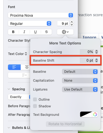
Another (also kludgy) option might be to employ baseline shift across a whole line. Only works in 1 pt. increments, but could work.

Screenshot 2023-08-07 at 3.04.30 PM.png
 
Register on MacRumors! This sidebar will go away, and you'll see fewer ads.