Become a MacRumors Supporter for $50/year with no ads, ability to filter front page stories, and private forums.

Juicy Box

macrumors 604
Original poster
Sep 23, 2014
7,579
8,919
I checked out Apple's Refurbished store today, and it is totally redesigned.

I personally do not like it. At first glance, it is aesthetically pleasing, but there are some issues.

One thing, they removed the original released date of the model while browsing. If you click on each one you can see it though.

Actually, the redesign reminds me of a common theme I am seeing with a lot of media apps. It reminds me of the Netflix App on tvOS and other newer devices. It visually looks nice, and more modern, but the user friendliness of the UI suffers. Another issue is that it lists the devices in columns and rows instead of just a simple list to scroll down.

Anyone like it?
 

Beachguy

macrumors 65816
Nov 23, 2011
1,008
407
Florida, USA
I've noticed similar trends in many places. The new App Store on macOS sucks. As to the Apple store refurbs, I found it to be a bit slow. Nice looking, but honestly... I liked the previous design because for me, it worked just as I preferred.
 

maverick28

macrumors 6502a
Mar 14, 2014
630
312
I've noticed similar trends in many places. The new App Store on macOS sucks. As to the Apple store refurbs, I found it to be a bit slow. Nice looking, but honestly... I liked the previous design because for me, it worked just as I preferred.

Exactly. The difference only is that I don't find the current design (tiles without edges, tiny greyish fonts against white background aka "modern", expanding menus organized out of order) pleasing and simple they think it is. The new overhaul of the Apple Store was part of the general overhaul of their web-site including the forum. Funny thing I was able to browse and post any section of the site, incl. the developer site, even from old Safari (going back to Safari 5) in Lion which I preferred over Chrome. After they pulled the plug in early December Safari 5 can't load any part of it at all (new SSL implementation?). The refurb section which I visited on a frequent basis became inaccessible. Chrome 49 (2016) too failed to load it as well as ASC and so failed Safari 7.1.8 (2015 I believe) in Mavericks. I'm forced to stick to Waterfox still being updated for old revisions of OS X though it's slow or switch to High Sierra which make me crawl with its greyish tones and cause headache periodically. I liked older look of Apple web-site, it was streamlined and fast. It's true that it now loads at significantly slower speeds.
 
Last edited:

smirking

macrumors 68040
Aug 31, 2003
3,917
3,996
Silicon Valley
A contributing reason why they don't use a list format is because their main store isn't rendered in a list format and they probably wanted to keep the design pattern consistent with the main Web store.

And as I mentioned in a different thread, they appear to have set a design goal of aligning the Refurb store to best suit the browsing habits of the least informed shopper. These are not people with an exact config, year, and model in mind. They're just looking for a computer with a 13" screen or a "Mac with 1TB of storage". The latter could be anything from a Mac Mini to an iMac Pro.
 

Juicy Box

macrumors 604
Original poster
Sep 23, 2014
7,579
8,919
A contributing reason why they don't use a list format is because their main store isn't rendered in a list format and they probably wanted to keep the design pattern consistent with the main Web store.
I am sure this has a lot to do with it, and like I said, it is aesthetically pleasing, I just find it to be less useful when compared to the previous website.

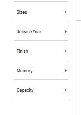
One thing that was added to the Refurbished Store that wasn't there when I created this thread is the filter:
Capture.JPG
This definitely makes things easier, although it looks like the filter is glitchy ATM.
 

smirking

macrumors 68040
Aug 31, 2003
3,917
3,996
Silicon Valley
I am sure this has a lot to do with it, and like I said, it is aesthetically pleasing, I just find it to be less useful when compared to the previous website.

I'm sure the aesthetics were important, but I'd suspect Apple values a design that will help them move product just as much as the aesthetics. The Refurb Store's design is clearly following the general design of the rest of their online store. Like take a look at these pages:
https://www.apple.com/shop/mac/mac-accessories/cases-protection
https://www.apple.com/shop/mac/mac-accessories/headphones-speakers

In those cases, the design actually works very well. The reason is because when the image matters, that design yields a high information display. It makes it easy to find what you're looking for, especially if you don't know it by name.

That same design doesn't work so well for the Refurb Store because the image isn't important. They all look the same so the exact same interface ends up being a low information display when it has to deal with similar products that have different configurations.

They could have dealt with it by having an different design for the Refurb Store, but that carries some other interesting consequences and I'd suspect at the time they were doing the designs, they thought that even though the design wasn't ideal for the Refurbs, it was good enough and didn't want to rock the boat.
 

TheIntruder

macrumors 68000
Jul 2, 2008
1,765
1,275
There's something to be said for consistency, in having a unified look, and simplified back end.

But it's plainly apparent to those who try to use the Refurb store that it's a poor experience, and no apparent effort wad made to address that, which is even more damning for a company that touts its strength as user experience.

Wasn't there some guy who started a successful computer company who said something about how something works versus how something looks?
 
Register on MacRumors! This sidebar will go away, and you'll see fewer ads.