Become a MacRumors Supporter for $50/year with no ads, ability to filter front page stories, and private forums.

Small White Car

macrumors G4
Original poster
Aug 29, 2006
10,972
1,468
Washington DC
There's a little drawing app called iDoodle2lite that recently upgraded their application icon. It was a terrible looking green square and now it's a box of crayons. It's a huge improvement.

This got me thinking. The iPhone interface is very beautiful, but this is mostly dependant on the icons of the apps we have.

So what apps are messing up your phone? Personally, I would love for Urbanspoon to do something with their logo. There's no reason for the title to be IN the logo when its repeated right below. It's also very flat and boring looking.

Cube Runner is also poor, in the sense that it doesn't really look like anything in the game. I think the icon should match the subject at least a little bit.

And yes, I know about Jailbraking. No need to bring it up. I'm presenting this as an "advice for developers" kind of thing. Hopefully we can ALL learn a little something about what works and what doesn't. (So hey, let's compliment too! 'Koi Pond,' 'Galcon,' and 'Toy Bot' are all GREAT examples of good icons!)

Any other suggestions?
 

soberbrain

macrumors 65816
May 9, 2008
1,268
2
Agreed about iDoodle2lite. Much better icon.

I don't like the purple and yellow "FREE" on Video Poker.

I appreciate Balance changing it's logo from a $ to a light green ledger.
 

slidetounlock

macrumors regular
Aug 12, 2008
100
0
Fav App Icons (My opinion)

Sol Free
2 Across
Sketches
Trism
NY TIMES
Admit One (Now Playing)
de Blob
aSleep
 

Applepi

macrumors 6502a
Aug 15, 2007
549
0
Call me silly, but I absolutely HATE the icon for Twitteriffic. I changed to another app just so I didn't have to look at that icon. All is well in my world now. :D
 

Small White Car

macrumors G4
Original poster
Aug 29, 2006
10,972
1,468
Washington DC
Call me silly, but I absolutely HATE the icon for Twitteriffic. I changed to another app just so I didn't have to look at that icon. All is well in my world now. :D

I can't think of any examples at the moment, but yes, I have chosen an app based on the icon alone. You know, the free ones where there are 3 that do the same thing?
 

Rojo

macrumors 65816
Sep 26, 2006
1,328
241
Barcelona
The way an icon looks makes a HUGE impact on if people download it -- and it's just shocking to me that there are so many developers out there that don't understand this. Seriously -- if you can't make a decent looking icon yourself, hire someone else to do it for you! Because an ugly icon versus a cool-looking icon can amount to a HUGE difference in number of downloads. Depending on what the app is, and how the icons look, the difference could literally be in the thousands. It's REALLY beneficial to get the most eye-pleasing icon possible -- it helps the developer, and it helps users to have nice-looking homescreens.
 

beate

macrumors regular
Jun 8, 2007
246
0
I love Tris but have it on last page as I think icon is too ugly...turn my eyes away when I have to go there and select it.

I bought Bingo just for the icon! Needed to brighten a page up a bit.

Love NY Times, FileMagnet, Rooms, Lumina, AquaForest, Sketches, Ambiance, Moonlight Mahjong & Tarot.

I hate Talk Bubbles the most - it's next to Tris on the last page...
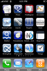
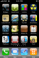
I took screenshots a while back as my productivity/utility page was a bit blue...Why are so many Apps blue??? I've actually called a moratorium on purchasing blue Apps.

Productivity Too Blue.... Games and entertainment better.
 

Attachments

  • IMG_0002.PNG
    IMG_0002.PNG
    98.9 KB · Views: 85
  • IMG_0003.PNG
    IMG_0003.PNG
    125.6 KB · Views: 79

dougdawson

macrumors member
Aug 24, 2008
62
0
Austin, TX
The way an icon looks makes a HUGE impact on if people download it -- and it's just shocking to me that there are so many developers out there that don't understand this. Seriously -- if you can't make a decent looking icon yourself, hire someone else to do it for you! Because an ugly icon versus a cool-looking icon can amount to a HUGE difference in number of downloads. Depending on what the app is, and how the icons look, the difference could literally be in the thousands. It's REALLY beneficial to get the most eye-pleasing icon possible -- it helps the developer, and it helps users to have nice-looking homescreens.

Speaking of how this affects sales...

Don't forget the differences between the screens on the iPhones and iPod Touches and how an icon looks in iTunes on a standard LCD computer screen. You can have the best-looking app icon the iPhone home screen will ever display, but if people are making a purchasing decision based on the icon as viewed in iTunes on their Macbook, they're not seeing it. Don't ask me how I know this.

What you see when you buy is only superficially related to what you are going to be using as installed.

Doug
 

philgilder

macrumors 68000
Sep 30, 2007
1,756
3
UK
personally, i dislike the icons for enigmo, trism, cro-mag, reMovem, motionx poker, sudoku, moonlight mahjong, fast contacts and here i am
most of them are simply too dark. bright icons look fantastic on the iphone, though not necessarily on a pc/mac
 

Bear Hunter

macrumors 6502a
Aug 10, 2008
598
0
Totally agree about the icons. People in general tend to steer away from anything that they think would make their phone look like azz. So I decided to do something about it

new.jpg
 

stevearm

macrumors 6502a
Nov 15, 2007
992
91
Enigmo: godawful design.
Aurora Feint: PLEASE go back to the old, earth block icon
Trism: I don't like. Doesn't look right incased in a box, and there should be more colours and have the trisms fill the icon.
Datacase: not that keen. Would prefer a standard square enclosure.
Sketches: I HATE this icon, the etcha sketch from last year was much better.


Texas Hold'Em, Monkey Ball, Dizzy Bee, Bejeweled, Tris, Dactyl, Toy Bot Diaries, Mobile Fotos, Vicinity, Currency, Jaadu, IOweYou, Koi Pond, Visual Radio ALL GOOD!
 

Niiro13

macrumors 68000
Feb 12, 2008
1,719
0
Illinois
Speaking of how this affects sales...

Don't forget the differences between the screens on the iPhones and iPod Touches and how an icon looks in iTunes on a standard LCD computer screen. You can have the best-looking app icon the iPhone home screen will ever display, but if people are making a purchasing decision based on the icon as viewed in iTunes on their Macbook, they're not seeing it. Don't ask me how I know this.

What you see when you buy is only superficially related to what you are going to be using as installed.

Doug

Like how Super Monkey Ball looks amazing on the computer...yet on the iPhone they have that terrible shadow thing.

Datacase: not that keen. Would prefer a standard square enclosure.

The fun thing is that the developer said that the next update will have a more standard shaped icon :).
 
Register on MacRumors! This sidebar will go away, and you'll see fewer ads.