Become a MacRumors Supporter for $50/year with no ads, ability to filter front page stories, and private forums.

kallisti

macrumors 68000
Original poster
Apr 22, 2003
1,751
6,670
The Bad Guy started a thread asking why there aren't more threads on this forum asking for critique. There was an initial discussion about what would constitute "appropriate" critique for this forum and then the remainder of the thread largely became examples of people asking for critique on individual photos.

I like the idea of people starting threads about individual photos, whether it ranges from "I just bought a camera and this is my first picture, please help" to "I had a specific intent when I shot this and here is how I set up the shot, please offer advice on how I could have done it differently."

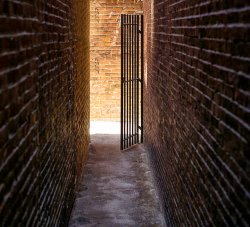
In this spirit, I'm offering up a photo I took last summer while walking around in Boston. I have a thing for alleys and took this while on a walking tour. 50mm lens with the camera in a vertical orientation. I like the dark walls with lines leading the eye to the sunlit area in the background.

What could I have done differently either when shooting this or in post? Thoughts?

16999732996_8a0fcb4469_c.jpg
 

TheGenerous

macrumors 65816
Nov 14, 2010
1,123
438
I'm an Austronaut
Good composition!

Probably I would center the focal point and decrease slightly the luminance of the highlights from the floor. Maybe shooting at a shorter height than eye level could have made the converging lines of the wall to look different. The wall lines will become more visible when decreasing the almost overexposed parts of the photo.

Perhaps not practical, but if you had more time maybe you could have wait for the sun light to be less bright or at a different hour of the day. The light coming through my window shades is quite interesting only at a certain time of the day. Some other times is either too harsh or not interesting at all.

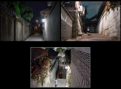
In the first set of photos I lowered the angle from eye level and it gave a whole different perspective. In this case it worked better by lowering the height --I had to kneel-- because the photo shows more crafts on the right wall as well as more of the background.

The alleys in the second set of photos show equally interesting surrounding walls and leading scene.
 

Attachments

  • ????????? 2015-04-03 22.37.18.png
    ????????? 2015-04-03 22.37.18.png
    2.1 MB · Views: 154
  • ????????? 2015-04-03 22.38.17.png
    ????????? 2015-04-03 22.38.17.png
    1.2 MB · Views: 135
Last edited:

steveash

macrumors 6502a
Aug 7, 2008
527
245
UK
I think the more interesting thing about this picture rather than the technique and processing is the subject and your motivation to capture it. Why are you interested in dark alleyways leading into the light? What were you trying to achieve?

I've had my best work torn apart in critiques and the best thing I have learnt as a result is that any picture is about the subject or message and not the technique or equipment.

The subject is king, everything else is just polish. On its own this picture could easily be dismissed but as part of a set based around the same subject where it supports a bigger storyline, it could equally be worthy of a gallery.

This image in my opinion, you leave a little too much to the interpretation to the viewer. There isn't quite enough storyline for the viewer's imagination to take hold of. If I took a picture of a plain white closed door and told you it was about what was on the other side you might tell me that you don't care what is on the other side because I didn't create enough interest in the first place. If there was a silk stocking on the handle or a bloody hand print, or the door was open just enough to see a suggestion of what is inside then it becomes a lot more interesting.

As part of a set of images this story could be more complete. As a single image it could also be developed to give a stronger message. If it is about the mystery of that is around the corner then you could go in one direction, the dark high walls of the alleyway could take you another way.

As far as the capture itself is concerned, I'm glad that you didn't choose to balance out the contrast by pulling back the light and dark. I think the fact the footpath is blown out and the walls are in shadow is the point of the picture.

I think though, you should look deeper into your motivations and try to develop them further. Once you understand why you are taking a picture you will be much more focussed on the end result. It's a lot more complicated than "try it in black and white" but this is probably the best advice I have ever learnt as a photographer.
 

Designer Dale

macrumors 68040
Mar 25, 2009
3,950
101
Folding space
The Bad Guy started a thread asking why there aren't more threads on this forum asking for critique. There was an initial discussion about what would constitute "appropriate" critique for this forum and then the remainder of the thread largely became examples of people asking for critique on individual photos.

I like the idea of people starting threads about individual photos, whether it ranges from "I just bought a camera and this is my first picture, please help" to "I had a specific intent when I shot this and here is how I set up the shot, please offer advice on how I could have done it differently."

In this spirit, I'm offering up a photo I took last summer while walking around in Boston. I have a thing for alleys and took this while on a walking tour. 50mm lens with the camera in a vertical orientation. I like the dark walls with lines leading the eye to the sunlit area in the background.

What could I have done differently either when shooting this or in post? Thoughts?

16999732996_8a0fcb4469_c.jpg

Nice framing in my opinion. Never center a subject area in either the vertical or horizontal axis. That's a sure way to put the eye to sleep and make the photo as static as possible.

Processing and exposure is another issue. This is one of those difficult shots technically with a dark area leading into a bright center of focus/subject. It calls for some old school techniques like dodge and burn to find a balance between detail in the shadows and highlights.

Try treating this as two seperate shots. First process in post for either the shadows or highlights and record the settings on paper. Go easy on the sliders and keep it simple. Then reset the image to original and do this over with the other tonal area, again recording the settings. Zero it out again (or just keep making new copies) and process the image using the parameters you found as minimum and maximum settings until it looks OK. Then play with things like contrast and fill light to improve it from there.

The most delicate area will be the bright b ar of light on the lower center of the wall. Using a brush of some sorts to dodge this out will remove some of the washed out effect it has on the image.

I lived in Boston during the early to mid 1970s when I had no camera :( Great place for a shutter bug.

Good luck.

Dale
 

robgendreau

macrumors 68040
Jul 13, 2008
3,471
339
I like all the converging, but different, lines.

IMHO the bright spot on the ground past the gate is a bit too bright.

And I'd like some kind of gradual light change along the brick to the side, to bring out the lines a bit more.
 

Phrasikleia

macrumors 601
Feb 24, 2008
4,082
403
Over there------->
You have some elements here that work quite well together, such as the strong lines in the walls leading to the light in the distance. It’s a lot of direction towards an area without a visual payoff at the end, however. If there were something in that bright area to let us know why we should be looking there, the photo would feel more resolved. As it is, there isn’t even any detail in that bright area. For example, maybe if there were an object on the ground there—a potted plant?, a child’s toy?—it might help to flesh out the story of ‘light at the end of the tunnel.’

As for processing, the use of color here probably isn’t helping. The green of the plant on the low wall is almost the exact complement of the reds elsewhere, so it really grabs the eye and leads it to a place other than where the light and lines are directing us. It’s therefore more of a distraction than anything else. A B&W conversion could solve that problem, but you would still be left with the compositional problem noted above.

And just a note about placing points of interest on a horizontal or vertical axis: I think what Dale meant is that placing a point of interest on *both* axes (i.e. smack in the center of the frame) can cause the image to be very static, making the eye get stuck there unless it has some really strong lines to lead it out to other points of interest. Using just one of those axes can work very well and is an age-old trope of both painters and photographers because it can provide a nice sense of balance and stability. In that regard, I think you’re OK here; the brightest part of the frame is well beneath the visual center; there just isn’t anything for us to find there.
 

Reality4711

macrumors 6502a
Aug 8, 2009
738
558
scotland
Take a second look.

I like this a lot.

No deep analysis but if it where me at the time I know exactly what I would have done (all things being equal).

Three or more frames of this view moving between each (up-down-sideways) and then a few seconds to close the gate and do it again.

Have a bit of a think to make sure I felt good about what I had tried to capture and move on.

Reasons:- if a subject/composition is static I feel the urge to move my view. Can't help it, almost a glitch; but one which has served me well from the beginning.

Oh, when in the groove I don't chimp. Another habit that kinda builds your confidence over time that you have "got it"!

Be prepared to fail.
 

kallisti

macrumors 68000
Original poster
Apr 22, 2003
1,751
6,670
A huge thank you for all the replies. Points are well taken. A few I had noticed on my own, but several that I hadn't thought about at all. Very helpful and very much appreciated.
 

kallisti

macrumors 68000
Original poster
Apr 22, 2003
1,751
6,670
Went back and looked at the original RAW file again. The highlights on the sidewalk are just blown--no details to recover. In hindsight was a clear error on my part as underexposing to at least give me the option of recovering some detail here at the expense of a loss of some shadow detail might have been preferable. At the least should have bracketed the shot to be able to compare the two exposures and see which tradeoff would have been more pleasing.

Converted it to B&W (though this may not be an optimal conversion). I think I still like it better in color, though I may need to look at it again in a day or two to see how it gels out in my brain.

The compositional comments are much appreciated. A problem that I notice in many of my photos is that I notice leading lines which may have prompted me to take the shot in the first place, but I don't pay enough attention to whether they are leading somewhere interesting. For this particular shot it doesn't bother me as much. But that may be a reflection of where I need to push myself in the future. If I'm not seeing the problem, I certainly can't fix it.

Thanks again for all the replies.

17046812981_0a050c960f_c.jpg
 
Last edited:

kallisti

macrumors 68000
Original poster
Apr 22, 2003
1,751
6,670
I think the more interesting thing about this picture rather than the technique and processing is the subject and your motivation to capture it. Why are you interested in dark alleyways leading into the light? What were you trying to achieve?

I've had my best work torn apart in critiques and the best thing I have learnt as a result is that any picture is about the subject or message and not the technique or equipment.

The subject is king, everything else is just polish. On its own this picture could easily be dismissed but as part of a set based around the same subject where it supports a bigger storyline, it could equally be worthy of a gallery.

This image in my opinion, you leave a little too much to the interpretation to the viewer. There isn't quite enough storyline for the viewer's imagination to take hold of. If I took a picture of a plain white closed door and told you it was about what was on the other side you might tell me that you don't care what is on the other side because I didn't create enough interest in the first place. If there was a silk stocking on the handle or a bloody hand print, or the door was open just enough to see a suggestion of what is inside then it becomes a lot more interesting.

As part of a set of images this story could be more complete. As a single image it could also be developed to give a stronger message. If it is about the mystery of that is around the corner then you could go in one direction, the dark high walls of the alleyway could take you another way.

As far as the capture itself is concerned, I'm glad that you didn't choose to balance out the contrast by pulling back the light and dark. I think the fact the footpath is blown out and the walls are in shadow is the point of the picture.

I think though, you should look deeper into your motivations and try to develop them further. Once you understand why you are taking a picture you will be much more focussed on the end result. It's a lot more complicated than "try it in black and white" but this is probably the best advice I have ever learnt as a photographer.

I didn't respond to each reply (but I appreciate all of them). Wanted to specifically reply to this one though as it relates to what I am currently struggling with. I sometimes "see" something that catches my eye. I am getting better at stopping and thinking about how best to capture it rather than just taking a snapshot. But I don't always metaphorically step back further and ask myself why I find this scene interesting/compelling. I don't always ask myself what story or message I am trying to convey with a particular shot before I take it. I think this translates into my images.
 

Phrasikleia

macrumors 601
Feb 24, 2008
4,082
403
Over there------->
I don't always ask myself what story or message I am trying to convey with a particular shot before I take it. I think this translates into my images.

I wouldn't worry too much about the story of an image as you're working with the camera; if the story presents itself to you at that point, great, but creativity is a messy place--sometimes it's best to let intuition do its thing and save the analysis for later. When you're reviewing your images to decide which ones to process and release, that's a great time to pause for greater thought about them. Then you can consider with a greater sense of objectivity what the picture might communicate, how it interprets a scene, or what story might be there. The ones that don't speak very clearly at that point might be the ones to leave alone.
 

kallisti

macrumors 68000
Original poster
Apr 22, 2003
1,751
6,670
As for processing, the use of color here probably isn’t helping. The green of the plant on the low wall is almost the exact complement of the reds elsewhere, so it really grabs the eye and leads it to a place other than where the light and lines are directing us. It’s therefore more of a distraction than anything else. A B&W conversion could solve that problem, but you would still be left with the compositional problem noted above.

Phrasikleia,

Looking at the two versions again today I think I still prefer it in color. I understand your point about the green from the plant though.

I think I like how it isn't just light at the end of the tunnel, but it is colored light at the end of the tunnel. Was trying to think how to best show this, so did a fairly radical blur in Photoshop on both the color and B&W versions. Taking out all the detail and reducing the photo to its basic elements.

16871626230_d779c0c27d_c.jpg


17033187556_be3da020e3_c.jpg


The blip of green from the plant is there and it *is* a distraction. But I think part of what I like about the background is the gradient of white from the sidewalk going up to a deeper red higher up. This is the "interesting" part for me visually that the lines all lead to.

In B&W I don't see this gradient as much. Could probably do a different conversion to bring this out, but I think the presence of color helps to make this gradient more evident/striking.

I'm not trying to make "chicken salad" out of "chicken ****." But I think this is one of the reasons that this shot stood out for me when reviewing the photos from that day and why I kept it in color.

I certainly welcome other opinions however :)
 

Phrasikleia

macrumors 601
Feb 24, 2008
4,082
403
Over there------->
Phrasikleia,

Looking at the two versions again today I think I still prefer it in color. I understand your point about the green from the plant though.

I think I like how it isn't just light at the end of the tunnel, but it is colored light at the end of the tunnel. Was trying to think how to best show this, so did a fairly radical blur in Photoshop on both the color and B&W versions. Taking out all the detail and reducing the photo to its basic elements.

Image

Image

The blip of green from the plant is there and it *is* a distraction. But I think part of what I like about the background is the gradient of white from the sidewalk going up to a deeper red higher up. This is the "interesting" part for me visually that the lines all lead to.

In B&W I don't see this gradient as much. Could probably do a different conversion to bring this out, but I think the presence of color helps to make this gradient more evident/striking.

I'm not trying to make "chicken salad" out of "chicken ****." But I think this is one of the reasons that this shot stood out for me when reviewing the photos from that day and why I kept it in color.

I certainly welcome other opinions however :)

Sure, I understand completely why you enjoy the color, and my comment about it was limited only to the issue of how the green of the leaves commands attention.
 

Nickwell24

macrumors regular
Nov 13, 2008
149
12
What could I have done differently either when shooting this or in post? Thoughts?

My only critique is my eye is immediately drawn to the grey blob on the back wall.

Things I'd change:
- Lower perspective (this will help hide the blob behind the gate and give you a more interesting point of view)
- Move in closer (or zoom if you're not using a 50mm prime)
- Boost the shadows some to bring out the converging lines a bit more (but only slightly)
 

Edge100

macrumors 68000
May 14, 2002
1,567
25
Where am I???
Honestly, I'd bin this shot altogether. Seriously.

What is the story here? What am I supposed to focus on? What are you trying to convey in this photograph, exactly?

A person walking through this scene would immediately lend the shot an element of mystery and intrigue. But as it stands, I get nothing from this. B&W or colour; it makes no difference.
 
Register on MacRumors! This sidebar will go away, and you'll see fewer ads.