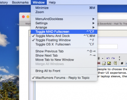
I always thought the big white menu bar on the top of the screen ruined the overall appearance of the desktop wallpaper. If Apple is all about streamlining the interface, then you'd think auto-hiding the menu bar would already be an option. It seems only practical that it should should show up only when you need it.
MenuandDockless is a plugin that works with the SIMBL framework that allows you to choose which apps will autohide the menu and dock. So far it works with most apps but not all. All Apple apps work with it, including Finder. It might have to do with what programming language it was created in. A developer might be able to support or refute this.
https://www.youtube.com/watch?v=qRN7nL-Z0Zs&feature=youtu.be


