I was wondering if Auxo developer Sentry would implement this slight change which would make it more functional and practical, would look good to the eyes too. If any one can make this possible, it would be great!!
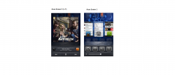
This would make good use of the wasted space on the upper half of the screen. And the size of the App Previews should be a bit bigger than the present Auxo ones.
This would make good use of the wasted space on the upper half of the screen. And the size of the App Previews should be a bit bigger than the present Auxo ones.
Attachments
Last edited:
")