Become a MacRumors Supporter for $50/year with no ads, ability to filter front page stories, and private forums.

Andrew73875

macrumors regular
Original poster
Feb 1, 2022
225
599
I believe there's a bad UI decision regarding the private/regular mode switch in Safari. This annoyed me since iOS 15 and I couldn't quite figure out why exactly.

So since iOS 15 we have this UI

ScreenSafari.jpg


There's no reason to have "Private" button while in private mode. It just does nothing and results in confusion. Same goes for regular mode.

This problem didn't exist before iOS 15. "Private mode" button would bring you back to "Regular mode" and vice versa.
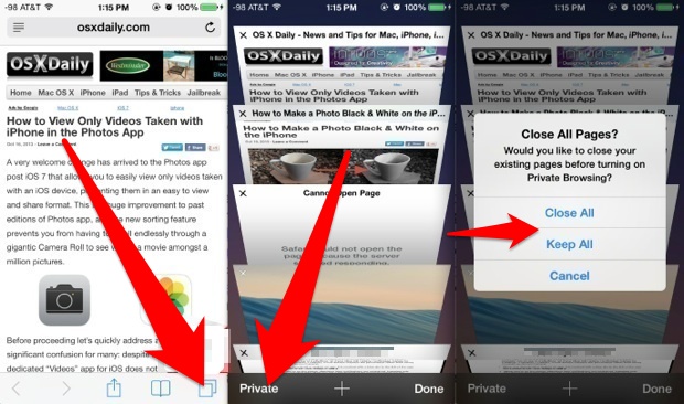
use-private-browsing-ios.jpeg


What are your thoughts on this?
 

Andrew73875

macrumors regular
Original poster
Feb 1, 2022
225
599
it indicates that you’re using private mode. 🤓
Haha yeah I get it 😃

But it's not merely an indicator, it's a button. And if you tap on it, nothing happens.

Wouldn't it make more sense to remove this button, at least when there are no tabs open? There are so many options which would make this submenu smaller and more intuitive. Now it takes too many taps to switch between these modes.

Even the previous iteration was faster and more concise:

use-private-browsing-ios.jpeg


There's some kind of trend to leave the buttons when they serve no function. For example, AirPlay button in iOS 5 and prior would only appear when you have some device to connect to (Apple TV for example). Now it's always here in Apple Music player, takes space even when Airplane mode is activated.

iOS 5:

AirPlay devices not available:

iOS-Video-Pause-button.jpg


AirPlay devices available:

12fig09.jpg


Current (bottom row in the middle):

e4eb295dc06ae39875db7a6840e78167.png
 
Last edited:

NoGood@Usernames

macrumors 6502
Dec 3, 2020
263
317
United States
Since the introduction of tab groups, it seems that private mode is less of a “mode” and is now handled as a tab group (hence the check mark next to the actively selected group). So private shows up as though it’s a tab group on the list to be switched between. Tapping any list item that’s already selected won’t do anything in most cases, and that’s how it works here too. You have to select a different, non-private tab group to switch back to “normal” browsing mode.
 

Andrew73875

macrumors regular
Original poster
Feb 1, 2022
225
599
This is not a button.
giphy.gif


Since the introduction of tab groups, it seems that private mode is less of a “mode” and is now handled as a tab group (hence the check mark next to the actively selected group). So private shows up as though it’s a tab group on the list to be switched between. Tapping any list item that’s already selected won’t do anything in most cases, and that’s how it works here too. You have to select a different, non-private tab group to switch back to “normal” browsing mode.
Yeah I see your point. They kind of changed the logic behind the menus. But it would be nicer to see a better implementation. Maybe to highlight the current group with a colour as well. There's certainly space for improvements.
 
Last edited:

Mr.Blacky

Cancelled
Jul 31, 2016
1,880
2,583
giphy.gif


Yeah I see your point. They kind of changed the logic behind the menus. But it would be nicer to see a better implementation. Maybe to highlight the current group with a colour as well. There's certainly space for improvements.
You can GIF as much as you want, but it's still no button. Where it says "New Empty Tab Group" this IS a button.
 
  • Like
Reactions: Daku93

thv

macrumors regular
May 12, 2022
185
213
How easily confused are people these days? The blue check mark isn't a big hint that you're already in private mode?
 
  • Like
Reactions: Mr.Blacky

Andrew73875

macrumors regular
Original poster
Feb 1, 2022
225
599
Looks more like a checkbox with a label.

So "9 Tabs" is a checkbox with a label, "private" is not a button according to @Mr.Blacky and "New Empty Tab Group" is a button.

And all this diversity is in this small screenshot

screensafari-jpg.2031733


And all of them perform the same functions somehow and look the same.
 

Mr.Blacky

Cancelled
Jul 31, 2016
1,880
2,583
So "9 Tabs" is a checkbox with a label, "private" is not a button according to @Mr.Blacky and "New Empty Tab Group" is a button.

And all this diversity is in this small screenshot

screensafari-jpg.2031733


And all of them perform the same functions somehow and look the same.
I would acknowledge it as a button, if it would turn on/off private mode. But here you're clearly selecting either private mode or normal mode (9 tabs in this case). The same as you would select different tab groups, if you would have some.
 

johaen8

macrumors regular
Aug 17, 2010
109
177
Near Montgomery, AL
So "9 Tabs" is a checkbox with a label, "private" is not a button according to @Mr.Blacky and "New Empty Tab Group" is a button.

And all this diversity is in this small screenshot

screensafari-jpg.2031733


And all of them perform the same functions somehow and look the same.
Let me see if I can explain this. "9 Tabs" and "Private" are selection labels. Select "9 Tabs" to open your default tab group, which currently has 9 tabs. Select "Private" to open your private tab group.

"New Empty Tab Group" is a button. It creates a new tab group that you can name whatever you want. For example, I have a Animal Crossing tab group with various tabs open on various Animal Crossing (AC) related web pages. After creating my AC tab group, it appears as another selection label below the default tab group and the private tab group. I can select it in that menu, view my AC tabs, and then us that menu again to switch back to the default tab group. The check mark indicates which tab group you're in when you're in that menu.
 

Andrew73875

macrumors regular
Original poster
Feb 1, 2022
225
599
@johaen8 I get your point.

All these propositions are incredibly interesting. But there's no such thing as "selection labels" in iOS elements.

We can all open “iOS Human Interface Guidelines” by Apple and see which UI elements exist:

1) System button.

"A button initiates an instantaneous action"

More on exciting world of buttons here:

https://developer.apple.com/design/human-interface-guidelines/components/menus-and-actions/buttons/

This is exactly what happens when we change Safari's private/regular mode.

But let's review other elements.

2) Switch

1*PjHEsBxh7B9BrYARqHcujQ.jpeg


3) Stepper


9XTX6.jpg


4) Slider

11-iPhone-Screenshot.png


5) Segment Control

segmented-control-simulator.png


6) Refresh Control

refresh-control@2x.png


More on refresh control: https://developer.apple.com/documentation/uikit/uirefreshcontrol

7) Picker

pickers-intro_2x.png


Like in alarm clock.

More on pickers here:


So we come to the conclusion that:

1) These mysterious UI elements are indeed buttons.

And these buttons could be made more intuitive and consistent. This would provide a faster access to both private and regular modes.
 
Last edited:

twintin

macrumors 6502a
Aug 10, 2012
828
417
Sweden
And all this diversity is in this small screenshot

screensafari-jpg.2031733


And all of them perform the same functions somehow and look the same.
My mistake. “Private” and “9 tabs” are radio buttons.

Radio Button: Selects one and only one item from a list (the items in the list are mutual exclusive)

Checkbox (or switcher): Selects one or more items from a list (the items in the list are nonconflicting).

Button: Used in non-list context to initate an action.
 
Last edited:
  • Love
Reactions: compwiz1202

Nermal

Moderator
Staff member
Dec 7, 2002
21,026
4,616
New Zealand
FWIW I hate the UX if private mode since 15 too. I’m normally pretty fluid when it comes to adapting to changes but it’s never sat right with me
When I go into private mode I accidentally open a new non-private tab almost every time. I think it's because Private used to be in the bottom-left corner and I still have muscle memory telling me to tap there. I don't really understand why it all changed in the first place...
 
  • Like
Reactions: Andrew73875

Mr.Blacky

Cancelled
Jul 31, 2016
1,880
2,583
When I go into private mode I accidentally open a new non-private tab almost every time. I think it's because Private used to be in the bottom-left corner and I still have muscle memory telling me to tap there. I don't really understand why it all changed in the first place...
How? By tapping the "+" in the lower left corner?
 

Feenician

macrumors 603
Jun 13, 2016
5,313
5,100
When I go into private mode I accidentally open a new non-private tab almost every time. I think it's because Private used to be in the bottom-left corner and I still have muscle memory telling me to tap there. I don't really understand why it all changed in the first place...

I find myself having left private mode on iOS accidentally quite often and I never have sny idea why or how. Since I’m logged in on the same iCloud account on my work laptop that is chock full of agents it’s then “oops. Time to delete all history and hope no-one is looking” time
 

Andrew73875

macrumors regular
Original poster
Feb 1, 2022
225
599
My mistake. “Private” and “9 tabs” are radio buttons.

Radio Button: Selects one and only one item from a list (the items in the list are mutual exclusive)

Checkbox (or switcher): Selects one or more items from a list (the items in the list are nonconflicting).

Button: Used in non-list context to initate an action.
Yeah so it's a button. As a radio button is one of the many types of buttons.

I don't agree it's actually a radio button though. Radio button is used to select something, for example in settings or maybe a pizza menu or something like that.

buttonsradioon.gif


More on this here:


Here we have a usual button which brings us to another screen. Usual button with a check mark (to differentiate which mode we are in). It could've been done via colour or anything else.


screensafari-jpg.2031733


The point here, is that it brings both private mode, regular mode and tab groups together. And that's inconvenient.


For example on MacOS version of Safari, tab groups are separate from incognito mode:

93e0ec103363ecf6f337f3fbd39aaf5e.png


It would make sense to separate "incognito" from "tab groups" on iOS as well. Here's just one of the many ways of doing it:

TabGroup.jpg
 

compwiz1202

macrumors 604
May 20, 2010
7,389
5,746
They are technically "radio buttons" They're a mutually exclusive list. They act like radio buttons, but the circles are just implied.
 
Register on MacRumors! This sidebar will go away, and you'll see fewer ads.