Sorry it's taken me a while to respond, I've had some band gigs and a lot of school work to do. For everyone that has contributed to the thread, I give a big Thank You. None of you were required to give your opinion, but having others look at a logo make a huge difference. Let me get to some specifics.
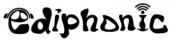
My ONLY suggestion is to make the letters more even. When I first look at it, it looks like it's going from left to right at an angle. Hard to explain, but I think if you straightened that out a bit, it'll be more powerful.
Otherwise, I like it and I think it'll screen just fine on a t-shirt, providing the original is a vector image, and not a raster image. You don't have that much detail to worry about.
I assume that you are talking mostly about the first 'i', right? I was trying to go for a random vibe with letters scewed in different directions, but I can see how you mean it leans more right than left. I'll have to take a look at it again.
And yes, it is a vector image, so scaling will be fine.
The Wifi-looking dot on the "i" is distracting to me because I recognize it from elsewhere.
I had no problem reading it as an "e." It looks good, but I've never been a big fan of logos that use an image in place of a font character. That's my personal opinion.

Both of these say similar things. Is it distracting or tacky to use symbols instead of letters? I'm not a graphic designer by any means so I don't always recognize what is too amateur.
Maybe if you wrap the radiation waves coming off the "i" a little more, it would seem more fluid.
I'm not sure what you mean by this. Do you mean having it curve around the head of the 'i' more?
What about 3D with colors?
Do you mean 3D as in with the glasses, or doing it in a 3D program and extruding the whole thing? As for multiple colors, I considered it, but with the band's small budget I thought going simple black and white with no shading would be easier on the pocketbook.
:smacks you:
the logo blows.
:rips it up:
If this post is meant to be serious, what is it that you hate about it? I'm open to criticism, but this just isn't helpful at all.
Anyway, I opened the e and made the n bigger to balance it better. Just about there now?
P-Worm