This after a few hours...
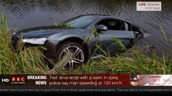
This is a mock-up screen shot of what the next BBC World News *should* look like.
The new layout will be optimised for HD 16:9 viewing. The normal SDTV 14:9 compromise resolution will display as much information as possible, but cropping out the "HD" logo and the time.
BBC World News could be broadcast in HD 16:9. It is currently being broadcast in 14:9 format.
Oh and that globe at the bottom right hand corner is spinning slowly.
I had to resize it to 720p, because 1080p would be pointless to upload -- although my working size is 1080p.
So what do you think?
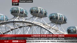