Become a MacRumors Supporter for $50/year with no ads, ability to filter front page stories, and private forums.

RobbieTT

macrumors 6502a
Original poster
Apr 3, 2010
577
830
United Kingdom
Admittedly only an issue on smaller screens but the massive vertical space taken by the Safari Toolbar on Big Sur is a waste of precious screen space. Together with the favourites bar, plus any tabs, I am loosing over an inch of vertical space out of the 8" or so of viewing height:

Screenshot 2020-11-13 at 13.18.39.png


Anyone found a way of reducing the size of the Safari toolbar, either via settings or a tweak tool?

👨‍🦲
 
I didn't even notice it on my iMP but now I have Big Sur (BS?) on my 13" MBP it just screams at me. I cannot un-see it now, not even on the 27" of the iMP.

I cannot see a reason why the toolbar is not the same height as the layer(s) immediately below it. Perhaps the devs at Apple don't find themselves dipping down to a mere 13" display.
 
  • Like
Reactions: decypher44
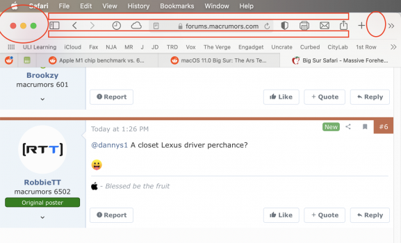
Also with Safari, and please someone back me up here - As big as the forehead is for the bar, the draggable area for the safari window is extremely SMALL!

Attaching picture of what I believe to be the only draggable areas, but if you get too close to an icon, you won't hit the drag ability. I actually really dislike this.
 

Attachments

  • Screen Shot 2020-11-13 at 3.41.35 PM.png
    Screen Shot 2020-11-13 at 3.41.35 PM.png
    267 KB · Views: 245
I had the same initial thoughts too during the betas. I've already forgotten about it but you'll probably get used to the new forehead.
 
Admittedly only an issue on smaller screens but the massive vertical space taken by the Safari Toolbar on Big Sur is a waste of precious screen space. Together with the favourites bar, plus any tabs, I am loosing over an inch of vertical space out of the 8" or so of viewing height:

View attachment 1664062

Anyone found a way of reducing the size of the Safari toolbar, either via settings or a tweak tool?

👨‍🦲
I'm with you on this...noticed it also.
 
I was mumbling about this earlier. All their developers must be on 27in iMacs because there’s no way they’d do this if they’re on a 13in MBP.
 
  • Like
Reactions: RobbieTT
I was mumbling about this earlier. All their developers must be on 27in iMacs because there’s no way they’d do this if they’re on a 13in MBP.
Can't imagine doing any serious development on a 13 in anything. Using dual 27 inch here and it is sill too small.
 
I certainly agree about the forehead on Safari. Really jarring. For what it's worth, I notice this on a lot of apps -- Notes, even the Finder. I'm also a bit bugged out by the slightly smaller text size in the Menu Bar.

I have a 13" MacBook Pro (mid 2014). Big Sur is running well on it. I prefer the small size for travel and what not, but when I'm home, I'm connected to 27" and 25" displays; I can't work any way else now!

Work bought me a nice 16" late 2019 MacBook Pro (1 TB, 32 GB RAM, AMD Radeon Pro 5300M) which is great screen-size wise. Maybe after a week of seeing how Big Sur is on my non-work laptop, I'll move the work one over.
 
  • Like
Reactions: Wolf1701
Also with Safari, and please someone back me up here - As big as the forehead is for the bar, the draggable area for the safari window is extremely SMALL!

Attaching picture of what I believe to be the only draggable areas, but if you get too close to an icon, you won't hit the drag ability. I actually really dislike this.

I *think* I know what you're talking about, but you can put a spacer on the right there to push the icons far right like they used to be.

Screenshot 2020-11-14 at 11.07.23.jpg


the biggest new issue for me is that the last tab no longer has a new tab button that I used to press all the time.
 
  • Like
Reactions: RobbieTT
the biggest new issue for me is that the last tab no longer has a new tab button that I used to press all the time.
I've move some of the buttons and spaces to make it a little bit more like the Catalina version but yes, I thought the previous placement of the tab '+' button at the end of the last tab was more intuitive:

Screenshot 2020-11-14 at 12.22.51.png


Times change I guess.
 
Currently working with this toolbar layout, seems to keep the cursor moving to a minimum whilst giving suitable clear space to work with:

Screenshot 2020-11-14 at 12.46.13.png


Still not completely at ease with the layout though.
 
From Apple; not sure how making something bigger makes it look more streamlined:

By default, toolbars are taller.... The increased height and bezel-free controls combine to give macOS 11 toolbars a streamlined appearance.

The relevant Apple Dev page:

Screenshot 2020-11-14 at 13.28.31.png


So it looks like this is a 'feature' that is working 'as designed'.

Grump-mode on; learning-to-live-with-it caption flickering.
 
  • Wow
Reactions: Nebulance
I've move some of the buttons and spaces to make it a little bit more like the Catalina version but yes, I thought the previous placement of the tab '+' button at the end of the last tab was more intuitive:

View attachment 1666099

Times change I guess.
Oh wow, look how thin it is. They really took a step backward, especially with the placement of the new tab button.
 
Register on MacRumors! This sidebar will go away, and you'll see fewer ads.