I have been fiddling around in Keynote and decided I wanted to utilise it for something, but I dont have any presentations to give. So I thought why not use it to present my design portfolio on my website.
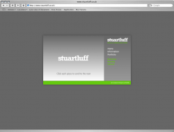
This is the result:
http://www.stuartluff.co.uk
Please can you give me any feedback you feel necessary. Keep an eye on the portfolio section performance. Be warned the portfolio sections are between 3 and 6MB but they load in the background. If the movie has not fully loaded you will get some erratic portfolio behaviour so just click through slowly as you would if viewing the work.
Many thanks. As it is late I will be going offline until tomorrow so I will read any feedback later.
Thanks again.
Oh its done in iWeb too.