Got a tip for us?
Let us know
Become a MacRumors Supporter for $50/year with no ads, ability to filter front page stories, and private forums.
Brand New Portfolio Site *Critique*
- Thread starter Simplesimon101
- Start date
- Sort by reaction score
You are using an out of date browser. It may not display this or other websites correctly.
You should upgrade or use an alternative browser.
You should upgrade or use an alternative browser.
Wow!
Wonderful work Simon. Incredible amount of hand built pieces in both the online presentation and in your profiled projects. The stop-motion paper intro is a hoot -- pulled over this a half dozen times. I found nothing wrong with the entire site nav - everything worked well. Also, the miminal mouse-over scroll through is a fitting concept to your work and the site. Fantastic. Engaging. Congrats!
Wonderful work Simon. Incredible amount of hand built pieces in both the online presentation and in your profiled projects. The stop-motion paper intro is a hoot -- pulled over this a half dozen times. I found nothing wrong with the entire site nav - everything worked well. Also, the miminal mouse-over scroll through is a fitting concept to your work and the site. Fantastic. Engaging. Congrats!
Neat interaction. I was a little confused at first how it all worked, but I blame myself for that.
Looks great! Very unique.
Looks great! Very unique.
Wow, I mean Wow. How the hell did you manage your scroll thingy. Very very impressive.
I would prefer the nav bar/ list to span across your feature scroll thingy; I think that would be a nicer layout but I'm only a construction worker and know nothing about design .
.
Brilliant scroll thingy though; so clever.
I would prefer the nav bar/ list to span across your feature scroll thingy; I think that would be a nicer layout but I'm only a construction worker and know nothing about design
.Brilliant scroll thingy though; so clever.
I took a look at your code... wow... lots of bloat there, but it's necessary to accomplish the hover trick.
I'm a huge supporter of usability and conventions — your site has very few. There's no emphasis on your name or exactly WHAT I should do when I hit your site.
You've put a lot of work into your home page, but it's not playing that role very well. Add a few callouts — invite me to click onto your about page or your portfolio sections.
Your content pages are fine — just work on that home page. Otherwise, I like the site.
I took a look at your code... wow... lots of bloat there, but it's necessary to accomplish the hover trick.
yeah, it's that gallery. Hopefully it doesn't affect the user experience though. (and it's not a web designers portfolio so the fact that the code is a little wonky should be fine..)
I'm a huge supporter of usability and conventions — your site has very few. There's no emphasis on your name or exactly WHAT I should do when I hit your site.
I'm not quite sure what you mean... I'm new to web but I did try and keep usability in mind when creating it ...There are only a few options to choose from, I catagorised my portfolio into clear sections and I tried to make all the content assessible within one or two clicks.
Also the the site is probably for me to refer people to rather than people just stumble across, so they should know why they're there.
You've put a lot of work into your home page, but it's not playing that role very well. Add a few callouts — invite me to click onto your about page or your portfolio sections.
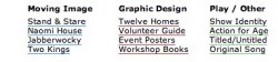
I think for me the purpose of the home page in this case is just to provide a bit of interest and provide a summary of what I do 'Moving Image', 'Graphic Design' & 'Play'. I am really keen to keep it simple although I had thought about adding a feed to my blog when that develops a little?
I sortof get your point but I think because it's such a tiny site it's probably not needed. I looked at my web stats yesterday and my average page views per visit is something like 18 which isn't bad for a site with just 15 pages.
Thanks for the critical feedback... I think you've got alot of good points if it was a site for me to get business directly but I think at the moments it's more of an online design Resume.

All I can say is that it's a really nice concept well executed, you also has some very nice pieces of work there I doubt you'll find it too hard to get work from it.
I'm trying to view your portfolio from work, which admittedly is quite limiting.
The scroll functions never load, I just get the message that they will work when the page finishes loading (which it doesn't).
I can see a white background - if it's supposed to be like that then I would change it to a darker colour like black to fit with your homepage animation thing.
I can view your basic Flash, but it stutters a lot (I'm assuming it's not supposed to be like that).
I know I'm in the minority here, but if you're trying to get work it's likely that you will have office people viewing your site from a similar kind of set up to mine, so it could really do with being more accessible or it just looks like it doesn't work.
I'm not quite sure what you mean... I'm new to web but I did try and keep usability in mind when creating it ...There are only a few options to choose from, I catagorised my portfolio into clear sections and I tried to make all the content assessible within one or two clicks.
Honestly I love the concept - but the index thing at the top is a bit dull. Everything is screamingly great but let down in my humble opinion by the index, otherwise it is incredible. It deserves more of your obvious talent.
Attachments
Thanks for the feedback...
I don't quite understand. So the animation on the front page that you scroll over to control doesn't work?
It's the image that you scroll over, the text is just to instruct you what to do. Should I change the text to 'scroll image'? It's just CSS and HTML, nothing funny, so the scrolling should work.
Yeah that's probably because it's HD - you can turn it off once the player activates. Perhaps I should make that clearer.
Just out of interest if you turn off HD do you still have issues?
Yeah I've had a few people comment that the menu area is quite simple. I think wanted it to be fairly simple so it's clear and doesn't compete with the work.
I may have a play with it at some stage but I think I'm reluctant to change it at the moment until I can think of something that's simple, clear as well as being more interesting (but not too gimmicky).
The scroll functions never load, I just get the message that they will work when the page finishes loading (which it doesn't).
I can see a white background - if it's supposed to be like that then I would change it to a darker colour like black to fit with your homepage animation thing.
I don't quite understand. So the animation on the front page that you scroll over to control doesn't work?
It's the image that you scroll over, the text is just to instruct you what to do. Should I change the text to 'scroll image'? It's just CSS and HTML, nothing funny, so the scrolling should work.
I can view your basic Flash, but it stutters a lot
Yeah that's probably because it's HD - you can turn it off once the player activates. Perhaps I should make that clearer.
Just out of interest if you turn off HD do you still have issues?
Honestly I love the concept - but the index thing at the top is a bit dull.
Yeah I've had a few people comment that the menu area is quite simple. I think wanted it to be fairly simple so it's clear and doesn't compete with the work.
I may have a play with it at some stage but I think I'm reluctant to change it at the moment until I can think of something that's simple, clear as well as being more interesting (but not too gimmicky).
I may have a play with it at some stage but I think I'm reluctant to change it at the moment until I can think of something that's simple, clear as well as being more interesting (but not too gimmicky).
Maybe something as simple as a different font, but I agree - if it ain't broke.
Thanks for the feedback...
I don't quite understand. So the animation on the front page that you scroll over to control doesn't work?
It's the image that you scroll over, the text is just to instruct you what to do. Should I change the text to 'scroll image'? It's just CSS and HTML, nothing funny, so the scrolling should work.
Yeah that's probably because it's HD - you can turn it off once the player activates. Perhaps I should make that clearer.
Just out of interest if you turn off HD do you still have issues?
The toolbar says the page is 'Done' loading, I hover over the image and the animation stutters a bit but is ok. When I try to click, nothing happens at all.
The toolbar says the page is 'Done' loading, I hover over the image and the animation stutters a bit but is ok. When I try to click, nothing happens at all.
it's just an animation not navigation... you control it with your mouse so when you move you mouse over it to the left or the right it moves if you stop it stops too.
Maybe something as simple as a different font, but I agree - if it ain't broke.
Yeah, I had a play with using a dark grey georgia... perhaps I'll have another little tinker?
I think the simple menu is nice as it doesn't distract from the main content. Maybe if you used larger type for "simon roberts" and somehow differentiated the top menu style from that of the project descriptions to create a bit more of a visual hierarchy that'd make it look a little more resolved. I'm a big fan of the page flipping on mouse over! I've never seen a portfolio site that made it that easy to browse through such a large amount of work, clever idea.
Honestly I love the concept - but the index thing at the top is a bit dull. Everything is screamingly great but let down in my humble opinion by the index, otherwise it is incredible. It deserves more of your obvious talent.
I agree about the index.
I also feel that the wood floor takes away from the books etc., your showing. Maybe a different background?
The scroll on the homepage is really cool but I think you should make it a working nav as well. Right now it just seems like you did all that work for something awesome that has no functionality.
I've been away for a bit but thanks for the replys.
I think I'm going to do an update in the next few days... just to make a few simple/subtle changes. Thanks for all the feedback.
I'm still not sure about adding navigation to the scrolling page at the moment just because I'm not sure it'd be clear were it'd take you. I'm thinking about redoing that animation at some point and perhaps I'll make it navigation then.
I agree about re shooting the print work on a different background. I'm going to do that in the near future.
Cheers, Si
-----
Update: I've done a little test. It's just one page atm and not that different but let me know what you think.
Update: I've done a little test. It's just one page atm and not that different but let me know what you think.
I prefer your previous opening page.
Here's an idea for the navigation area, why not take the designs you've established in your homepage introduction and apply them to your navigation categories? You can tie this into the design of the site by applying a similar scroll technique where the shapes will turn into the list of your works when the user places the cursor over them:
[click for full size]

You could even add a quick crumple animation to the first two and the awesome cut-up effect you've got on the "Play" triangle
[click for full size]
You could even add a quick crumple animation to the first two and the awesome cut-up effect you've got on the "Play" triangle
Register on MacRumors! This sidebar will go away, and you'll see fewer ads.