Attached is a mock of a brochure I am doing for a company to promote their meeting, conference, registration services.
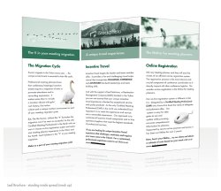
This is the inside spread using various shades of their brand colour, pantone 626.
I am still working on the other side which will have the back/cover and another (unique) service they offer.
All text is from the client (I find it too be heavy but this is what they requested). They wanted something that is clean, visual and reflects their brand environment - north/wildlife.
*Don't mind the watermarks on the images, they are comps and will be replaced by high res stocks once approved.
Please let me know your thoughts so far?
- Thanks
")
