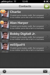
I'm in the middle of building a new app for IM (msn, aim, gtalk etc) and came up with the following UI so far. What do you guys think?
The screen is pretty self explanatory in terms of functionality. Is there anything missing or you would like to see improved? Any input is welcomed
")
dont listen to the others in this thread
if I want an IM app with apples UI design, there are more than enough out there for me to choose
but this one interests me, because its fresh and different (although the top right should be a green plus, that I do agree with)
it is a move in the right direction IMO
its time for a UI refresh on the iPhone, that or allow themes!
the pre, and HTCs new android interface, although both probably less intuitive than the iPhone, look SO MUCH nicer. the iPhones interface was great, but its getting old. They should keep everything where it is naturally, that is set up perfectly. Just change the look of things (and the notifications, please the notifications!)
but thats enough about the iPhone. This is supposed to be about your app
I think it looks great. This is what I want to see from developers. As a matter of fact, as I was waiting for the image to load, I thought to myself "please let it be different, not the traditional apple UI", and thats what you have here. Something to make your app stand out from the rest. Now you just need a compelling new feature
oh, and does the app automatically make everyones picture charlie?
not bad (obvious joke here, I understand its a placeholder, at least, I hope its a placeholder)