Got a tip for us?
Let us know
Become a MacRumors Supporter for $50/year with no ads, ability to filter front page stories, and private forums.
Business card
- Thread starter Normunds
- Start date
- Sort by reaction score
You are using an out of date browser. It may not display this or other websites correctly.
You should upgrade or use an alternative browser.
You should upgrade or use an alternative browser.
I'm personally not a huge fan of minimalist design like this, yeah sometimes it looks great (ala: apple) but a lot of the time it looks barren.
But if you insist on using this style I'd say play with kerning a bit, the letters all seem pretty widely spaced.
But if you insist on using this style I'd say play with kerning a bit, the letters all seem pretty widely spaced.
Honestly, it needs a little help.
The basic idea is there. Good use of white space and simplicity.
Now for the criticism. A business card should tell the holder what business you're in. Perhaps adding a descriptive underline to the logo/brand would help with that.
Also, coloring the first and last letters seems a little random. I can see coloring the first letter of each word in leu of capitalization.
You may want to add a physical address. Clients (generally) want to work with businesses they can meet face-to-face with, and proximity is important to that.
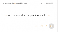
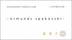
Normunds said:Hi,
Wwhat do you think - is it a good business card or not?
What business are you in? It's probably suitable for a designer, but obviously not right for a banker.
Also I think the color isn't dark enough...seems like it would be hard to read on paper.
I must qualify my answer first...I assume you know what information you want on the card and have deliberately chosen to leave off the sort of important stuff that people want a business card for...having said that...
I like it.
I like it.
no. Why would you change color for first and last characters? What happens when you make a business card for Betty Harris? You get B and S in bright yellow! Hopefully you won't have to make a card for Frank Wu either. 
iGary said:No, it's confusing.
Sorry, you asked.
why not give some coonstructive criticizing for his card instead of just saying it no good?
What's a business card for? To remind others of you... and what the feck you do.
So I'm going through my purse and I find a business card with someone's name on it and after discounting the probability that I picked it up in a bar, I'm thinking 'What does this person do again?'
So I'm going through my purse and I find a business card with someone's name on it and after discounting the probability that I picked it up in a bar
, I'm thinking 'What does this person do again?'Good design, I like the style of it.
Now keep the design and incorporate what others have said into it and you should be good to go.
Now keep the design and incorporate what others have said into it and you should be good to go.
Normunds said:interesting points. I dod not include adress, because of I am on constant travel and my customers can always reach me over the phone or e-mail.
if you prefer that customers contact you by phone or email then I don't think you have give a postal address as well....I would agree that it's a good idea to put some sort of information about what your company does
It's a good idea to put on the location you want them to send the cheque to...Macky-Mac said:if you prefer that customers contact you by phone or email then I don't think you have give a postal address as well....I would agree that it's a good idea to put some sort of information about what your company does
even if it's just a postal drop.
Put the logo of the company above your name, drop it down toward the center of the card, and number/email at the bottom.
im a huge fan of minimalistic design...i like it. im really not sure how anyone finds it confusing..unless they're unfamiliar with wat an email address and phone number is.
I like it. I like the clean simplicity, the text effects (color and kerning), and the fact that's unique without being hard to read at all.
You know how you give them out, so I assume you expect people will already know what you do when you hand them the card. But consider whether someone ELSE might ever run across the card. A couple words telling what you do might bring you work!
You know how you give them out, so I assume you expect people will already know what you do when you hand them the card. But consider whether someone ELSE might ever run across the card. A couple words telling what you do might bring you work!
Blue Velvet said:What's a business card for? To remind others of you... and what the feck you do.
So I'm going through my purse and I find a business card with someone's name on it and after discounting the probability that I picked it up in a bar
thats is what i was thinking...i supposed photog....but who knows...
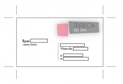
I like the logo, and they typeface you have chosen. But as for the layout, it does look a little unorganized. Most business cards that i have, give the most general information: name of the person, position, address, contact info, and then maybe company info on the back of the card.
Here is a company card i designed:
Here is a company card i designed:
Attachments
I like the minimalist design.Normunds said:Hi,
Wwhat do you think - is it a good business card or not?
However, dislike the name (color and kerning). Makes it hard to read.
Maybe a more simple one color font without the kernin for the name.
Also, I don't know about other places, but titles are very important here in Japan. So if it were here, I would be sure to include the title somewhere (maybe under the name) on the card.
Lots of critiques here.... I'll add my 2 cents. On initial glance, I like the white space and the logo. But, after further reflection, I think a few changes might be necessary. A title is important...how are you connected to Aero? Most people use a business card for specific reasons, and invariably in this order:
1. What is the company
2. Who is the contact
3. What is his/her position within the company (am I dealing with a sales rep or an account manager)
4. How can I contact him/her
5. What does this company do/specialize in
6. Where is the business based
Therefore, 1 and 2 are extremely important. This should be the first thing you notice on the card. The title is also important. Next is contact information, followed by 5 and 6. I agree, it's good to reiterate the address so your clients know where to send the checks to.
Currently, in the proportions/colors you have created, my eye does not go to any location first. It roams around the card, but never focusing on a specific point. I would suggest intensifying some of the colors, and reorganizing the information to bring the company name and your name to the forefront. Adding the color highlights to your name is creative, but nothing else on the card carries this idea through. It's a new element that has no continuity. I would also suggest printing on the back side and include points 5 and 6. This way you can keep your minimalist design and still have all the relevant information.
Im revamping my web design company with a new "apple-esque" look. I want it to be very minimalist. Im trying to get my cards to say "We are so good that we don't need to have flashy gimick cards!" - Most of my clients appreciate a superiority complex. Not that I have one but I put on the persona
Im getting this card made with thick card and a matt finish:

I did think about adding a drop shadow but I dont know if it would spoil the simple look of it.
I not made the back of the card but it is in the same place and will have my mobile number and web address on it.
Constructive critisism is welcome. Ive never designed a buisness card before and I do realise that the card is a little cold but that is why im using the matt finish to warm it up a notch.
Im getting this card made with thick card and a matt finish:
I did think about adding a drop shadow but I dont know if it would spoil the simple look of it.
I not made the back of the card but it is in the same place and will have my mobile number and web address on it.
Constructive critisism is welcome. Ive never designed a buisness card before and I do realise that the card is a little cold but that is why im using the matt finish to warm it up a notch.
Not a bad idea, but I found it very difficult to read. The way the letters are lined up made me want to read down. The large amount of spacing between letters doesn't help either.Johnny.MacLeod said:Constructive critisism is welcome. Ive never designed a buisness card before and I do realise that the card is a little cold but that is why im using the matt finish to warm it up a notch.
Register on MacRumors! This sidebar will go away, and you'll see fewer ads.