Become a MacRumors Supporter for $50/year with no ads, ability to filter front page stories, and private forums.

Jasonwexler1t

macrumors newbie
Original poster
Jun 22, 2023
5
2
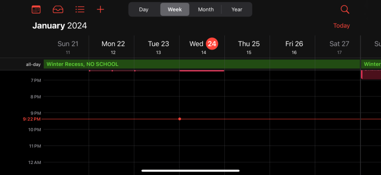
Seeing the 'week view' in the calendar app requires holding your phone in landscape orientation. Doing so should bring up toggles at the top to switch between expanded day, week and month views.

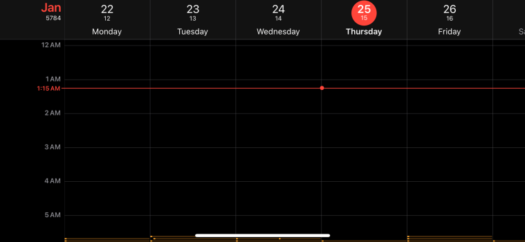
For some reason, on my iPhone (and someone I just helped switch over from android), the landscape view is distorted and cropped with all options missing! See attached pics for what the landscape view is SUPPOSED to look like and what mine looks like.

This has been driving me craaazy!

Please help. Any recommendations greatly appreciated!
 

Attachments

  • IMG_2055.png
    IMG_2055.png
    72.4 KB · Views: 118
  • IMG_9063.png
    IMG_9063.png
    133.3 KB · Views: 54

Jasonwexler1t

macrumors newbie
Original poster
Jun 22, 2023
5
2
You get different layouts on different screen sizes. Regular/Pro vs Plus/Max.
I ran into the same bug on 15 Pro Max. After trying a whole bunch of phones it seems to affect both screen sizes equally.

It should be noted that the cropped screen view is just that - cropped! The words/numbers will get cut off
 

IngoX

macrumors regular
Jan 4, 2022
140
98
Sweden
On the 15 Pro Max, did you check Settings > Display & Brightnes > Display Zoom? If it was set to ”Larger text” the screen gets the same resolution as a non Max iPhone, and you should expect the same app layout as on the smaller screen.
 

FreakinEurekan

macrumors 604
Sep 8, 2011
6,539
3,418
Not sure I understand the "distorted and cropped" comment, I don't see any distortion and nothing looks cropped in your first screenshot.

FWIW I don't use landscape mode on my iPhone.... at all, really, with calendar. But as a data point, my iPhone 15 Pro resembles your first screenshot (no buttons for Day/Week/Month/Year). You state that is what it's "supposed" to look like - what's your source on that?

My iPad, which I do use in Landscape mode, looks like your 2nd screenshot.
 

Jasonwexler1t

macrumors newbie
Original poster
Jun 22, 2023
5
2
Apologies for not clarifying my “cropped” comment. In that particular screenshot there is no crop but at other times the red circle indicating the selected date gets cut off at the top.

Regarding what I said about the view buttons being the way it’s supposed to look: I only came to that conclusion after looking at Apple’s own marketing/tutorial material and holding 2 of the exact same iPhone models with the same iOS version side by side and still seeing discrepancy
 

Jasonwexler1t

macrumors newbie
Original poster
Jun 22, 2023
5
2
Here goes a second round of apologies 🤦‍♂️. I actually confused the different devices I was looking at and it turns out the only phones with the alternate week view (aside from the smaller screen sizes) were the pro maxes with “Larger Text” enabled under “Display Zoom”.

I was confused being that some of the Pro Maxes had increased text size and still retained the buttons which I mistakenly assumed should’ve resulted in the same effect as the “Larger Text” option under “Display Zoom”.

Also was bothered by the strange and unApple like spacing of the smaller week view. The red circle around the selected day looks nanometers away from the phone bezel and the overall layout is greatly altered and non uniform in relation to the larger layout.

Thanks for the information!
 
  • Like
Reactions: IngoX

IngoX

macrumors regular
Jan 4, 2022
140
98
Sweden
Well, your shoutout was to ”iOS Calender haters” and I’m one of them, or at least a none user 🙂. The calender app is unintuitive and unusable on iOS, barely usable on macOS. Luckily there are several good alternatives, my self I’ve got accustomed to WeekCal wich gives good overview options on all screen sizes, even my iPhone 13 mini.

The syncing Apples Calendar does in the background is excellent though.
 
  • Like
Reactions: Jasonwexler1t
Register on MacRumors! This sidebar will go away, and you'll see fewer ads.