Hallo, I've been reading the forum for quite some time, and I'm a beginner. I've read the composition rules, exposure and try to put it in practice. Please comment so I can be a better photographer
Become a MacRumors Supporter for $50/year with no ads, ability to filter front page stories, and private forums.
Can you critics my photo please
- Thread starter isianto
- Start date
- Sort by reaction score
You are using an out of date browser. It may not display this or other websites correctly.
You should upgrade or use an alternative browser.
You should upgrade or use an alternative browser.


Thanks, I did not put the child in the center because I want to give her "space", but it seems I'm wrong. Thanks again
Not "wrong"... It's just opinions. Just like there are no composition 'rules'... but just starting points to consider.
Hallo, I've been reading the forum for quite some time, and I'm a beginner. I've read the composition rules, exposure and try to put it in practice. Please comment so I can be a better photographer
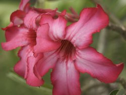
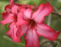
These are good images. I like the composition on the first and second one. On the first, I'd be tempted to try to put some light into the center of the flower so that the eye's lead down the petals and inside. On the second one, the composition looks good to me, I'd probably have shot it a little tighter, or cropped it- as there's a lot at the top and left that isn't really necessary and sort of detracts from the cute little subject and wonderfully bright umbrella. The last one looks like a snapshot- and it too could do with some closer-in framing, the wire, wrinkled pillow and shirt detract overall and a smile would brighten up the mood some.
Thanks, I did not put the child in the center because I want to give her "space", but it seems I'm wrong. Thanks again
Little too much, IMO, but nevertheless a right approach. You should generally give little space forward to the face, but this is rather extreme and it makes me want to crop that pic.
I believe you've tried to learn the "rule of thirds" but that rule is not written to the stone so be flexible and trust your instincts in breaking that rule whenever necessary.
Also, the flower pic would be better if it wasn't that tightly cropped.
The flower looks very nice. It's very dimensional and has a nice pop and I do like it. On the other hand, the people look very flat. Not bad, but not extraordinary at all. They are perfect as snapshots though (which isn't always a bad thing).
I suspect the OP may have used a forward facing flash? That would remove shadows like that.
Edit: Looking at the bigger ones it's obvious that that is the case.
I noticed that too, It's fine in my computer, it not desaturate/flat. I have no idea why when I uploaded them, it's become so desaturate (the color), I don't know why, is it because my monitor calibration? I'm using my macbook pro.
Actually leighonigar, I didn't use forward flash, I use bouncing flash (using sb600), like I said I have no idea why when I uploaded it's become saturated. anyway in my iphoto the color is more vivid. ^_^
I'm sure have no idea. Iif one of you have an idea why it happened please tell me. I checked the jpg files that I exported from iphoto, and it's still look a lot better in my mac, than in the web
I noticed that too, It's fine in my computer, it not desaturate/flat. I have no idea why when I uploaded them, it's become so desaturate (the color), I don't know why, is it because my monitor calibration? I'm using my macbook pro.
Actually leighonigar, I didn't use forward flash, I use bouncing flash (using sb600), like I said I have no idea why when I uploaded it's become saturated. anyway in my iphoto the color is more vivid. ^_^
I'm sure have no idea. Iif one of you have an idea why it happened please tell me. I checked the jpg files that I exported from iphoto, and it's still look a lot better in my mac, than in the web
Aha, interesting. Try different browsers. They sometimes handle the colour profiles differently.
Aha, interesting. Try different browsers. They sometimes handle the colour profiles differently.
Thanks, I will try using firefox, I used safari (newest version with newest update, but I forgot the exact version ^_^)
Sorry, I have not have time to upload, here's the same photo uploaded using firefox. I did some adjustment cropping.
Edit: the color looks more like it, even though it's still more desaturated than the picturs in my laptop. I have no idea why
Edit: the color looks more like it, even though it's still more desaturated than the picturs in my laptop. I have no idea why
Attachments


Register on MacRumors! This sidebar will go away, and you'll see fewer ads.