Got a tip for us?
Let us know
Become a MacRumors Supporter for $50/year with no ads, ability to filter front page stories, and private forums.
Check out my in progress site *cough*critique*cough*
- Thread starter tominated
- Start date
- Sort by reaction score
You are using an out of date browser. It may not display this or other websites correctly.
You should upgrade or use an alternative browser.
You should upgrade or use an alternative browser.
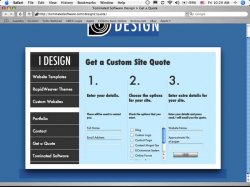
I just want to know what you think about the quote form on my design site. It doesn't work yet (still gotta get the php) and has to have a few things added, but do you like the layout? -linkety
Tried it in IE7 and IE6 and it is just a blue page.
When i view source the code is all there... but no page..
I like almost everything about this design and layout. It's really simple, elegant, crisp, and easy to use. The only thing I don't like is the font. So before I criticize that, I want to show you what it looks like on my computer and ask if this is the font you intended. This is on FF2.x on Windows 2003.

The font is fine by me
So I see a totally different font than you do... The font jng gets is nice. Does this page use a font not typically found on Windows? If so, you may want to specify a longer list of alt fonts.
Is this ANOTHER template?
Seriously, how many is this for you?
I fail to see the word "custom" anywhere here.
Seriously, how many is this for you?
I fail to see the word "custom" anywhere here.
So I see a totally different font than you do... The font jng gets is nice. Does this page use a font not typically found on Windows? If so, you may want to specify a longer list of alt fonts.
I have like a gabazillion fonts in the font list. I'll try to find a default one for windows. I have made allowances for linux. BTW: I am still trying to figure out why it just shows a blank page in IE. I tested it in browsercam and it renders fine in everything but all the IE's
You should experiment with tints on the content pages; right now all the text being black is a little bland. Also, it might be a personal opinion, but some of the text in certain hierarchies appears a little too big. Other than that, nice work.
do you mean where the numbers are bigger than the title?
oh yeah, webkit also renders my pngs a little darker. Is that something to do with those color profile thingamajigs? I put the same hex code in photoshop and textmate, but webkit thinks otherwise.
It's still got the reloading problem where every time you click on a link you have to scroll down.
If you use <a> or something similar to make it load say webpage.html#frame, it would fix it.
I'm sure there's a more up to date way, now.
I really like the design, though.
EDIT: I've noticed it's of no great concern because you don't need to scroll because there's nothing under that point besides design features. It's just a pity that you don't get to see the bottom part of the box.
Are you using the Save For Web feature? I tend to work with RGB color profiles OFF if I'm working on web images, generally no color problems with PNGs.I put the same hex code in photoshop and textmate, but webkit thinks otherwise.
Damn man who's your webhost? All your sites pop up lightning fast. Not sure if it's just superior coding, or a decent host, but either way they load very quickly.
But yes I'm getting some of the blue not blending as well in Safari.
I think this looks great for the most part, but I'm just not a huge fan of the font you've chosen for the body copy.
But yes I'm getting some of the blue not blending as well in Safari.
I think this looks great for the most part, but I'm just not a huge fan of the font you've chosen for the body copy.
Are you using the Save For Web feature? I tend to work with RGB color profiles OFF if I'm working on web images, generally no color problems with PNGs.
oh, good point. I did that with some images and they are fine. I'll try it.
dornoforpyros: I am using eboundhost. They say that they are 'hosting 8000 very fast sites' themselves.
The box with the checkboxes is still got to have things added into it. I have made it a scroll box just for proof-of-concept. BTW: do you notice the checkbox looks different? I used some javascript and css (i found it on the web) to replace the checkboxes with an image
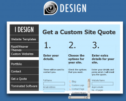
I have a bit larger default font size set in my browser and it overflows. I increased font size by one more to illustrate the problem. Otherwise, it's simple and nice from usability perspective.
damn, I should have tried that. BTW: I am adding Century gothic and Twentieth Century to the font lists (century gothic is a windows font and bth are derived from futura). Should I use the sIFR technique to render the titles in the proper font (Futura Condensed Medium)?
oh yeah, webkit also renders my pngs a little darker. Is that something to do with those color profile thingamajigs? I put the same hex code in photoshop and textmate, but webkit thinks otherwise.
Instead of trying to match background colours of certain elements with the site background, you could try to set the element's background transparent, based on the colour that should match the background. Usually, the edge pixels blend nicely with the site background this way.
Hard to explain, hope you could follow me...
")
[edit] Oh, and - nice page.
Instead of trying to match background colours of certain elements with the site background, you could try to set the element's background transparent, based on the colour that should match the background. Usually, the edge pixels blend nicely with the site background this way.
Hard to explain, hope you could follow me...
[edit] Oh, and - nice page.
I know what you mean, it's just that I want IE to render it without all this grey/pink crap! BTW: the quote for works now, just don't spam it! BTW: does anybody know a fix for that IE problem (not showing the page at all!)
No page showing on FireFox either ... Still.BTW: the quote for works now, just don't spam it! BTW: does anybody know a fix for that IE problem (not showing the page at all!)
::20ROGERSC::
No page showing on FireFox either ... Still.
::20ROGERSC::
it's not showing on firefox!?! WTF!?!?!?!
FireFox on XPeeee. Said in the Which logo should I use? thread ...it's not showing on firefox!?! WTF!?!?!?!
20rogersc said:Is it only me that's seeing just a plain blueish page?
[Although it is a very nice blue colour]
::20ROGERSC::
One thing that separates the pros from the rest is the fact that your site won't fall apart when you resize the text 2-3x larger and smaller. That's an improvement you could work on.
Register on MacRumors! This sidebar will go away, and you'll see fewer ads.