Become a MacRumors Supporter for $50/year with no ads, ability to filter front page stories, and private forums.

Scooby_Doo

macrumors member
Original poster
Apr 5, 2005
83
0
Chicago
Greetings everyone. I'm working on a class project to make a can label for an imaginary product and was wondering if I could get some critique on the draft.

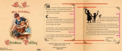
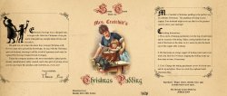
My idea is that shortly after the events of A Christmas Carol Ebenezer Scrooge goes into multiple businesses to help the common good. One of which is selling canned goods on the cheap.

My product is Mrs. Cratchitt's Christmas pudding. I'm not sure how best to make an expressive logo for the company, and am not sold that my center "front" side of the can is particularly strong in terms of matching the style of the time. Color was being printed but wood etching styles/black and white sketches were still quite common.

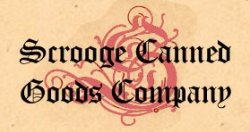
Any thoughts on names for the canned goods company or ways to make a logo that reflects that?

Thanks a lot for all the help! Merry early Christmas.
 

Attachments

  • ToddDiemer_Project_3.jpg
    ToddDiemer_Project_3.jpg
    973.1 KB · Views: 155
Overall I think that it has a good period "feel" to it that I like quite a bit. You are probably right about the color illustration, but it is hard to imagine it without it too since it is such an appropriate subject!

Now just a couple of thoughts to share- and in order to illustrate what I am talking about I pulled your graphic and chopped it up a little in the interest of clarity. (See reduced size rough below).

First off all, in your original design if you imagine where the seam would meet on the can it seems that it would look a little odd since the two text panels (which would then be beside each other) would be offset from each other vertically (indicated by the red lines). That, along with the different widths of the panels, would not be real appealing (as least to my eye which I why I chopped it up and moved the one panel to make it easier to visualize, not that they need to be left in that order). Another alternative might to merge the two into one panel- with the Scrooge story on top and the prep instructions in the lower section... hmmm....

Also, move the text at the right side of each box so that the margin more closely matches the left margin (pink lines/arrows). That will look a lot better!

As far as you question about the canning company logo, it is easy to imagine (in keeping with the period) it being fairly simple, so I have just attached a simplified version of yours- in which only the S is used in a paler shade (which could use to be lighter in the final version) overlaid with the company name. That is just one easy alternate that I wanted to show you to compare with yours and get your thoughts going! ;)

Anyway, hope that is not more than you wanted but I wanted to give you some alternate avenues of thought, so take it with a grain of salt in the end! Keep up the good work. :)

(BTW- If you upload any more pics, be kind to those that still have dial-up and don't upload any more of them at 300dpi- 72 dpi is fine for the screen, though of course you will need higher for the final submitted project.)
 

Attachments

  • small_label.jpg
    small_label.jpg
    131.6 KB · Views: 96
  • logo.jpg
    logo.jpg
    12.7 KB · Views: 204
sickmacdoc thanks for the thoughtful reply. In a rush to get the project online I forgot to change the DPI, sorry! I'll keep that mind for next time.

The issue with the margins is quite right, I'll get to work on that.

I'm not sure what should be done about the seam. Combining the text might be almost too much in one space. I was trying to visualize the label on the can where you would rotate to another 1/3 to see the two different texts, but you are right in wondering what will happen when people are between the two.

The logo advice helps a lot as well, good brainstorming.

Thanks again for your comments!
 
Register on MacRumors! This sidebar will go away, and you'll see fewer ads.