When it comes to removing haze, contrast is king. But it needs to be done with consideration for not crushing your shadows or highlights and/or adding too much contrast to the non-hazy areas of the image.
So I did some comparisons. In all of these comparisons, I first used Levels (Auto where possible) to get the histogram spread out as much as possible (overall contrast) and then added micro contrast to try to further eliminate the haze in the distance. Of course, to some extent, this will crush some blacks and blow some highlights so I tried not to go overboard while still seeing what the limits of these tools are like, both in how they cut-through haze but also how they might negatively impact other parts of the image.
RAW File
The original image, taken from the 2nd floor of the Eiffel Tower of the roof tops of central Paris was severely lacking in contrast and looks hazy. If you want to play around with the RAW file, you're welcome to it here.
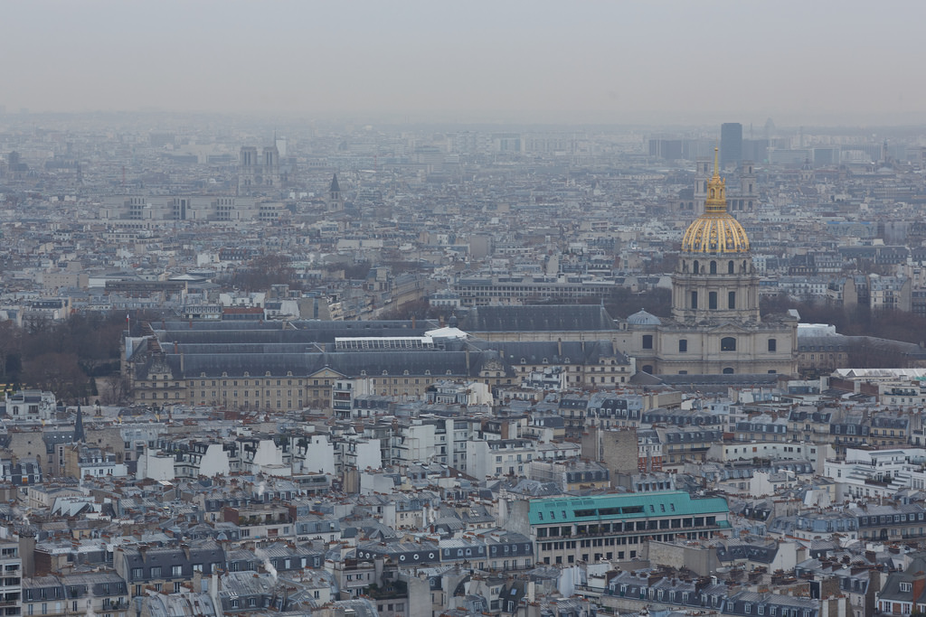
Original RAW by Virtual.Rain, on Flickr
Aperture
Here's Aperture with the Definition slider maxed out. Although it helped with haze in the background, it actually makes the foreground look a bit too contrasty... the bottom row of roofs just looks too dark. I've also seen it result in nasty HDR-like halos around high contrast objects, but that's not apparent with this image.
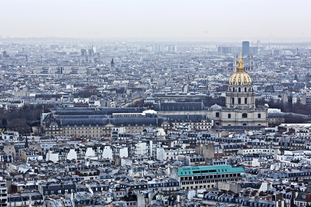
Aperture Definition by Virtual.Rain, on Flickr
NIK
When I was using Aperture, NIK was my goto for any serious adjustments. One of the tools I liked in NIK was their "Structure" adjustment, which adds micro-contrast which adds detail and is effective at removing haze. I found it much more effective than Aperture's Definition slider... especially since in Viveza you can use Control Points to make local structure adjustments.
This image was first corrected with Auto Levels in C1 and then round-tripped to NIK to max out the structure. The NIK image actually ends up with the least contrast, and that's because it's Structure Control is a bit more subtle than the others. It's done a good job adding micro-contrast without affecting overall contrast and darkening shadows or blowing highlights.
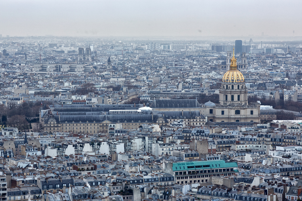
NIK by Virtual.Rain, on Flickr
DxO Optics Pro
I've heard a few comments on how effective DxO Optics Pro can be cutting through haze, so I thought I would check it out for myself.
DxO presented a bit of a challenge. First, it doesn't offer a "Levels" tool... so based on some googling around, I was able to find the "Blacks" tool and used the "Highlights" to try and spread the histogram out like you would with a Levels tool.
Next, it's frustrating to use because the histogram doesn't refresh while you're dragging a slider to make an adjustment... so if you're adjusting the black point, you need to nudge it, see what you've done, nudge it some more, etc. It's an iterative process rather than just watching the histogram respond to your slider movements.
Then, I tried the "ClearView" tool... it has the side-effect of lowering the black point further... so I had to undo the Black Point adjustment and use this control... but it still overly darkens the shadows in my opinion. Here I stopped at about 75 on the ClearView slider as the shadow details were getting too dark. While it did a good job cutting through the haze in the distance, it did so at the expense of the buildings in the foreground.... Everything in the foreground is much darker now... not ideal.
I also tried the DxO micro contrast slider but it seems like more of a sharpening tool than a micro-contrast or haze removal tool. It looks harsh quickly and doesn't do much to reduce haze. It also negatively impacts saturation.
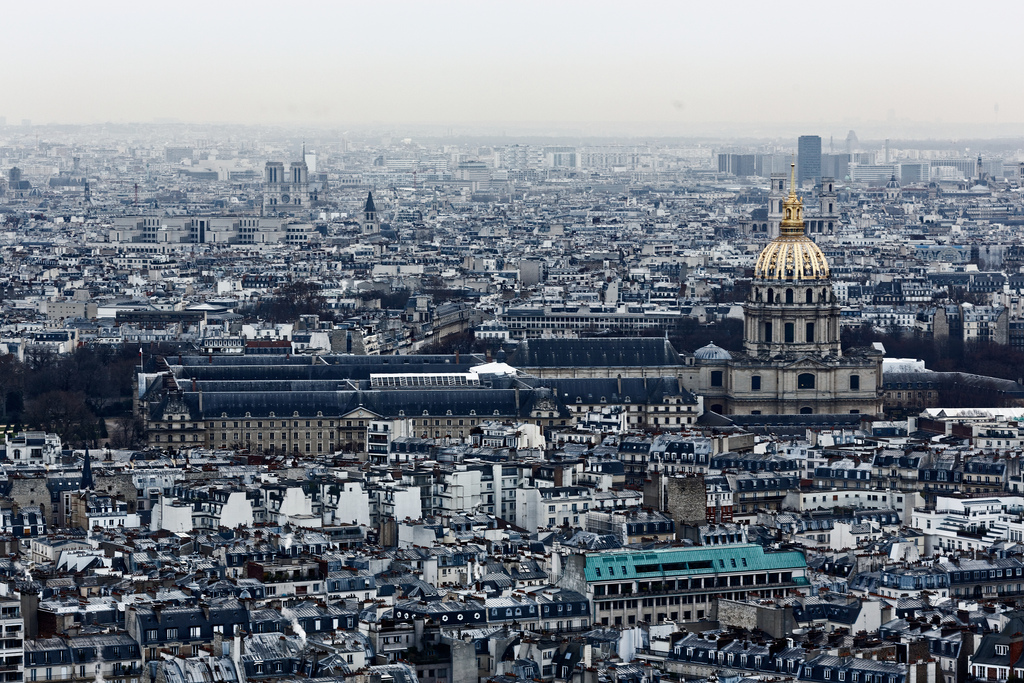
DXO ClearView by Virtual.Rain, on Flickr
Capture One Pro
Lastly, I've got Capture One here which you're safe in assuming I'm pretty biased towards these days (so keep that in mind)
The first C1 image here is done like the others... Auto Levels and then max out the Clarity and Structure to see what it can do. The Clarity adds micro contrast in the mid-tones to help cut through the haze while the structure adds more micro contrast to fine details... somewhere between Clarity and Sharpening. It does a decent job of cutting through the haze without over darkening the shadows or the foreground buildings or line of trees.
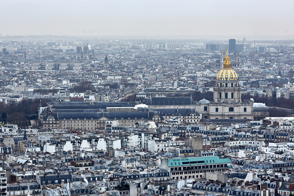
C1 Single by Virtual.Rain, on Flickr
Then I tried a bit of an experiment... On top of the image above, I added a local layer adjustment with a gradient mask extending down from the sky (and then erased the gold dome)...
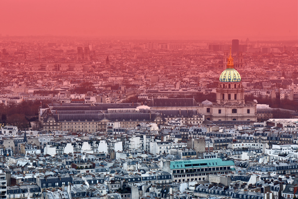
Mask by Virtual.Rain, on Flickr
I then added more contrast and clarity to that layer which really cut through the haze... while also lowering the clarity on the background layer to make the lower portion look less contrasty...
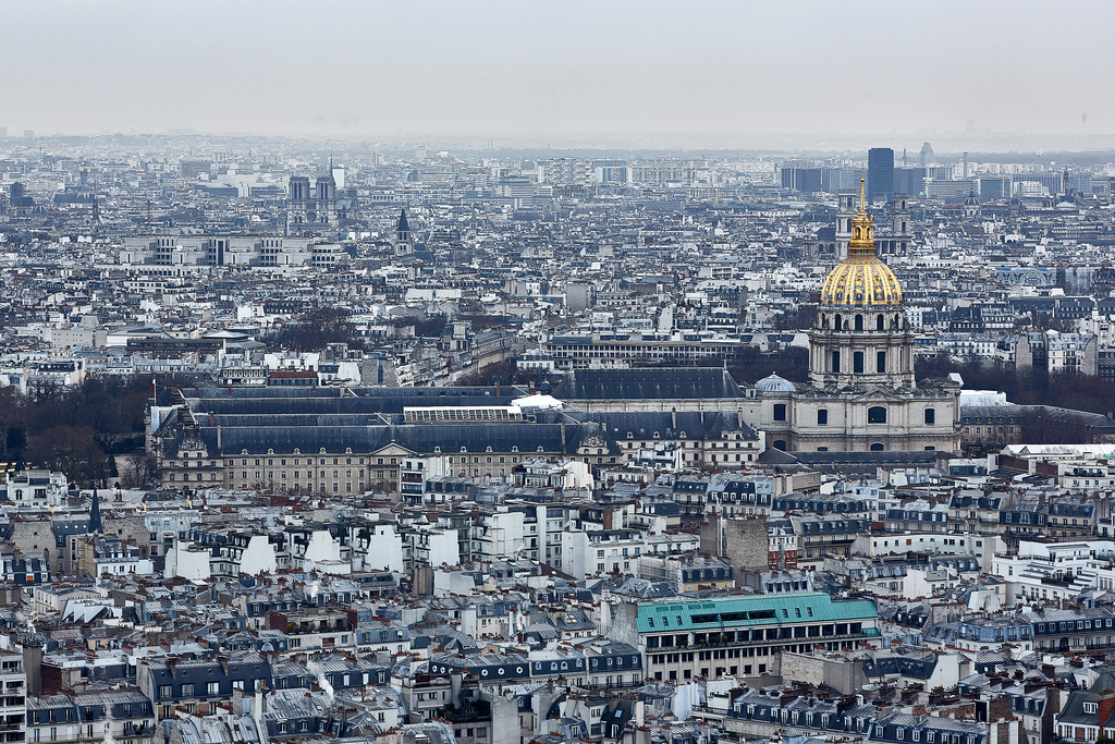
C1 Dual Layer by Virtual.Rain, on Flickr
Summary
For easier comparison, here's a grid of the upper left...
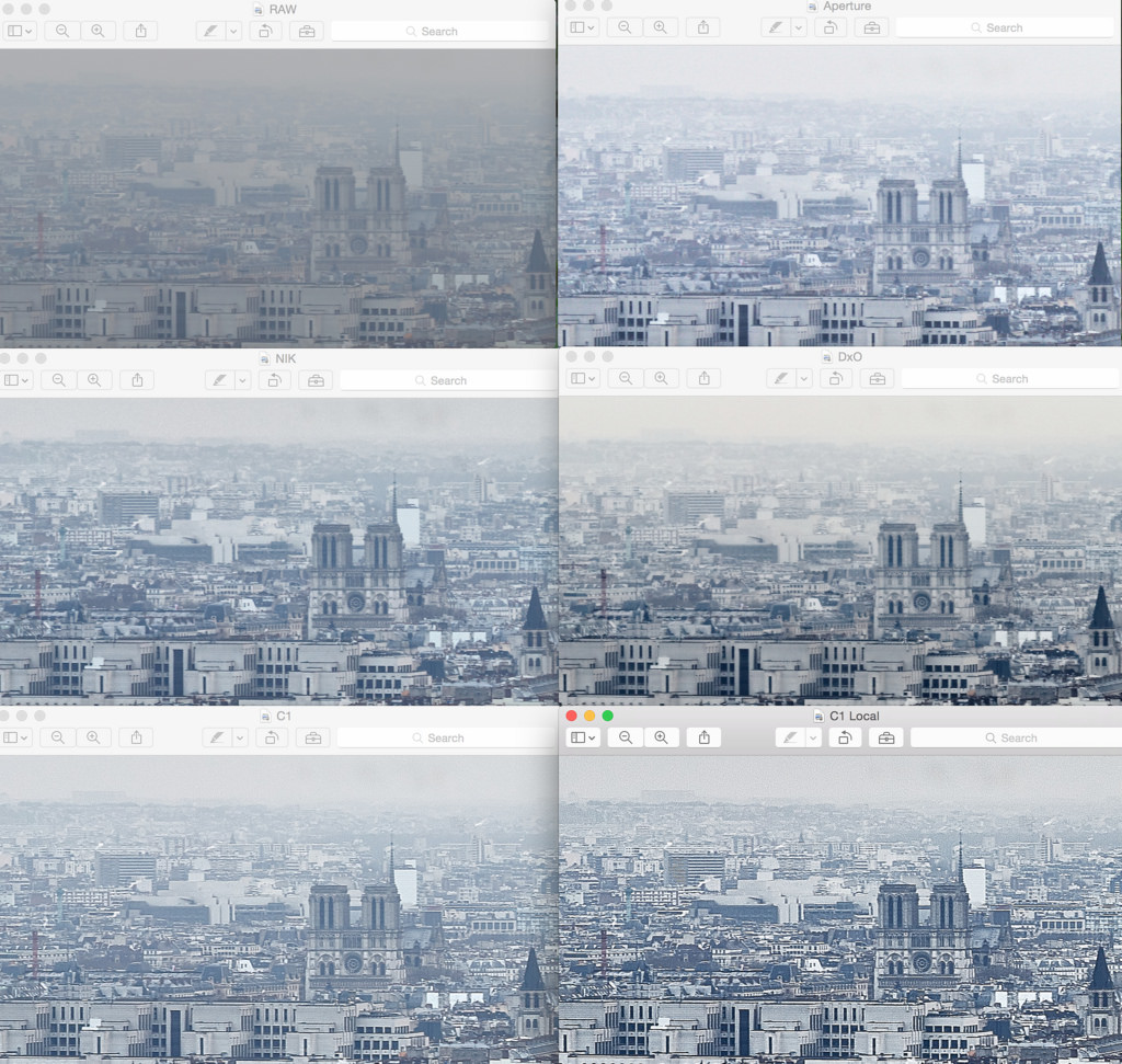
Screen Shot by Virtual.Rain, on Flickr
And a grid of the lower center...
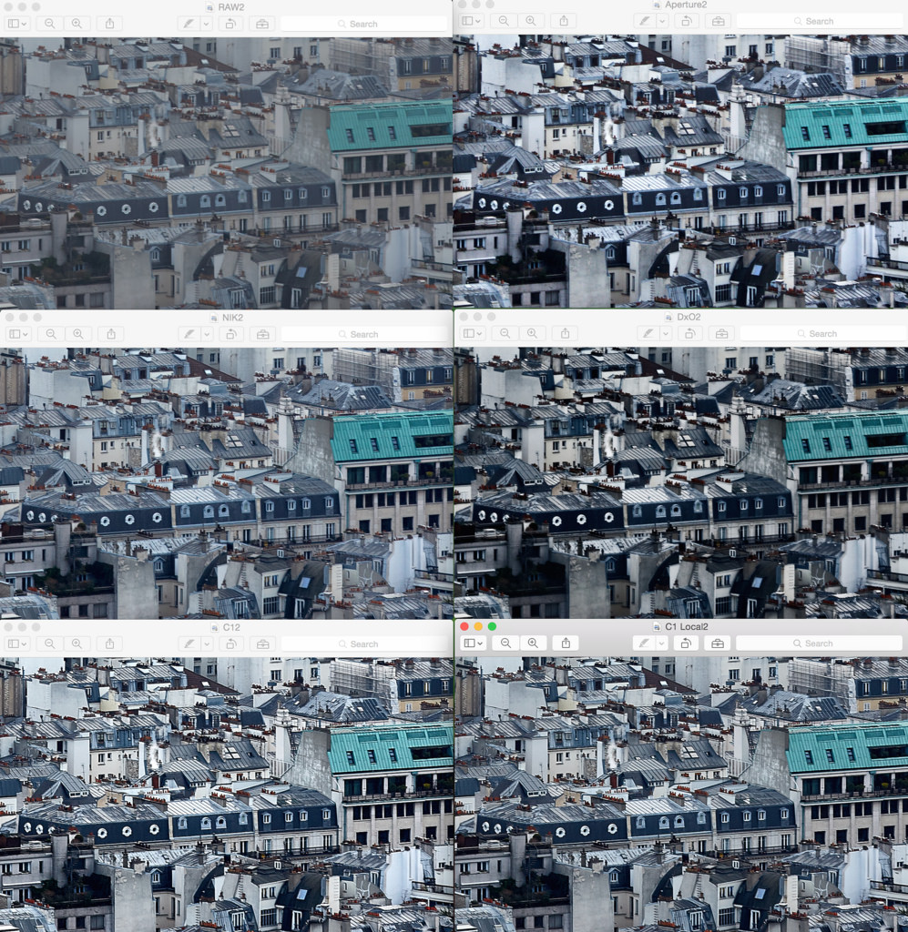
Screen Shot by Virtual.Rain, on Flickr
When LR6 appears, I'll run it through the same process.
My initial assessment:
I can see how DxO has a reputation for cutting through haze, but it also has some nasty side-effects that will require compensating for. It can really crush the blacks and shadows so it needs to be used sparingly which is counter productive when you're trying to cut through haze like this.
Apreture's Definition suffers from some of the same effects to a lesser extent and has other issues.
NIK produces the most natural result although not the most effective in this simple assessment... the cool thing about Viveza is that you can stack control points by putting multiples close together and get more impact where you need it without adversely affecting other areas of the image. So in this regard, if you're willing to round trip, NIK is probably the best tool for this job.
If you don't want to round-trip, then local adjustments are essential and that's where Capture One can excel. You can easily have completely different adjustments on the hazy buildings in the distance vs the more defined buildings in the foreground. I expect Lightroom to be in this camp as well with it's local adjustments.
So I did some comparisons. In all of these comparisons, I first used Levels (Auto where possible) to get the histogram spread out as much as possible (overall contrast) and then added micro contrast to try to further eliminate the haze in the distance. Of course, to some extent, this will crush some blacks and blow some highlights so I tried not to go overboard while still seeing what the limits of these tools are like, both in how they cut-through haze but also how they might negatively impact other parts of the image.
RAW File
The original image, taken from the 2nd floor of the Eiffel Tower of the roof tops of central Paris was severely lacking in contrast and looks hazy. If you want to play around with the RAW file, you're welcome to it here.

Original RAW by Virtual.Rain, on Flickr
Aperture
Here's Aperture with the Definition slider maxed out. Although it helped with haze in the background, it actually makes the foreground look a bit too contrasty... the bottom row of roofs just looks too dark. I've also seen it result in nasty HDR-like halos around high contrast objects, but that's not apparent with this image.

Aperture Definition by Virtual.Rain, on Flickr
NIK
When I was using Aperture, NIK was my goto for any serious adjustments. One of the tools I liked in NIK was their "Structure" adjustment, which adds micro-contrast which adds detail and is effective at removing haze. I found it much more effective than Aperture's Definition slider... especially since in Viveza you can use Control Points to make local structure adjustments.
This image was first corrected with Auto Levels in C1 and then round-tripped to NIK to max out the structure. The NIK image actually ends up with the least contrast, and that's because it's Structure Control is a bit more subtle than the others. It's done a good job adding micro-contrast without affecting overall contrast and darkening shadows or blowing highlights.

NIK by Virtual.Rain, on Flickr
DxO Optics Pro
I've heard a few comments on how effective DxO Optics Pro can be cutting through haze, so I thought I would check it out for myself.
DxO presented a bit of a challenge. First, it doesn't offer a "Levels" tool... so based on some googling around, I was able to find the "Blacks" tool and used the "Highlights" to try and spread the histogram out like you would with a Levels tool.
Next, it's frustrating to use because the histogram doesn't refresh while you're dragging a slider to make an adjustment... so if you're adjusting the black point, you need to nudge it, see what you've done, nudge it some more, etc. It's an iterative process rather than just watching the histogram respond to your slider movements.
Then, I tried the "ClearView" tool... it has the side-effect of lowering the black point further... so I had to undo the Black Point adjustment and use this control... but it still overly darkens the shadows in my opinion. Here I stopped at about 75 on the ClearView slider as the shadow details were getting too dark. While it did a good job cutting through the haze in the distance, it did so at the expense of the buildings in the foreground.... Everything in the foreground is much darker now... not ideal.
I also tried the DxO micro contrast slider but it seems like more of a sharpening tool than a micro-contrast or haze removal tool. It looks harsh quickly and doesn't do much to reduce haze. It also negatively impacts saturation.

DXO ClearView by Virtual.Rain, on Flickr
Capture One Pro
Lastly, I've got Capture One here which you're safe in assuming I'm pretty biased towards these days (so keep that in mind)
The first C1 image here is done like the others... Auto Levels and then max out the Clarity and Structure to see what it can do. The Clarity adds micro contrast in the mid-tones to help cut through the haze while the structure adds more micro contrast to fine details... somewhere between Clarity and Sharpening. It does a decent job of cutting through the haze without over darkening the shadows or the foreground buildings or line of trees.

C1 Single by Virtual.Rain, on Flickr
Then I tried a bit of an experiment... On top of the image above, I added a local layer adjustment with a gradient mask extending down from the sky (and then erased the gold dome)...

Mask by Virtual.Rain, on Flickr
I then added more contrast and clarity to that layer which really cut through the haze... while also lowering the clarity on the background layer to make the lower portion look less contrasty...

C1 Dual Layer by Virtual.Rain, on Flickr
Summary
For easier comparison, here's a grid of the upper left...

Screen Shot by Virtual.Rain, on Flickr
And a grid of the lower center...

Screen Shot by Virtual.Rain, on Flickr
When LR6 appears, I'll run it through the same process.
My initial assessment:
I can see how DxO has a reputation for cutting through haze, but it also has some nasty side-effects that will require compensating for. It can really crush the blacks and shadows so it needs to be used sparingly which is counter productive when you're trying to cut through haze like this.
Apreture's Definition suffers from some of the same effects to a lesser extent and has other issues.
NIK produces the most natural result although not the most effective in this simple assessment... the cool thing about Viveza is that you can stack control points by putting multiples close together and get more impact where you need it without adversely affecting other areas of the image. So in this regard, if you're willing to round trip, NIK is probably the best tool for this job.
If you don't want to round-trip, then local adjustments are essential and that's where Capture One can excel. You can easily have completely different adjustments on the hazy buildings in the distance vs the more defined buildings in the foreground. I expect Lightroom to be in this camp as well with it's local adjustments.
Last edited:

