Got a tip for us?
Let us know
Become a MacRumors Supporter for $50/year with no ads, ability to filter front page stories, and private forums.
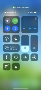
Control center, large space at top?
- Thread starter Paco II
- Start date
- Sort by reaction score
You are using an out of date browser. It may not display this or other websites correctly.
You should upgrade or use an alternative browser.
You should upgrade or use an alternative browser.
Mine currently has an active WiFi call app showing there. I can't tap it, but I guess it just shows what is active?
Basically what's using or recently used the camera or microphone (as it also relates to the green, for camera, and orange, for microphone, "dot" indicators that appear in the status bar at the top when those are in use).Mine currently has an active WiFi call app showing there. I can't tap it, but I guess it just shows what is active?
I don't have Home features enabled, but I wonder if it's related to the new Home features for Control Center. I can't find much info about it, but saw a reference from ibtimes. I have no idea how reliable that is though.
https://www.ibtimes.com/ios-14-update-how-use-new-control-center-features-3050508
https://www.ibtimes.com/ios-14-update-how-use-new-control-center-features-3050508
It's intended to prevent apps from "snooping" on you without your knowledge.Thanks for the replies all! Interesting. I have not yet seen anything in that space on my phone. Still seems like odd placement.
And what is the purpose in telling me what was used recently?
How often are people looking at the control center? Also, elsewhere in iOS that message comes as an overlay at the top, right?
It's intended to prevent apps from "snooping" on you without your knowledge.
The camera/microphone use indicators appear as colored dots in the status bar, with Control Center giving more details as to which app is behind that use (during the use and for a little after the use).How often are people looking at the control center? Also, elsewhere in iOS that message comes as an overlay at the top, right?
OK I get it. But it's still odd to reserve that space. Also it's like no one bothered to see how it looks on an iPhone XS size screen. My last row of icons cuts off a little. It comes across as a bit shoddy.
The camera/microphone use indicators appear as colored dots in the status bar, with Control Center giving more details as to which app is behind that use (during the use and for a little after the use).
Sounds like you mean Control Center (rather than Notification Center):

Control center, large space at top?
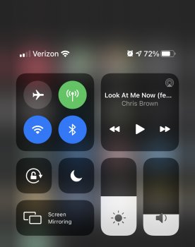
Is this a bug? Is it limited to my iPhone XS screen size? Seems like an odd waste of space and requires me to scroll more than necessary.
The camera/microphone use indicators appear as colored dots in the status bar, with Control Center giving more details as to which app is behind that use (during the use and for a little after the use).
So I’ve never see anything there until I purposely caused it after reading this thread. Great, that’s neat and all but it still begs the question, why so much wasted space?? Even with verbiage being shown, there’s still a ton of space above and below it. When NOTHING is there, why reserve the space?? It’s useless. It cuts off icons down below that I now have to scroll down to see. Never had to do that prior. It’s a crappy user experience on any level.
It’s the same in messages at the top of a message. Why does the contact photo need to be persistent? It takes up so much space and wastes it. I actually turn them off.
Register on MacRumors! This sidebar will go away, and you'll see fewer ads.


