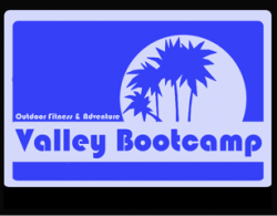
The stylised palm trees in blueflame's original logo suit the chunky typeface, in my opinion, and I would say they're very much recognisable as palm trees. Saying that they wouldn't resemble palm trees without the trunks or the moon is like saying you wouldn't recognise a cherry on top of a cake without the cake it's the whole image that counts, and I instantly thought "palm trees".
Anyway, I'm fairly sure that blueflame came here to get help with resizing his logo, rather than to be told it looks like "crap". I think your best bet, blueflame, is to retrace it in Illustrator a white rounded square, a blue rounded square on top, a white rectangle (for the stripe) and a white circle, trace the trees with the pen tool (the only fiddly part) and then type the text over the top.