I've already purchased and trademarked both marks - but can't decide which one to use for the rebranding !
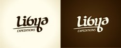
The new logos are similar, with one having a swoosh , and the other two dots . I think they both look great and fresh, and immeasurably superior to the old logo , which looks terrible compared to the new logos.
The new logos as you can see are clean, simple, scalable, works well in black and white, and somewhat distinctive.
Give me your opinions on which is the better logo - the swoosh, or the dots version ?
For disclosure, the dots aren't simply decorative -- they mean something.
In Arabic, the letter y, which is called "ya",is spelled with two dots under it.
Here is "Libya" written in Arabic script, and where the two dots are derived from -
ليبيا
The company is a tour operator that organizes escorted cultural and desert adventure tours to Libya.
We're getting rid of the OLD logo, it's up on the site ( www.libyaexpeditions.com), and below. The reason is the current logo is not very scalable and doesn't work well in black and white -
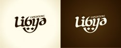

")