Become a MacRumors Supporter for $50/year with no ads, ability to filter front page stories, and private forums.
critique...just looking for some feedback
- Thread starter rweakins
- Start date
- Sort by reaction score
You are using an out of date browser. It may not display this or other websites correctly.
You should upgrade or use an alternative browser.
You should upgrade or use an alternative browser.
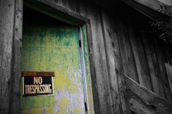

I really like the first and second one - the shed/door and the portrait. I love the texture and colouring of the building, and the portrait is simple and classic.
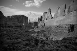
The composition of the landscape is fine, but I feel the black and white processing could have been better. It's too 'grayscale', I think it would be really powerful with deeper blacks.
The composition of the landscape is fine, but I feel the black and white processing could have been better. It's too 'grayscale', I think it would be really powerful with deeper blacks.
let me know what you think
Green door:
Really doesn't do anything for me. The wood has a nice texture, but the composition is bland and there aren't any really good lines to look at, plus the sign just keeps my eye in a boring place.
Portrait:
Nicely done. I'm generally not a fan of low catchlights, but the exposure is spot on for a white shirt, she's got a good smile, relaxed pose and the overall scene balances well. I'd tone down the white blob on the left in PS.
Canyon:
I'd probably have gone with more sky, but I'm assuming you wanted the little people in the bottom of the shot for scale? It's a good, but I don't think great treatment. I'm with epicwelshman on this, deeper blacks and more contrast would have helped, though I'm thinking a lot of it is just time of day and sun position.
1. I would like to see more surrounding the door, maybe if you didn't zoom in as far or stepped back a little.
2. I would crop the window frame to the left and possible some off the bottom, otherwise great shot!
3. I agree with compuwar, I would have included more of the sky, my eyes are drawn to that part of the picture and the land in the foreground just does nothing for me.
2. I would crop the window frame to the left and possible some off the bottom, otherwise great shot!
3. I agree with compuwar, I would have included more of the sky, my eyes are drawn to that part of the picture and the land in the foreground just does nothing for me.
1. I would like to see more surrounding the door, maybe if you didn't zoom in as far or stepped back a little
Agreed. A few steps backward and this photo would be even better

1. I would like to see more surrounding the door, maybe if you didn't zoom in as far or stepped back a little.
2. I would crop the window frame to the left and possible some off the bottom, otherwise great shot!
3. I agree with compuwar, I would have included more of the sky, my eyes are drawn to that part of the picture and the land in the foreground just does nothing for me.
I agree, particularly with your points for 1. and 3. More door and more sky. And no I'm not talking about the Lord of the Rings.
Register on MacRumors! This sidebar will go away, and you'll see fewer ads.