Been fiddling about with various card layouts and stuff but was getting a bit bored of the usual. I'm quite pleased with the layout of my website and as its the main point of contact for potential business I thought why not try and reflect my website in the card - not always a good idea but I think I've pulled it off, however there is a part of it I'm not sure about.
To understand the card I think you need to take a quick peek at my site (the first page will do) then come back and give me your thoughts on the card.
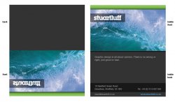
The bit I'm not sure about is the 'front' of the card. I have reversed it so when you open the card, what was reversed is now viewed correctly on the inside. This is to create a bit of intrigue to get people to open the card and also to make it stick in peoples minds - kind along the lines of "WTF...? *opens card* Oh yeh!!!! Thats clever"")
The actual content is incomplete. The image and little line of text about design being about opinion will most likely change.
Just to explain what you see below is a folded card but obviously opened out into front/back and inside.
I will probably go to the printers on the weekend and have a chat with them and get their thoughts on it and choosing correct colours/stock etc.
To understand the card I think you need to take a quick peek at my site (the first page will do) then come back and give me your thoughts on the card.
The bit I'm not sure about is the 'front' of the card. I have reversed it so when you open the card, what was reversed is now viewed correctly on the inside. This is to create a bit of intrigue to get people to open the card and also to make it stick in peoples minds - kind along the lines of "WTF...? *opens card* Oh yeh!!!! Thats clever"
The actual content is incomplete. The image and little line of text about design being about opinion will most likely change.
Just to explain what you see below is a folded card but obviously opened out into front/back and inside.
I will probably go to the printers on the weekend and have a chat with them and get their thoughts on it and choosing correct colours/stock etc.