Become a MacRumors Supporter for $50/year with no ads, ability to filter front page stories, and private forums.

66217

Guest
Original poster
Jan 30, 2006
1,604
0
So this is the first time I make something serious. I used Illustrator CS3.

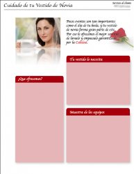
The text is still missing, and also the logo, which is going to be in the top left part. I'll move to the right the text that says "Cuidado de.....".

As you see, the text is in spanish. But please critique the design.

Don't hesitate on saying you think it is the worst design ever.:p


Thanks,


Roco
 

Attachments

  • Picture 3.jpg
    Picture 3.jpg
    143.3 KB · Views: 152
Unfortunately, I can't read Spanish. What are you designing it for? What's its purpose?
 
Unfortunately, I can't read Spanish. What are you designing it for? What's its purpose?

Oops, I forgot to write the purpose.

It is for a Dry Cleaning company. The purpose is to transmit to the client that we have the best service for cleaning and storing wedding dresses. The text that I would put there would say what methods we use, how we pack it, etc.
 
Did you write the text or did the company give it to you? Since the phrase: "Por eso te ofrecemos el mejor servicio de lavado y empacado garantizado por la calidad" seems a bit wonky...

Other than that I like the design, however I am no designer...
 
Did you write the text or did the company give it to you? Since the phrase: "Por eso te ofrecemos el mejor servicio de lavado y empacado garantizado por la calidad" seems a bit wonky...

Other than that I like the design, however I am no designer...

I wrote it.:D

After "Calidad" the name of the company would appear.

But yes, I agree that it seems a little out of place. I just added some text to see how it would look. It would probably change at the end.
 
I wrote it.:D

You speak Spanish well!

After "Calidad" the name of the company would appear.

Yes, that would pretty much fix it.

But yes, I agree that it seems a little out of place. I just added some text to see how it would look. It would probably change at the end.

It seems a little out of place now, but if you complete the phrase, it will be ok.
 
My suggestion is that if your focus or business is on cleaning and/or storing wedding dresses, then perhaps it would be a good idea to place visual emphasis on the actual wedding dress, rather then a head shot with veil.

Here is an example...

http://www.weddingdresscleaners.net/

Other then that, I think it's looking pretty good.
 
You speak Spanish well!

It is my native language. I'm from Mexico.:)

My suggestion is that if your focus or business is on cleaning and/or storing wedding dresses, then perhaps it would be a good idea to place visual emphasis on the actual wedding dress, rather then a head shot with veil.

Good point.

What royalty-free company would you recommend? I am using right now the browser that comes with Adobe Bridge, which I find good, but lacks variety.
 
It is my native language. I'm from Mexico.:)

LOL. I guess it's good that you can speak Spanish. Ha!


The design is simple but there's nothing that stands out as awful. Maybe a few more elements to draw the eye in to the paragraphs - rose petals, veil, pearls, etc.
 
Register on MacRumors! This sidebar will go away, and you'll see fewer ads.