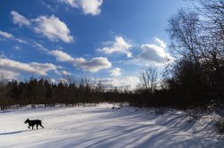
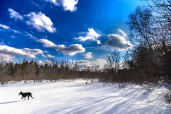
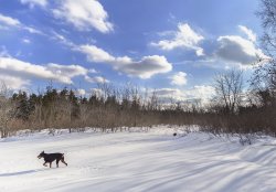
The only real problem at first glance, is that tones in the sky aren't right... I don't mind the fact that they are very saturated... Lots of people over saturate the sky (me included) but it shouldn't look uneven like that. I guess the issue is the top right... if that was the same tone as the deep blue in the top left and it all got gradually more cyan towards the horizon, I think it would look fine. Strangely, your original looks similar in terms of being lighter in the top right... so maybe it' s just too dark blue in the upper left. Maybe tone that down a bit?
The ground looks very natural, just like you'd expect.
The funny thing is, you could probably achieve nearly the same effect (perhaps even more natural) without the 3 exposures simply by adjusting exposure in different parts of the image. In my experience, either NIK Viveza with some control points in the right places (darken the sky, lighten the clouds, snow and woods) or Capture One Pro with a few local adjustments (a gradient on the sky? with an overall exposure boost or shadow pull) could easily get you the same result from a single RAW.


