Got a tip for us?
Let us know
Become a MacRumors Supporter for $50/year with no ads, ability to filter front page stories, and private forums.
critique my icon
- Thread starter benlee
- Start date
- Sort by reaction score
You are using an out of date browser. It may not display this or other websites correctly.
You should upgrade or use an alternative browser.
You should upgrade or use an alternative browser.
I love it! Is it transparent?
Ditto. It's a very elegant, minimalist design.
")
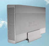
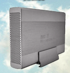
here we go.
there are two of them. just went as large as i could go and took a picture of them. Thanks
Wait, is this a Photoshop-made icon or a photo? If you made that from scratch, that's pretty damn amazing! Good job.
Wait, is this a Photoshop-made icon or a photo? If you made that from scratch, that's pretty damn amazing! Good job.
Pixel art gone wrong more like it
Wait, is this a Photoshop-made icon or a photo? If you made that from scratch, that's pretty damn amazing! Good job.
No its just a picture that i mad transparent and added drop shadow and messed with brightness/contrast and other levels. Maybe i should try to do ti from scratch though. it just doesnt look good below my macintosh HD icon that i got somewhere online
Attachments

No its just a picture that i mad transparent and added drop shadow and messed with brightness/contrast and other levels. Maybe i should try to do ti from scratch though. it just doesnt look good below my macintosh HD icon that i got somewhere online
That's cool... What is the file format of the icon? Can you use a PSD or did you have to save it as, say, PNG (because of the transparency)?
That's cool... What is the file format of the icon? Can you use a PSD or did you have to save it as, say, PNG (because of the transparency)?
It's saved as a resource file that I saved through icon builder. for some reason it just doesnt stand out to me though and i dont know why. maybe im just being too picky though.
It's saved as a resource file that I saved through icon builder. for some reason it just doesnt stand out to me though and i dont know why. maybe im just being too picky though.
OK, pardon my stupidity, but what's a resource file? (I'm a PC user, is this a Mac-specific term?) I'd be interested in making icons like that once I do have a Mac...
OK, pardon my stupidity, but what's a resource file? (I'm a PC user, is this a Mac-specific term?) I'd be interested in making icons like that once I do have a Mac...
I used photoshop and a plug-in called icon builder. it uses presets and is available for both osx and windows. not exactly sure what a resource file is but it is basically just an icon, not much mor to it.
I used photoshop and a plug-in called icon builder. it uses presets and is available for both osx and windows. not exactly sure what a resource file is but it is basically just an icon, not much mor to it.
Where could I get ahold of that plugin? (or does it even work with PS7?)
haha...guess i wasted a little bit of time. but atleast i know how to make an icon now. doesnt look much different than mine, just a darker outline. thanks for showing me that though.
yes it works with ps7Where could I get ahold of that plugin? (or does it even work with PS7?)
for windows xp: http://iconfactory.com/software/iconbuilder_xp it costs money but you can try it!
Better isn't really "better" unless you're happy with the results, but there are some things you could do to make it look a little more like it belongs in Aqualand.What should i do to make it better?
First, if the sky and clouds are part of the icon and not just a desktop showing through, they should probably be chopped out and left as transparent areas. Iconfactory will automatically deal with the mask shape for you.
If you want to keep the sky, it's a good plan to still add a transparent margin so that the icon doesn't slam against its neighbors in places like the dock. A quick fix would be to reduce the image to about 116 x 116 (nothing magic about that number, experimentation's fine), then change the canvas size to 128 x 128. If you stick with a rectangular icon, add a small drop shadow from directly overhead, around 15 or 20ish % opaque (use stock Mac icons for reference). Still, with that sky, it's going to look on the desktop like a picture of a disk enclosure, instead of an enclosure. The other icons are sure to laugh at it.
In Aqualand, devices (disks, printers etc.) are normally compelled by a powerful and mysterious force that aligns them to the front of the screen and forces them to be viewed from slightly above. Third party devices, perhaps due to their alien origin, sometimes escape this force, so you can get past with the photos you're using. It is very unusual for anyone in Aqualand to face the left of the screen, you may want to flip your image so that the other icons don't think it's rude.
The electricians' union in Aqualand is powerful, and its members refuse to install lights anywhere but the ceiling. It's a really nice enclosure you have there, and it would be sad if anything happened to it because it got too near an unauthorized side light. You may be able to fix this up with PS lighting effects, if you know what's good for you.
At the same time, the enclosure still wants a shadow, but not a plain old drop shadow (because that will make a 3D object look like a cardboard cutout). The icons for Preview, GarageBand, Automator will give you a good idea of how the lighting looks in Aqualand. There's no need to get too fancy with the shadowing, a blurred black blob or two in the right places should be enough to satisfy the local inspectors.
The interference pattern on the right-hand enclosure is a little weird. The grille on the left is much nicer to look at.
Register on MacRumors! This sidebar will go away, and you'll see fewer ads.