Hi -
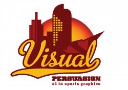
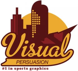
My graphic design business (Visual Persuasion) is changing gears - before we "specialized" in print design but now will focus more on a niche market...sports graphics (team logos, mascots, illustrations for sporting events, etc...)
So I'm re-branding the business starting with the logo - I have always struggled with designing logos for me. Anyways...my intention was to give it a look that is reminiscent of a professional sport's team logo. I've looked at many of these for inspiration and found there are some ugly sports logos out there.
We are located in denver so the 3 buildings in the background represent 3 distinct structures in the denver skyline.
This is what I have so far...please give feedback. Thanks!")
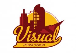
My graphic design business (Visual Persuasion) is changing gears - before we "specialized" in print design but now will focus more on a niche market...sports graphics (team logos, mascots, illustrations for sporting events, etc...)
So I'm re-branding the business starting with the logo - I have always struggled with designing logos for me. Anyways...my intention was to give it a look that is reminiscent of a professional sport's team logo. I've looked at many of these for inspiration and found there are some ugly sports logos out there.
We are located in denver so the 3 buildings in the background represent 3 distinct structures in the denver skyline.
This is what I have so far...please give feedback. Thanks!