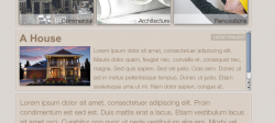
Hey guys, I'm making a site for one of my mum's friend's construction company called scotmac constructions. I made a design or it about 6 months ago, but that was when I was just starting to venture in web design (can't give a link though, sorry). I have fully re-vamped the site since then (i actually started yesterday, and this took about 2-3 hours in total) and need some critique while I am waiting on feedback from the client. The url is tominatedsoftware.com/scotmac2 (once they register the domian it will be different).
Thanks in advance.
BTW: because I did this on my pc laptop, i know it works fully in both IE6 and 7 (hell yes!). It also works in opera, firefox and safari.
Thanks in advance.
BTW: because I did this on my pc laptop, i know it works fully in both IE6 and 7 (hell yes!). It also works in opera, firefox and safari.
")