Got a tip for us?
Let us know
Become a MacRumors Supporter for $50/year with no ads, ability to filter front page stories, and private forums.
Critique My two Blogs and Logos...
- Thread starter Andrew K.
- Start date
- Sort by reaction score
You are using an out of date browser. It may not display this or other websites correctly.
You should upgrade or use an alternative browser.
You should upgrade or use an alternative browser.

Please do. Then you can avoid being accused of just trying to drive traffic to your site (which is against the rules here). Also, some people have chosen to not see signatures, so you might wanna include the links in the post itself.If you think I'm trying to do shameless self promotion I can just post the logos on here")
I've read the article before thanks, care to elaborate?
I've read the article before thanks, care to elaborate?
Your logos are way too complex. Get rid of the shadows, textures, gradients, outlines. If you want to add fancy stuff, make a simple one first and add it in later.
Your logos are way too complex. Get rid of the shadows, textures, gradients, outlines. If you want to add fancy stuff, make a simple one first and add it in later.
So you're saying they aren't transferrable to the context of the website? I understand they don't transfer to business cards or smaller forms, but I don't need that for the second logo (I changed the stock art crown to the skull and wings which I made in illustrator) I got rid of the shadow effect around it ( it was just for a wallpaper) for the banner, I changed the first one with no gradients, outlines or blended shadowing.
Attachments

You present a single concept for each site. In the logo design process, there are generally scores of initial sketches made before distilling a few promising directions. Each of your logos looks like an initial concept that has been taken directly to "print." Though not quite as permanent, your request is akin to someone buying shoes, wearing them outside, and then asking others what they think of them.
What in the "TECKABLE" logo communicates technology to you? Are you satisfied with the mere sound of the word? It is not a particularly inventive design. Thirty years ago I did something similar (Avant Garde with arrows). You get a couple of points for crafting your own typeface. However, the interlocking quasi-ligatures interfere with optimum kerning (same problem I had with Avant Garde). The "T" horizontal stroke appears too thick; diagonal strokes appear too thin; the "C" looks unfinished; some letters are optically too short. Nevertheless, you've jazzed it up with some Photoshop effects to improve the appearance. (Item #2 in 10 Common Mistakes...)
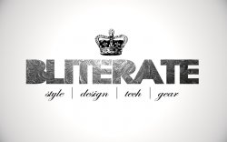
The "BLITERATE" layout is clean but the primary logotype is very bad. In this case, even the textures and drop shadows can't save it. Pick another font and don't fill in the counters. The crown is not particularly unique but it appears you can replace that with whatever clipart is available to suit your needs.
The blogs themselves are far from cluttered though I find it difficult to identify a blog theme for Bliterate. Clicking "Style," "Design," "Tech," or "Gear" does not appear to change the content. Can't a tech gadget be stylish? Isn't everything designed? Is the latest gear in style? I don't quite understand the categories.
The TECKABLE blog is self-explanatory. It just seems rather odd that the links take visitors to much more comprehensive tech blogs. This begs the question: "Why waste time at TECKABLE?"
What in the "TECKABLE" logo communicates technology to you? Are you satisfied with the mere sound of the word? It is not a particularly inventive design. Thirty years ago I did something similar (Avant Garde with arrows). You get a couple of points for crafting your own typeface. However, the interlocking quasi-ligatures interfere with optimum kerning (same problem I had with Avant Garde). The "T" horizontal stroke appears too thick; diagonal strokes appear too thin; the "C" looks unfinished; some letters are optically too short. Nevertheless, you've jazzed it up with some Photoshop effects to improve the appearance. (Item #2 in 10 Common Mistakes...)
The "BLITERATE" layout is clean but the primary logotype is very bad. In this case, even the textures and drop shadows can't save it. Pick another font and don't fill in the counters. The crown is not particularly unique but it appears you can replace that with whatever clipart is available to suit your needs.
The blogs themselves are far from cluttered though I find it difficult to identify a blog theme for Bliterate. Clicking "Style," "Design," "Tech," or "Gear" does not appear to change the content. Can't a tech gadget be stylish? Isn't everything designed? Is the latest gear in style? I don't quite understand the categories.
The TECKABLE blog is self-explanatory. It just seems rather odd that the links take visitors to much more comprehensive tech blogs. This begs the question: "Why waste time at TECKABLE?"
You present a single concept for each site. In the logo design process, there are generally scores of initial sketches made before distilling a few promising directions. Each of your logos looks like an initial concept that has been taken directly to "print." Though not quite as permanent, your request is akin to someone buying shoes, wearing them outside, and then asking others what they think of them.
What in the "TECKABLE" logo communicates technology to you? Are you satisfied with the mere sound of the word? It is not a particularly inventive design. Thirty years ago I did something similar (Avant Garde with arrows). You get a couple of points for crafting your own typeface. However, the interlocking quasi-ligatures interfere with optimum kerning (same problem I had with Avant Garde). The "T" horizontal stroke appears too thick; diagonal strokes appear too thin; the "C" looks unfinished; some letters are optically too short. Nevertheless, you've jazzed it up with some Photoshop effects to improve the appearance. (Item #2 in 10 Common Mistakes...)
The "BLITERATE" layout is clean but the primary logotype is very bad. In this case, even the textures and drop shadows can't save it. Pick another font and don't fill in the counters. The crown is not particularly unique but it appears you can replace that with whatever clipart is available to suit your needs.
The blogs themselves are far from cluttered though I find it difficult to identify a blog theme for Bliterate. Clicking "Style," "Design," "Tech," or "Gear" does not appear to change the content. Can't a tech gadget be stylish? Isn't everything designed? Is the latest gear in style? I don't quite understand the categories.
The TECKABLE blog is self-explanatory. It just seems rather odd that the links take visitors to much more comprehensive tech blogs. This begs the question: "Why waste time at TECKABLE?"
First off, thank you for your critique. I did not come here to show it off then defend it to the death. You have way more experience than I do so thanks for the insight.
I have been thinking for some time now what would communicate technology through a logo but all I could come up with was the sleekness of the look. I have seen many tech blogs use a wifi signal or just a typeface by itself because the wide spectrum of technology is always changing and I don't think you can pinpoint just a picture of a gadget. I think I need to lower the top of the T and finish the C thanks. I simplified the whole thing in the post above yours. So am I never supposed to use a gradient or shadow? I feel like it's just a giant taboo in the design world and no one can ever use them again. You're right this was started as a small project between me and my sister so there is no complete wow factor for visiting the site, I'll work on that.
The second one I wanted it to be very different, and it's also a more personal blog for me. That's why the logo is a bit out there and not made for transference. I wanted to have the flourish texture behind the font, is there a better way to execute that? Pick a different font then? The lower title was just to differentiate elements of stuff that I was interested in , I don't have much coding skills so they aren't buttons, but I can change it to "Design Blog".
TECKABLE - I like the subtle irony with this logo, do a 80 "techie" slant for a new tech concept. Although retro is back in vogue IMHO the logo will date, but in the right context it would work.
Bliterate- Although I can see what you're trying to do here I initially thought the | style | design | tech | gear | text under the type was navigation, it drove me nuts until I realised it wasn't nav.
The bliterate kerning as a little off, the A T needs the be brought closer together.
But besides that I think they look pretty good.
On the teckable website, I have to scroll left or right to view the entire page. You websites should be designed so that the user never has to scroll left or right to view a portion of the page in any size browser. Not everyone likes to browse in full screen, I like my wallpaper. Also, you should never assume that every reader is using the same size screen so the page width should change with the browser width. My parents still use a resolution of 800x600, and you should accommodate them as well. Someone using a smaller resolution does not mean that they will not be interested in your site, it simply means that their eyes are not as good as everyones.
In computer interface design a major concept they put forth is that when designing dialogue boxes they should NEVER exceed the bounds of 800x600 pixels. The same is true for web design. Many computer systems today will default to 640x480 when there is a problem and your website should be prepared for that.
In computer interface design a major concept they put forth is that when designing dialogue boxes they should NEVER exceed the bounds of 800x600 pixels. The same is true for web design. Many computer systems today will default to 640x480 when there is a problem and your website should be prepared for that.
Teckable tag line is slightly blurry. (No it's not because I don't know what anti-alias is).
FYI, most successful sites don't use logos that big.
FYI, most successful sites don't use logos that big.
Wirelessly posted (iPhone : Mozilla/5.0 (iPhone; U; CPU iPhone OS 3_1_2 like Mac OS X; en-us) AppleWebKit/528.18 (KHTML, like Gecko) Version/4.0 Mobile/7D11 Safari/528.16)
Sorry to be unclear. The tech styling is nice. I understand why you used it. The point commenters are making is that the logo itself should be strong even without a trendy shine or shadow. The underlying design of each logo is not quite complete. TECKABLE is further along than the other.
Nevertheless, you've jazzed it up with some Photoshop effects to improve the appearance. (Item #2 in 10 Common Mistakes...)
So am I never supposed to use a gradient or shadow? I feel like it's just a giant taboo in the design world and no one can ever use them again.
Sorry to be unclear. The tech styling is nice. I understand why you used it. The point commenters are making is that the logo itself should be strong even without a trendy shine or shadow. The underlying design of each logo is not quite complete. TECKABLE is further along than the other.
Teckable. What does that mean? Are you trying to combine 2 words "Teck" and "Able" to have a double meaning? What is the meaning of Teck? Do you mean "Tech" as in Technical? It's not working for me because there is no K in technical and so it's trying to hard to make a connection. Is that your last name? If it were, then it might be clever... but as it stands now, not so much.
Not going to comment too much about the logotypes other to say that I agree with the other posters. They are a bit unfinished and contrived. They each have a decent start but need to go through several more rounds of crit and revisions before you even think of taking it into Photoshop. Logos that are designed in Photoshop look like they are designed in Photoshop if you know what I mean. If not then I'll explain it by asking a question. How many thumbnails and half-scale sketches did you do before coming up with those designs? My guess is few to none. I know a lot of really good designers and none of them are able to do a good logo without sketching and refining it first. There is no shortcut unless you have YEARS of experience to fall back on.
Good luck with all that. Now you know why good Designers charge what they do.
Teckable. What does that mean? Are you trying to combine 2 words "Teck" and "Able" to have a double meaning? What is the meaning of Teck? Do you mean "Tech" as in Technical? It's not working for me because there is no K in technical and so it's trying to hard to make a connection. Is that your last name? If it were, then it might be clever... but as it stands now, not so much.
Not going to comment too much about the logotypes other to say that I agree with the other posters. They are a bit unfinished and contrived. They each have a decent start but need to go through several more rounds of crit and revisions before you even think of taking it into Photoshop. Logos that are designed in Photoshop look like they are designed in Photoshop if you know what I mean. If not then I'll explain it by asking a question. How many thumbnails and half-scale sketches did you do before coming up with those designs? My guess is few to none. I know a lot of really good designers and none of them are able to do a good logo without sketching and refining it first. There is no shortcut unless you have YEARS of experience to fall back on.
Good luck with all that. Now you know why good Designers charge what they do.
Teckable was the only domain name not taken, I would have gone with Techable, but also some may have read the ch phonetically. I went through a few sketches yes. And I'm not doing this just to take a crack at it, I am going to school for Graphic Design and Advertising soon so I love doing this. That's why I came here to find out what mistakes I've already done so I can be more prepared when I go. I completley understand why designers charge more, thank you for helping. I would never come to you guys for a design job that wasn't personal because Ive seen many ametuers ask for help and I know how much equity a more experienced designer has. I can't wait to learn and everyone in this thread has already helped me a lot
Register on MacRumors! This sidebar will go away, and you'll see fewer ads.