Sorry I didn't see this sooner.
I used to be a magazine editor at Conde Nast so whether or not I know what I'm doing when it comes to picking a part a layout, someone paid me as if I did.
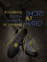
The biggest problem is the font. Fonts have a "feel" to them, and the feel changes when you scale them up to headline size.
And this font feels almost kitschy and retro, kinda 70s.
The story and the image are natural and organic, and this font is anything but. It also clashes with the text font in your second concept.
You clearly felt this in some way, so you tried to "distress" it. The more elegant solution is to find the right font to begin with.
Which is the right font? If I knew, I'd be a designer, but I might try something that feels really clean and solid (boulder-like?) like Franklin Gothic.
http://www.myfonts.com/fonts/bitstream/franklin-gothic/
Go to the More Fonts Like This tab on the link above and it shows literally hundreds of other fonts.
On the other hand, a heavy serif could give it a classic feel. Check out Clarity and Clarity Lost on page seven of the More Fonts list tab. There are lots of good answers.
I'd play with the typeface, and ask both your professor and the guy who aces every project for some feedback.
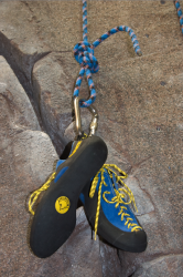
While I understand why you started darkening the photo with the reversed type, when I saw the original photo, it became clear to me that the rock was as much a part of the composition--and the message--as the shoes. In that second layout, try swapping in the original photo.
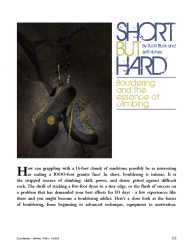
Your two concepts would work very differently in a magazine BTW. The first feels like the opener to a 6-8 page spread. The second with that much text on the page, is more like a column or a short feature that might have one spread and probably going to be continued in the back of the magazine.
best
Allen St. John


